A Photo Essay of the 2021 14-inch MacBook Pro
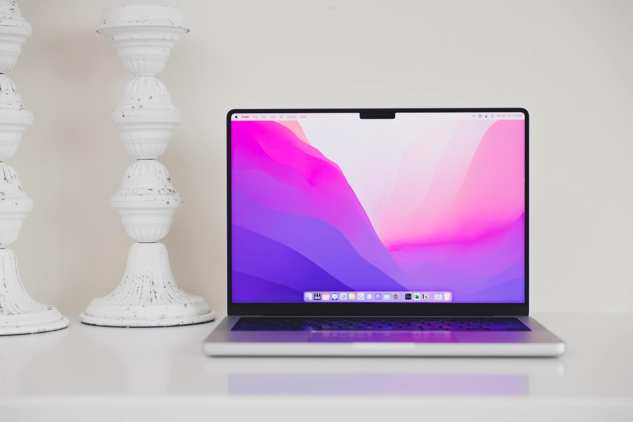
There are hundreds of great M1 Pro and M1 Max MacBook Pro reviews out there, many written by folks who use these computers to their max.
We here at The Sweet Setup are mostly writers though. Some of us create screencasts and do some heavier photo editing. Some do some heavier video editing. Others have their main careers that require a little more horsepower. Me, I run Windows on a Mac through Parallels 17. It’s semi-computer-intensive, but it’s not that strenuous. I’m not sure anyone here would really push this MacBook Pro to its ceiling.
So for this MacBook Pro, I’m going to stick with what I do best: photography and small personal anecdotes.
Below are some quick thoughts on the new 14-inch M1 Pro MacBook Pro and a close look at the 2021 MacBook Pro’s physical design.
Outer Design

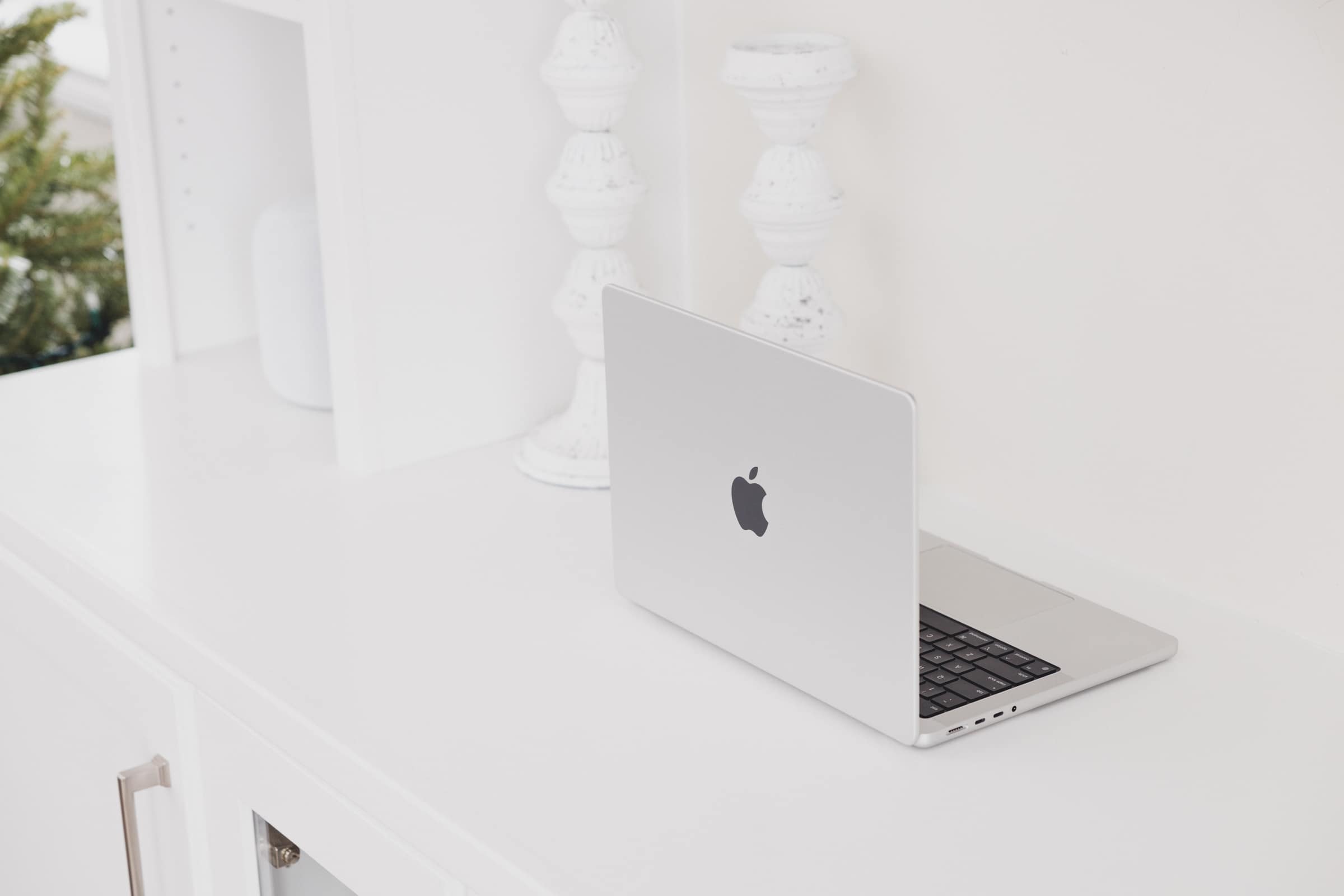
The 2021 MacBook Pro’s physical design is one of past and future. The chunky body is more reminiscent of my first ever MacBook Pro — a 2009 Intel Core 2 Duo 15-inch MacBook Pro — or one of Apple’s past PowerBooks.
There are two ways to quickly spot a 2021 MacBook Pro in the wild: the larger Apple logo and the flat top side. If you’re a sharp observer, you’ll quickly notice the way light and shadow falls off the rounded edges of MacBook Pros with pre-2021 design language. The 2021 MacBook Pro’s top lid is wonderfully flat and you’ll quickly notice this in the way light and shadow hit the lid.

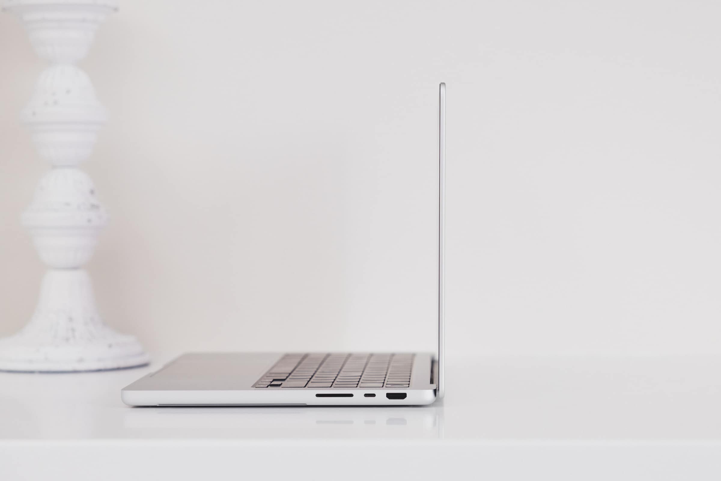
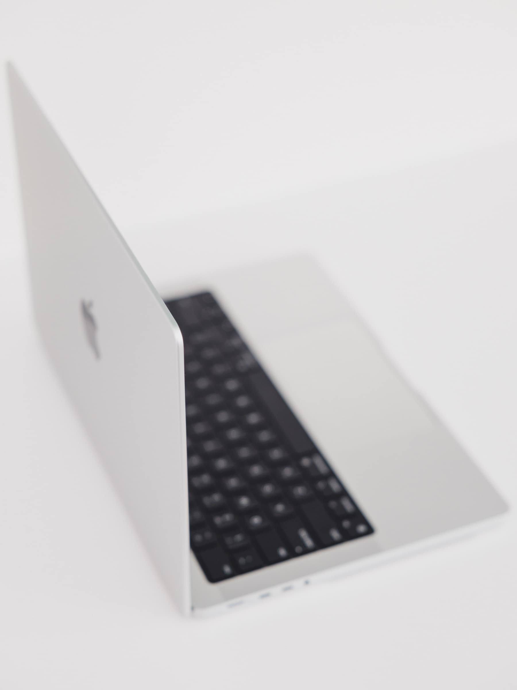
Though still quite thin, the 2021 MacBook Pro’s lid is thicker than we’ve seen in years. It’s not as thick as an iPad Pro, but it gets surprisingly close. The thicker display allows for all the required Liquid Retina XDR Display technology to be packed inside.
Like most of the design choices Apple made in the 2021 MacBook Pro, the choice to go thicker for the sake of power and features is a welcome decision when it comes to the lid and the display.
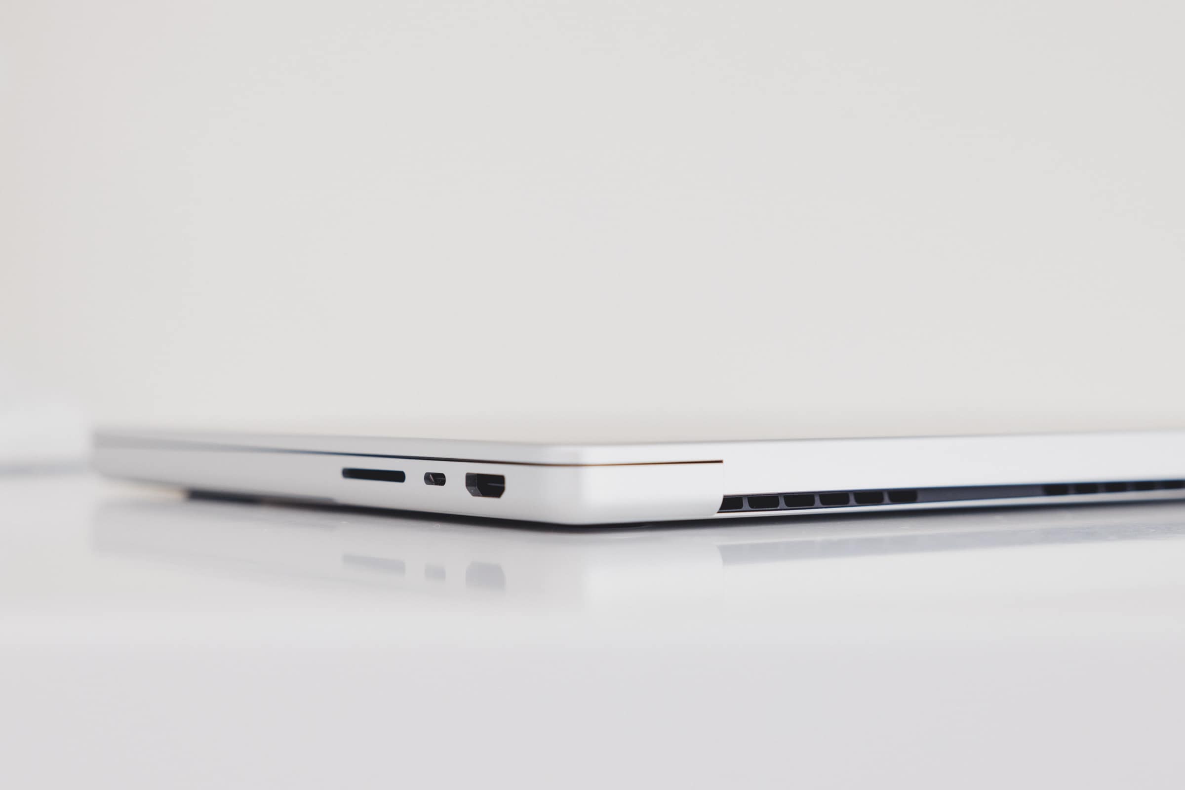
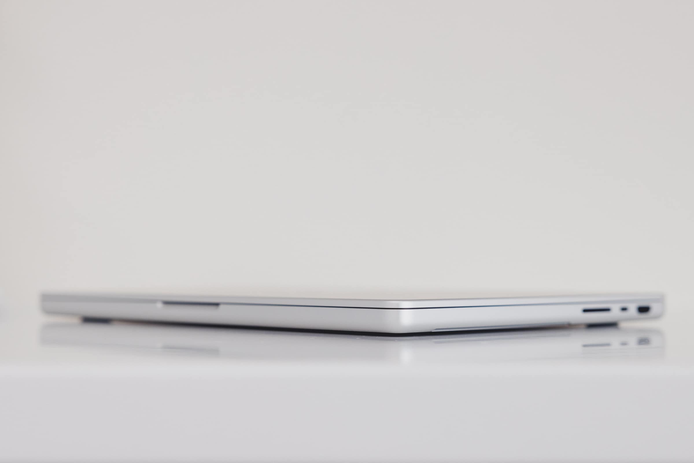
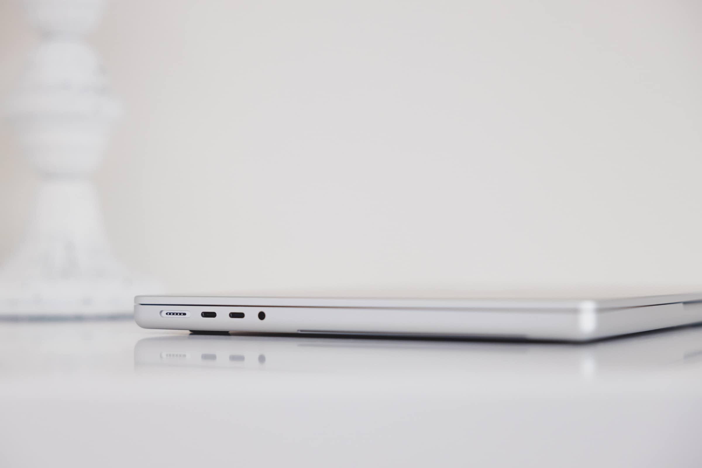
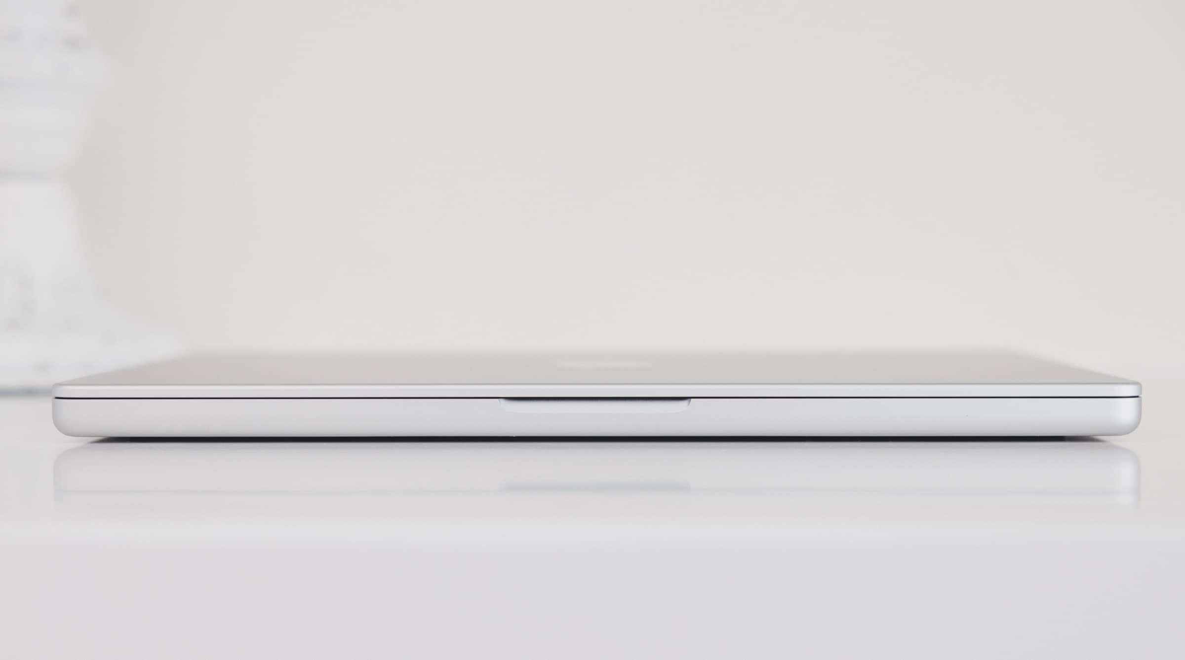
The topside lid is flat and hits the edge with a tight bullnose corner. On the bottom, that bullnose corner is a little less tight and a little more rounded. The result is a MacBook Pro that feels significantly softer in the hand than other MacBooks I’ve held. I fondly remember strolling through university campus in 2009 and 2010 with my gargantuan 15-inch MacBook Pro under my arm — everything about this new 2021 MacBook Pro makes me feel like a kid holding my 2009 MacBook Pro all over again.
A quick anecdote to add here: The bottom plate (which has a beautiful debossed “MacBook Pro” stamped into it) feels much thinner than other MacBook bottom plates. If you pick up the MacBook Pro from the hinge side and push your fingertips ever so slightly into the middle of the bottom plate, you’ll feel a slight flex. I don’t remember ever feeling this with past MacBooks. The plate feels thinner and more flexible — hopefully not so flexible as to permanently bend or dent.


I/O on the 2021 MacBook Pro is another welcome blast from the past. Included this time around are three Thunderbolt 4 ports, an HDMI 2.0 port, an SDXC SD card slot that supports UHS-II SD cards, a modernized MagSafe power port, and a high-impedance headphone jack. Each Thunderbolt 4 port has its own channel, enabling you to experience full power from each port and maximize the accessories you attach.
You can fast charge the 14-inch MacBook Pro with the 96W power adapter (included by default on all but the base model 14-inch MacBook Pro) and the MagSafe cable included in the box.
In my day-to-day work, I have two 24-inch LG UltraFine Displays attached to the MacBook Pro’s Thunderbolt 4 port. Attached to those daisy-chained displays are a Fujitsu scanner, wired ethernet, an external keyboard, and a MagSafe cable for charging the iPhone 13 Pro. All these accessories can be plugged in via a single Thunderbolt cable into the 2021 MacBook Pro. Plus, the MacBook Pro can be charged at the same time and has extra ports to spare on the MacBook Pro body itself. This is the truest definition of a one-cable life promised to us years ago with the still beautiful Apple Thunderbolt Display.
The 2021 MacBook Pro’s exterior design is a lesson in design compromise — add a few millimetres here and there and you gain the space to hammer in more battery, a significantly improved display, and more flexible I/O. And with Apple’s recent trend towards more industrial design (as seen with the flat-edged iPhone and iPad), the flatness of this MacBook Pro makes it feel softer and better in the hand than at any point in the last decade.
I find the design to look slightly chunky — especially when placed on a desk amongst Apple’s other super-thin devices — but am more than happy to accept the benefits of a chunkier MacBook Pro.
Keyboard
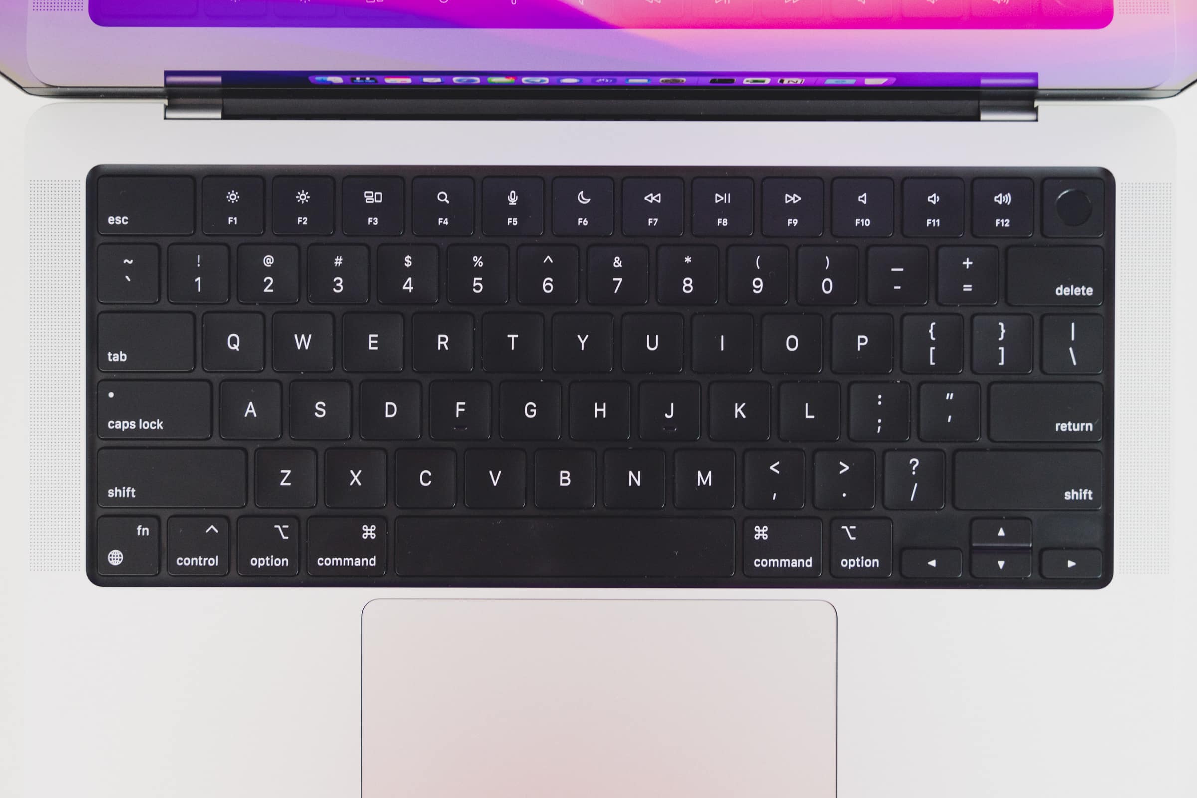
Despite the general consensus of Apple returning to its roots with the 2021 MacBook Pro’s keyboard, I’ve been surprised by how different this keyboard is when put beside recent MacBook keyboards.
For one, the full-size function row keys are both taller and narrower, making for different locations on the keyboard. The double-wide Escape key pushes all function keys to the right, while the larger Touch ID/sleep/wake key pushes all these function keys to the left. Something had to give — MacBook Air function keys are 13mm wide, while this new MacBook Pro’s function keys are 11mm wide.
The result is the need to relearn muscle memory. I constantly press F3 when I want to press F4. I constantly press F1 when I want to hit F2. If you work inside Microsoft Excel all day, the difference in flow between F1 and F2 is astounding — one opens up a gargantuan helper window, while the other jumps into a cell for modification. One completely destroys your workflow. The other is part of your workflow.
This small change in function row key sizes has been quite an adjustment for me to handle.
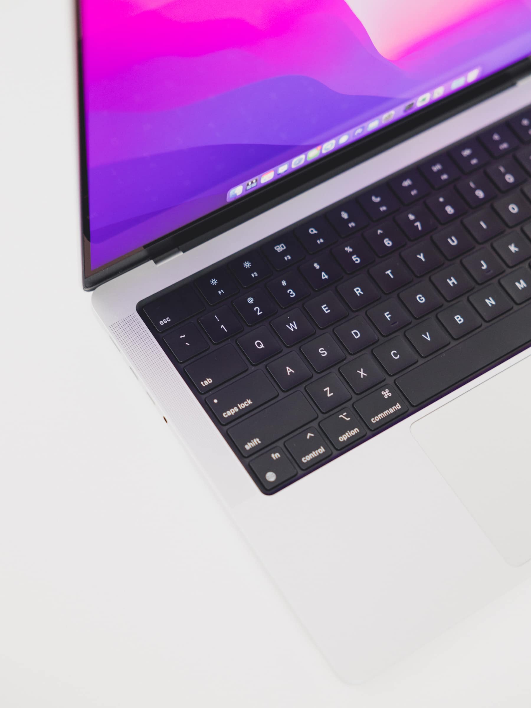
The keys now sit in a blacked-out key bed, whereas prior MacBooks keys were spaced apart by an aluminum bed. I prefer the old look, personally. This looks very enterprise-y.
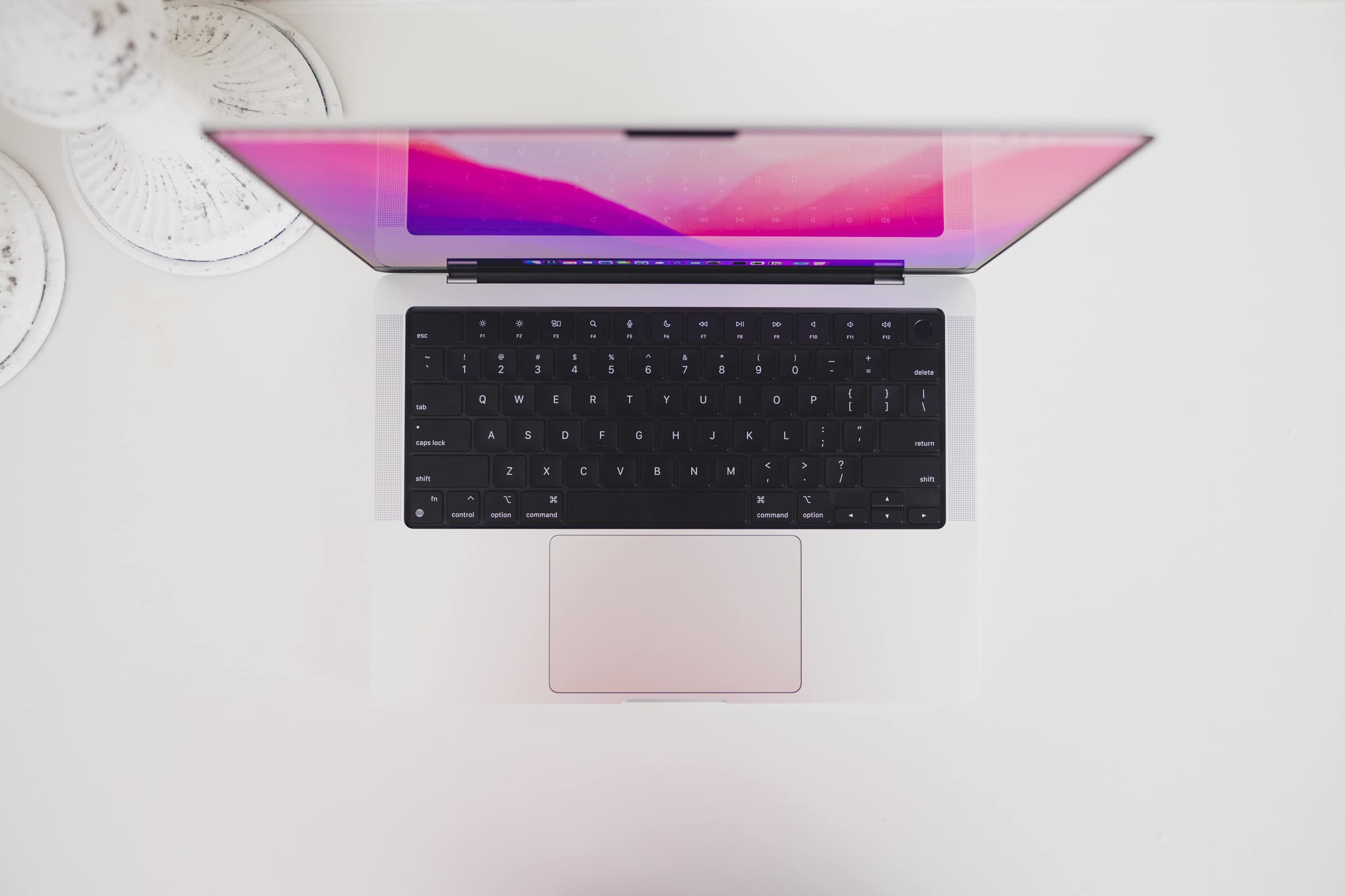
The 2021 MacBook Pro’s keyboard has a little more spring and a little tighter tolerances, at least to my fingers. Where I could miss a key actuation by hitting the corner of a key on the MacBook Air, here I feel as though every touch to every key corner results in an actuation.
All in all, this keyboard is great. If you’ve developed muscle memory for specific key locations, the function row could take some getting used to. But otherwise, this keyboard feels as great as any MacBook Pro keyboard from 2009 to 2016.
Display
Packed into that thicker lid is the most gorgeous display I’ve ever seen in my life.
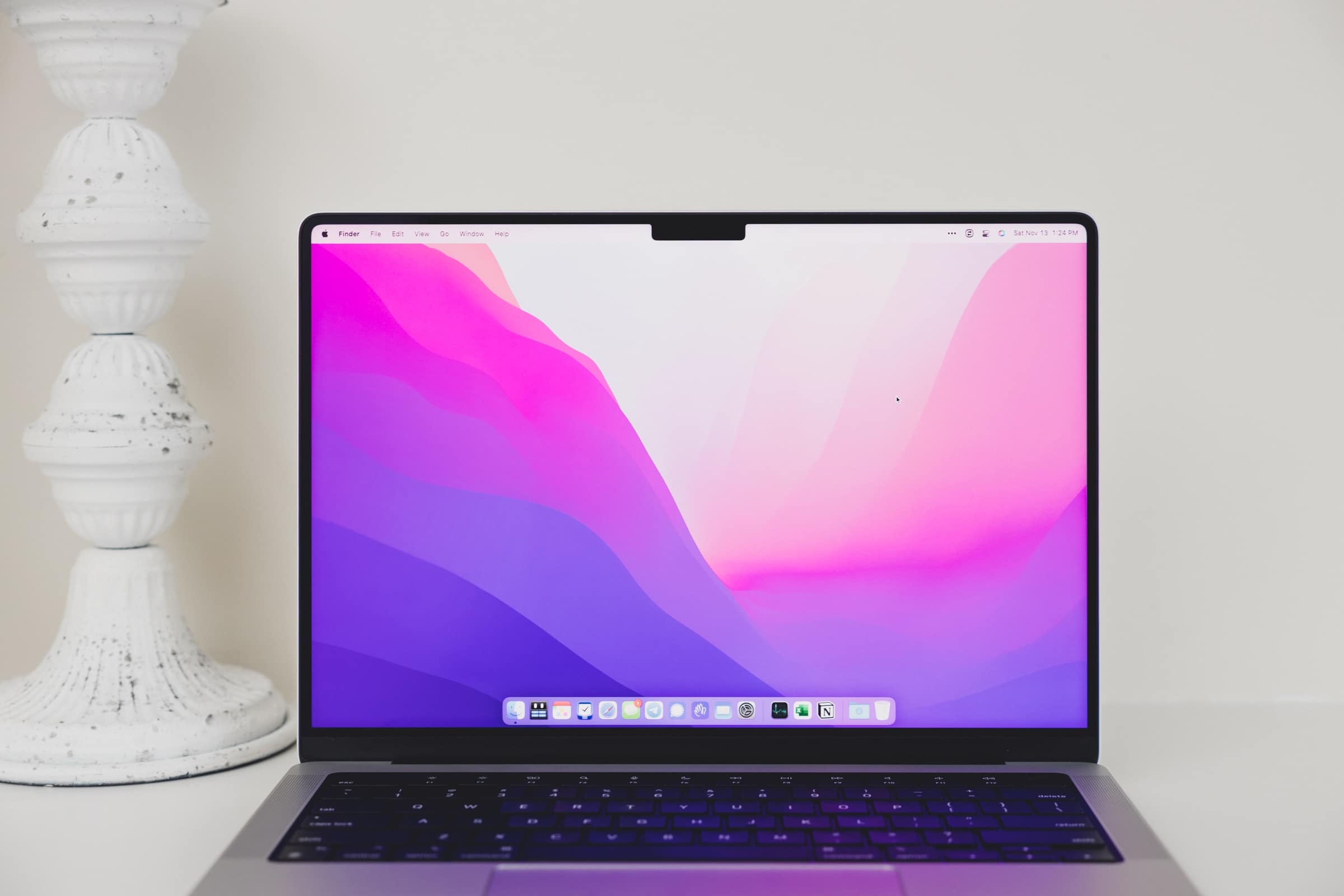
The screen is crisper than most recent Retina display MacBooks (it can run true Retina display resolution rather than a scaled version that looks a little fuzzier), it’s smoother (ProMotion 120Hz refresh rate is one of those “see-it-to-believe-it” features), and it’s brighter (the XDR Display features ensure HDR content can utilize peak brightness of 1600 nits).
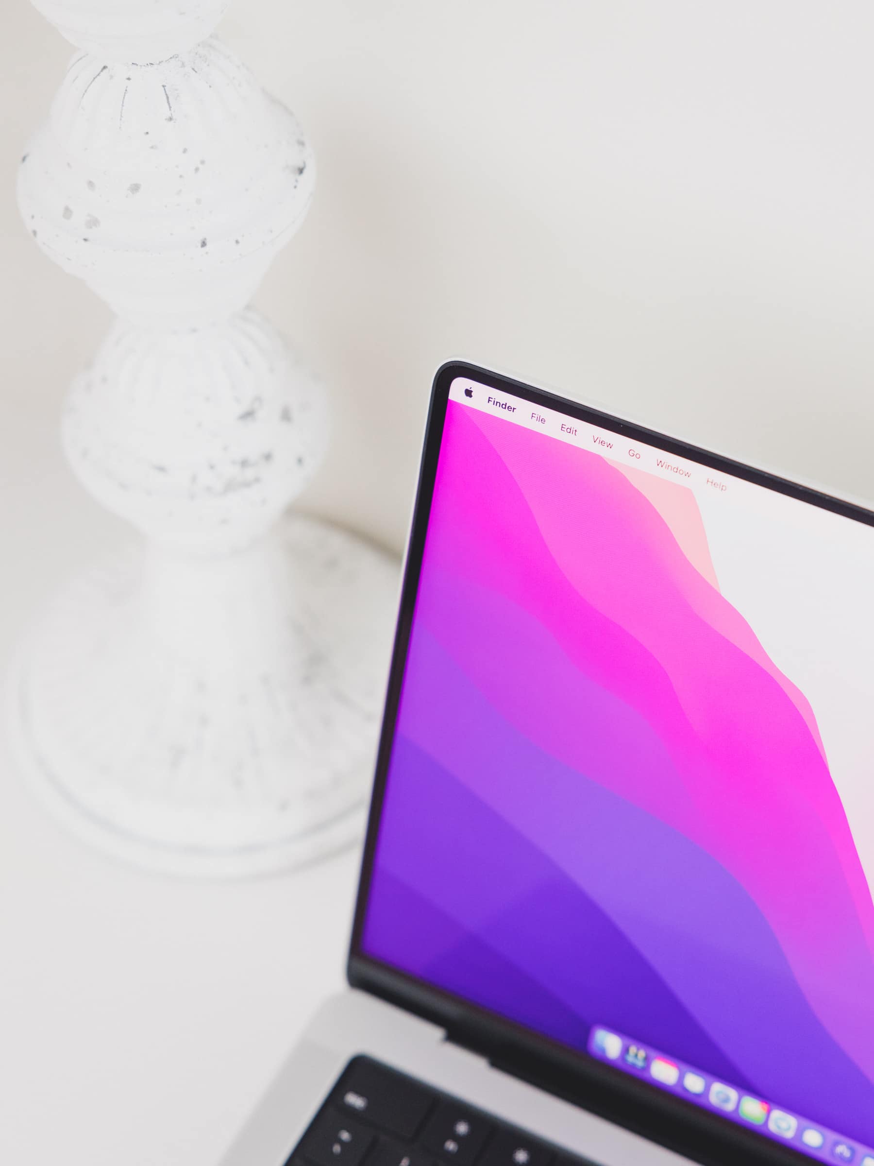
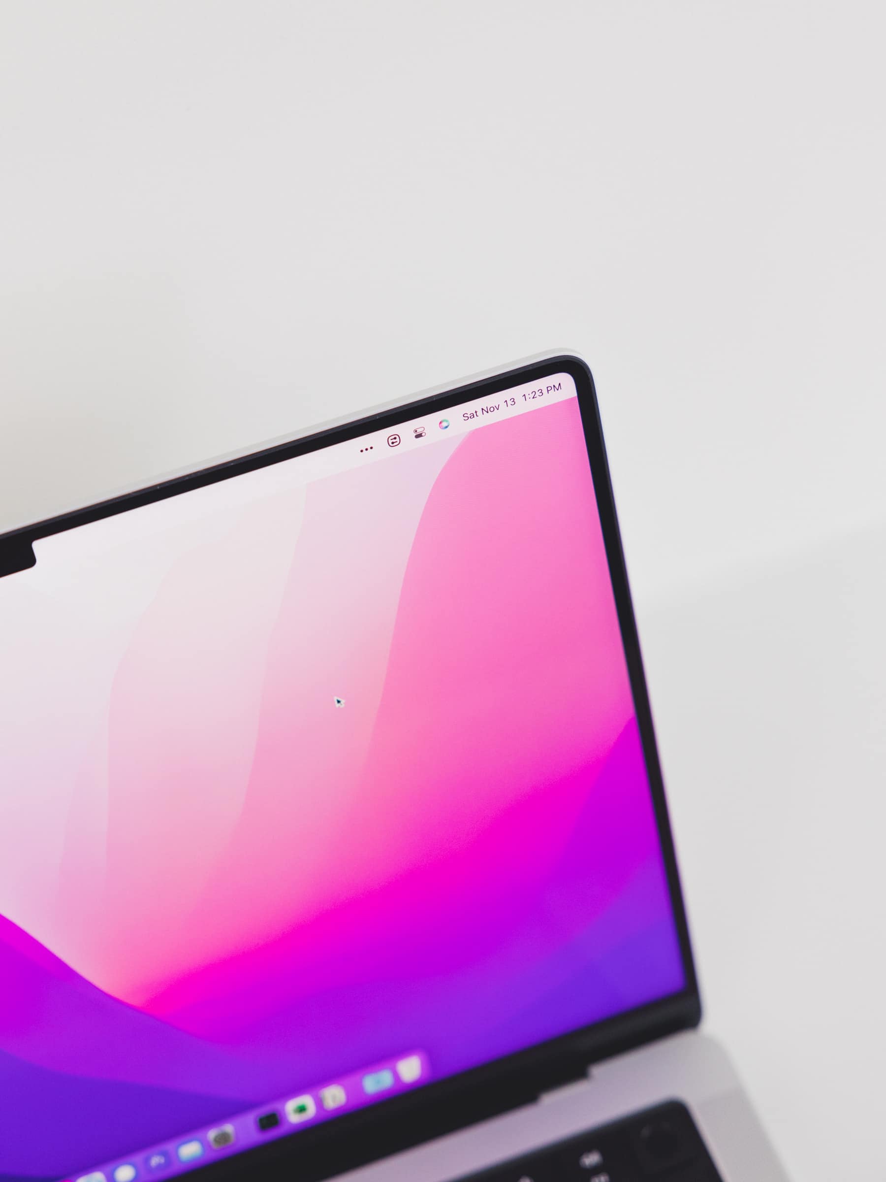
For the first time ever, the MacBook Pro has joined the iOS design aesthetic with rounded display corners. Perhaps of all the design choices in this MacBook Pro, it’s these rounded corners that make prior MacBooks look old. I love these rounded corners so much — they are my favorite aesthetic on the iPhone and iPad and I love how they’re implemented with this MacBook Pro.
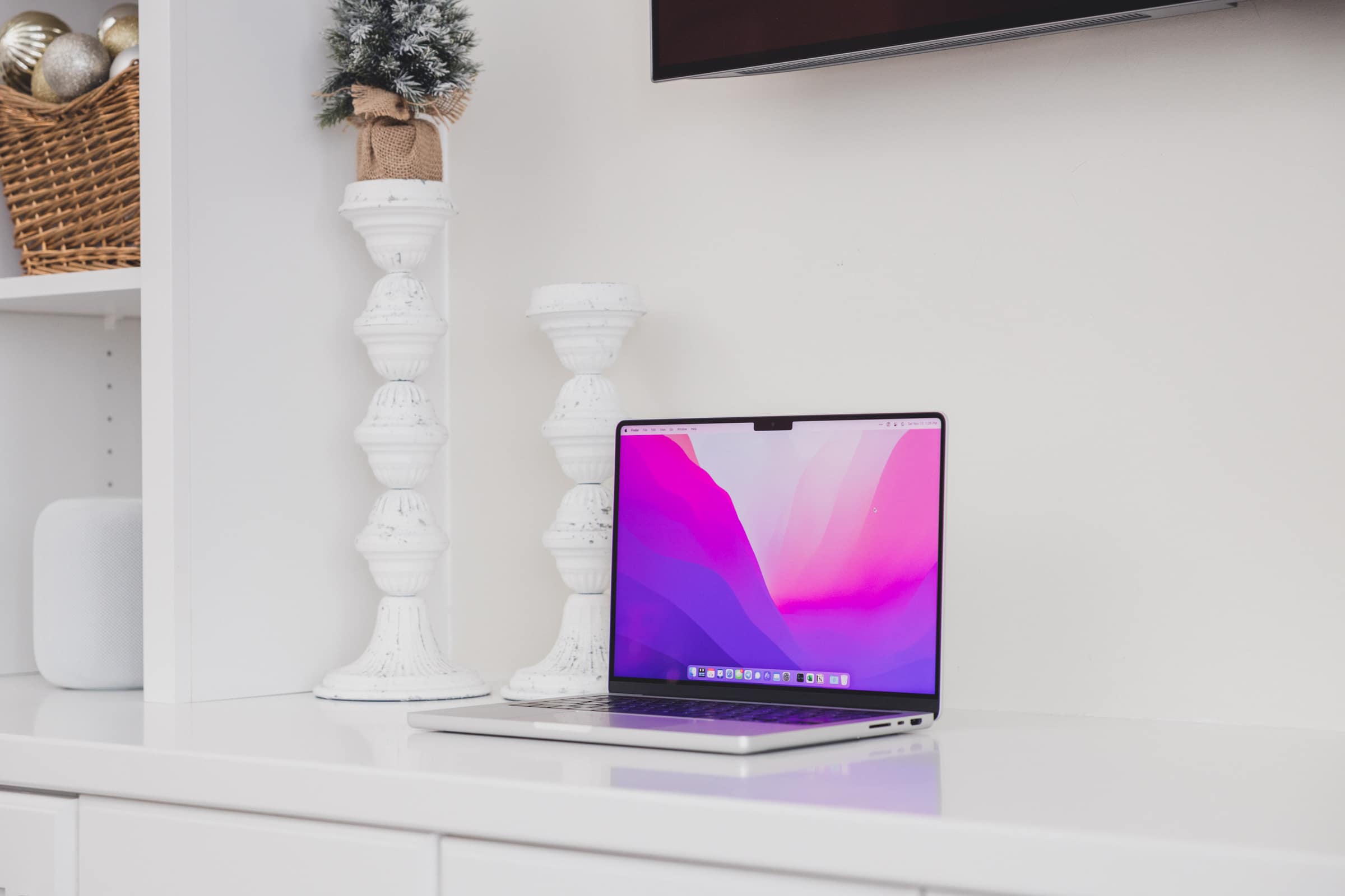
This Liquid Retina XDR Display is a mini-LED panel, providing a range of extraordinary features we haven’t seen on MacBook Pros to date. For me, the most noticeable impact of the mini-LED panel are the introduction of true blacks and an infinite contrast ratio. Watching the latest TV shows on Disney+ or Apple TV+ on this display trumps all other experiences — absolutely true blacks and far-reaching color ranges have had me exclaiming more than a few times. If you throw in a pair of AirPods, you can even add Spatial Audio to that experience.
Lastly, I like how Apple has provided a quick change menu in Control Center to quickly calibrate your screen for your current task. If you click Display in Control Center and then click it again in the sub-menu, you can see a dropdown list of all the different color calibrations shipped with the 2021 MacBook Pro. For photographers, a quick Photography P3 selection will ready your display for accurate photo editing. In Photography P3, you can’t change screen brightness and True Tone and Night Shift are immediately turned off. In the past, you’d have to manually change these settings each time you wanted to edit photos, so this is a welcome addition to the MacBook Pro’s Liquid Retina XDR Display.
Wrap Up
Perhaps the most prestigious anecdote I can provide: I feel this MacBook Pro is the most photogenic MacBook Apple has created in the last 10 years. The way light reflects off that flat lid. The way the rounded corners softly transition your eyes from one direction to the next. The elimination of sharp edges, sharp corners, and sharp display corners all provide for a more welcoming MacBook Pro design.
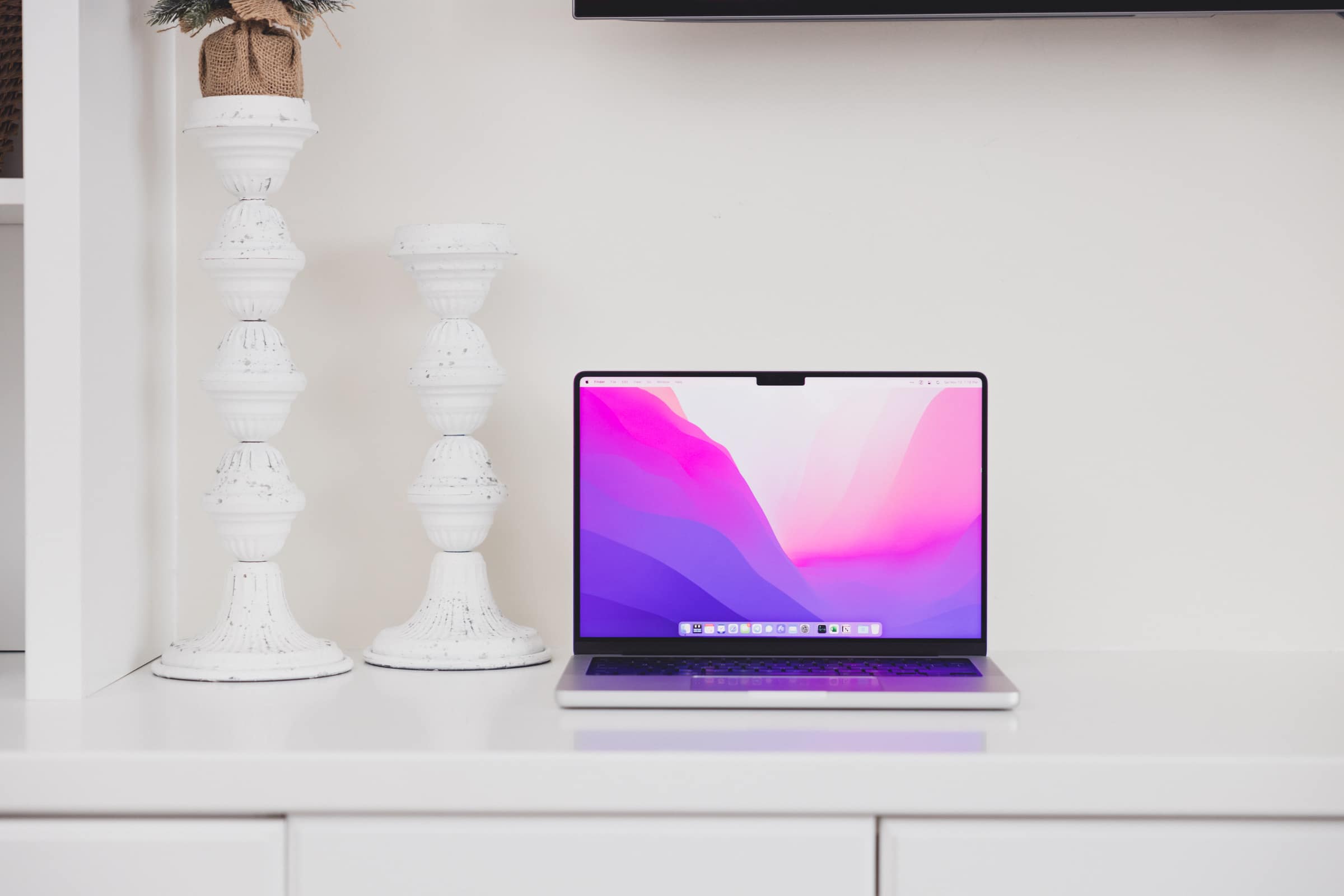
That this MacBook Pro has more power than one could have ever imagined is all just a bonus. The M1 MacBook Air already ran circles around my 2019 6-core 27-inch iMac. This M1 Pro MacBook Pro can run circles around the M1 MacBook Air. I certainly won’t take advantage of all that power, but the engineering behind it all is truly impressive.
Perhaps more than ever before, this MacBook Pro carries with it an instant-upgrade tag — many, many folks who make their livings on a Mac will feel some sort of improved performance experience with this MacBook Pro.
Whether this MacBook Pro’s chunkier design acts as a turn-off for would-be upgrades would surprise me — Apple’s return to function over form in the 2021 MacBook Pro is something many people have been awaiting for many, many years.
