A Look at Big Widgets and Focused Home Screens in iPadOS 15
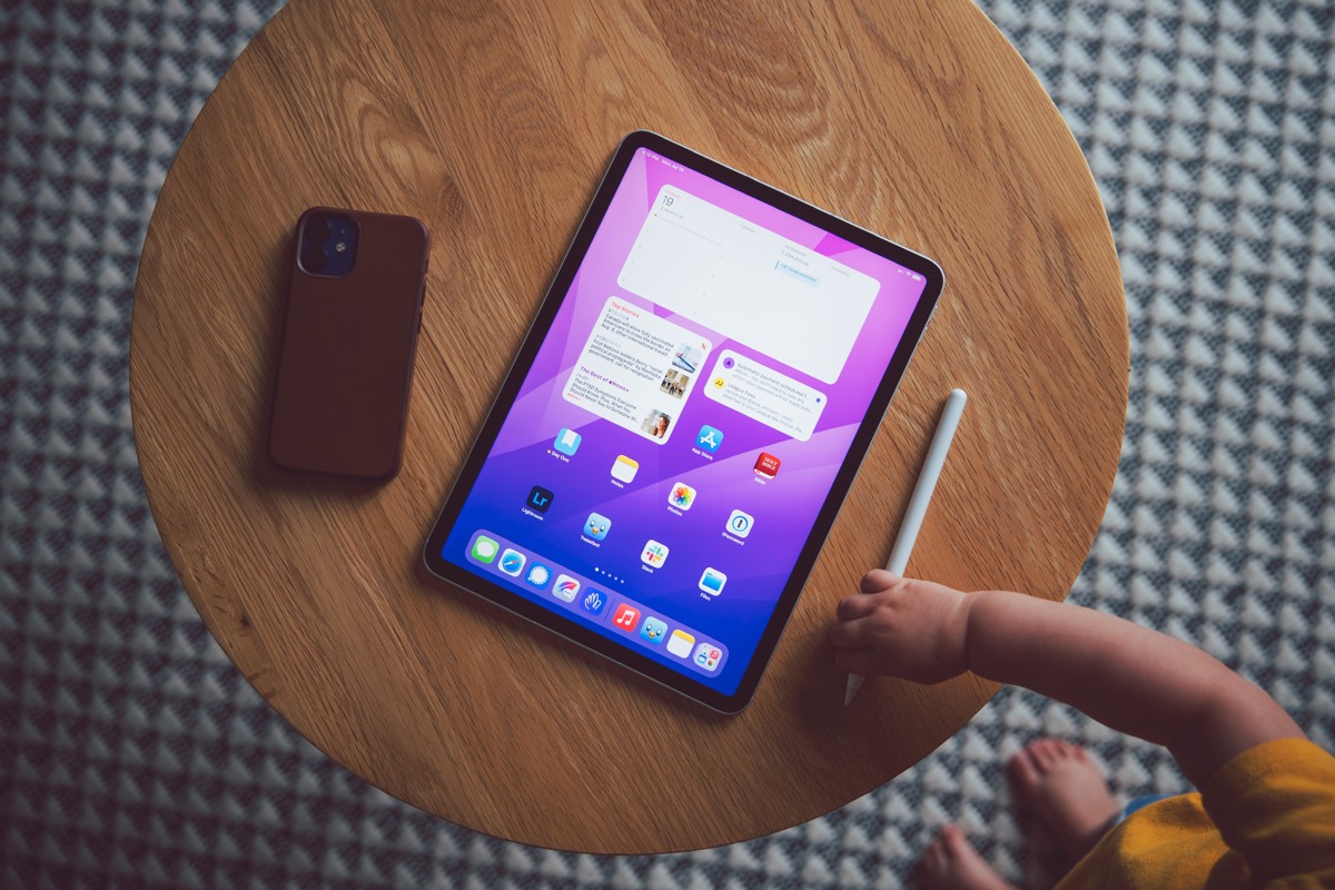
With big displays come big widgets in iPadOS 15.
Though we had a glimpse of the “larger” widgets with iOS 14’s News widget (sort of), the larger horizontal widgets in iPadOS 15 mostly came out of left field. iPadOS 15 widgets are even larger than the vertical News widget in iOS 14, taking up three columns in the app spring board and displaying content in bold new ways. Apple touted these extra large widgets as being great for media apps like Music, TV, and Photos, where the media inside the app can shine brightly.
But it doesn’t take long to see the value in these extra large widgets for the Calendar app and the Files app as well. More space means more room to spread out, more room for good design, and more room for quickly glancing at information.
These extra large widgets have only dipped their toe in my iPad workflow, but they’ve already fundamentally altered how I organize my home screens and manage apps on the iPad.
Three Different Home Screens
It’s long been possible to create focus-specific home screens on the iPad. However, a few tweaks to iPadOS 15 make this a more complete reality:
- The ability to create multiple instances of an app icon means you can have a Files app icon on two different home screens.
- Focus modes allow you to limit the home screens available to you when you need to get to work.
- Widgets of all sizes can live alongside app icons, and multiple instances of widgets on different home screens means you can tweak that widget to fit your exact focus.
The combination of multiple app icon instances and widgets escaping the side bar has resulted in the following home screens on my iPad.
The Landing Page
Though I often grab my iPad with a specific purpose, there are multiple times throughout the day where I simply grab the iPad to check in, catch up, and browse. For those times, the Landing Page provides an overview of everything going on, everything due, and everything going on outside.
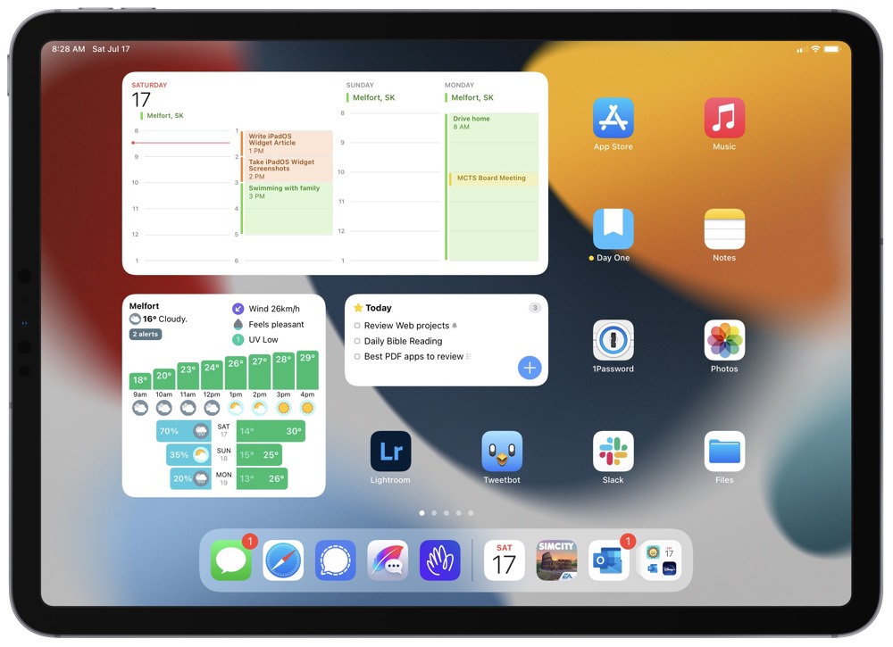
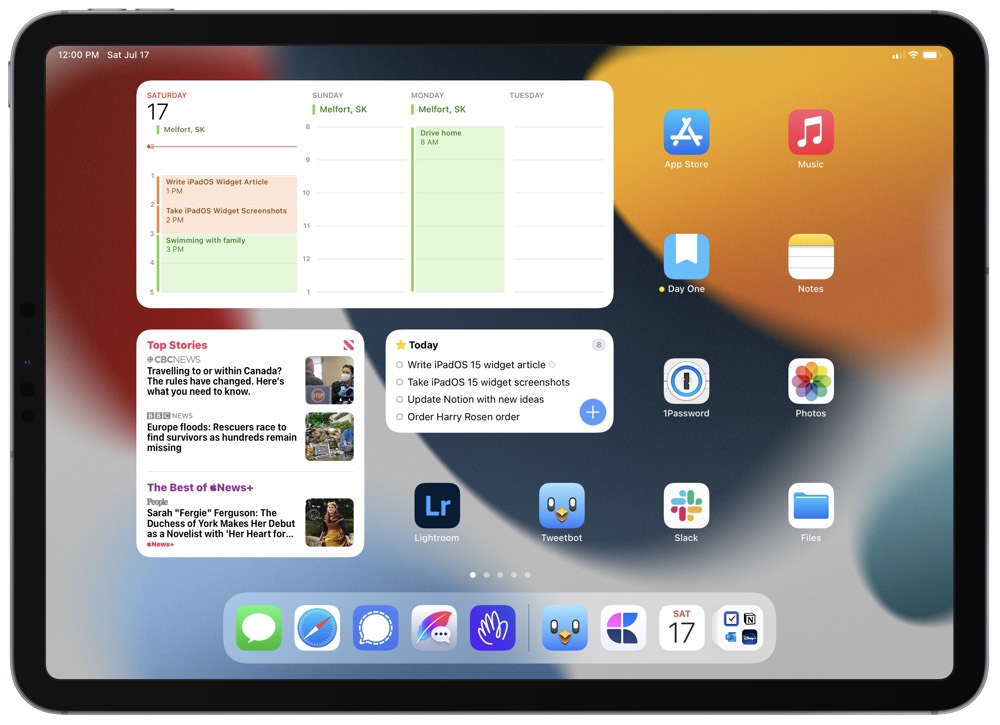
First is the extra large Calendar widget. Thanks to iPadOS 15’s extra large widgets, the Calendar widget can provide an overview of everything happening in the current day and up to three days into the future. This is great for seeing your next appointments and seeing if you have spare time to fit in some extra fun in the next few days.
The bottom left corner of the home screen is taken up by a widget stack containing Hello Weather, News, and Stocks. Siri’s machine learning often surfaces Hello Weather in the morning, while News and Stocks apps are surfaced during the work day. On the weekend, Siri seems to surface News and Weather more often. This is ideal. Though, I’d rather have an extra large weather widget containing more visually appealing data.
Lastly, I keep a second widget stack with an overall look at my Things Today view (outlining all the things I have to complete for the day) and a HEY widget for checking in on my personal email inbox. My work email inbox is located on a different home page, appropriately accessible only when it’s time to work.
The rest of the apps on my Landing Page are largely self-explanatory. The apps cover a variety of far-reaching needs, from consumption in the Music app and Photos app to more leisure-filled apps like Lightroom and Tweetbot. Essentially, these apps are my most-used apps across iPadOS and cover a wide range of uses.
The Working Page
Like anyone else working with the iPadOS Public Betas, home screens are a work-in-progress — especially considering the implementation of Focus modes. My Working Page is certainly an example of this and will likely be split into two home screens in the future.
I don’t have any extra large widgets on this home screen — yet. Almost all of my main productivity and work-focused apps are largely third-party apps and haven’t been updated yet for the extra large widgets. I am excited to see how these developers implement the large widget.

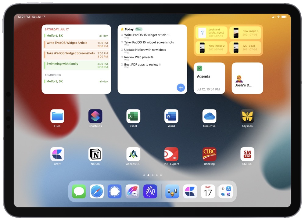
This home screen contains widgets, widget stacks, and apps as you’d expect:
- Outlook for seeing my work schedule for the rest of the day. This would be an ideal option for an extra large widget that spans the next few days on my calendar.
- Included in the Outlook widget stack is a Mail widget for seeing my work email inbox.
- And to round out the Outlook widget stack is another instance of a Calendar widget, this time with a list of my upcoming personal events. I like having my work calendar right next to my personal calendar to ensure I don’t double book any specific time slots.
- The Things widget stack contains two instances of the Things widget: one for an overview of my Office area tasks and the second for an overview of my Web area tasks. Office tasks pertain to my day job, while Web tasks pertain to my writing here for The Sweet Setup.
- The Files widget stack in the top-right corner contains three instances of the Files widget. One instance gives me quick access to my Downloads folder, the second accesses my Recents folder, and the third accesses a special Temp Files folder that I use for short-lived files that I need to access across devices.
- Lastly, I have two launcher widgets for sending me directly to my Agenda document in Craft (for daily work tracking) and to my specially created Notion dashboard (for my TSS work). I would love to see the Craft team enable a shortcut to the new Daily Note features right from the widget.
The rest of the apps here stretch far and wide for my daily job and my writing hustle in the evenings. Banking apps for keeping on top of personal and business banking are quickly available here (on iPhone, I use a Shortcuts app launcher for all the different banking apps, but there are less iPad-available banking apps here in Canada, hence why they are all broken into individual apps) as are Word, Excel, OneDrive, and PDF Expert app icons for quickly getting into any client document I may need to view. Lastly, for TSS work, I have Ulysses for writing, Craft for collaborating with contributors, and SMPRO for making classy screenshots for publishing.
This home screen could be easily split into a daily job home screen and a writing home screen. If more apps are updated to use that extra large widget and I run out of space to house my most used productivity apps, this will be the first step I take.
The Recreation Page
The iPad is king at consumption, after all. Every good iPad needs a Recreation Page.
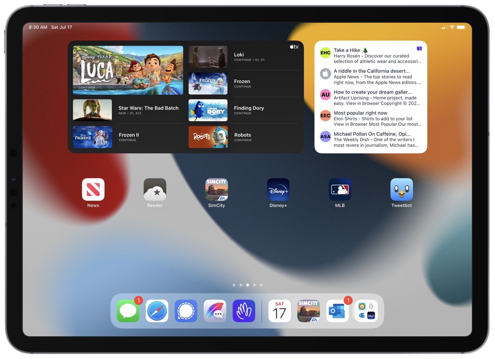
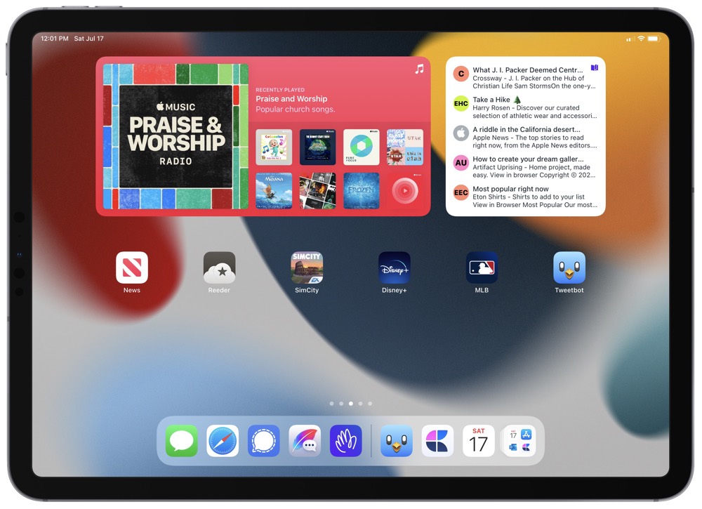
My Recreation Page takes big advantage of the new extra large iPadOS 15 widgets. The top left is dominated by a TV and Music widget stack. The extra large TV widget is beautiful and very good at surfacing something to watch.
The extra large Music widget, however, only showcases your “Recently Played” playlist. It’d be great if you could choose a specific playlist by editing the widget itself, or if Apple Music would find new music you’d like to listen to based on your current focus, your current location, or the current time of the day.
The top right widget houses my HEY Feed widget. This provides a list of the newest newsletters to read.
And of course, the rest of the apps in the Recreation Page are for pure consumption. I’ve recently taken to SimCity BuildIt, and I do all my reading in Reeder and News. I also can’t get enough Disney+ content right now and I’m an avid baseball fan.
In looking at this page, I definitely need to add a Safari icon.
Focus Modes and the App Library
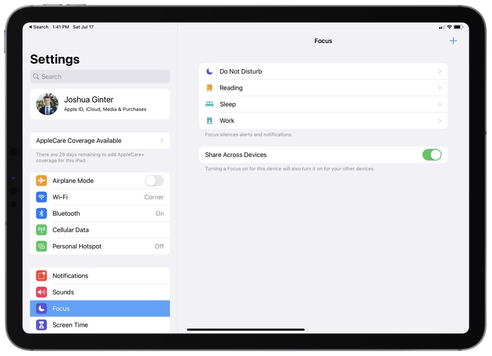
The ability to add multiple app icons across different home screens and the inclusion of the App Library make using Focus modes particularly useful. There’s so much to iOS 15 and iPadOS 15’s new Focus modes — I can’t talk about all Focus features here, but I’ll quickly touch on how they work with specific home screens.
iPadOS prompts you to create and edit Focus modes in your first few days of using the OS. If you disregard those prompts and want to edit through Settings, you can do so pretty easily. Simply tap the + in the top right corner to create an entirely new focus, or tap into one of the already-created options to fine-tune the focus.
I have three focuses currently: Reading, Sleep, and Work. Each have their own particular settings regarding who can notify me from Messages or Mail. Each have their own apps available, and each have their own home screens available.
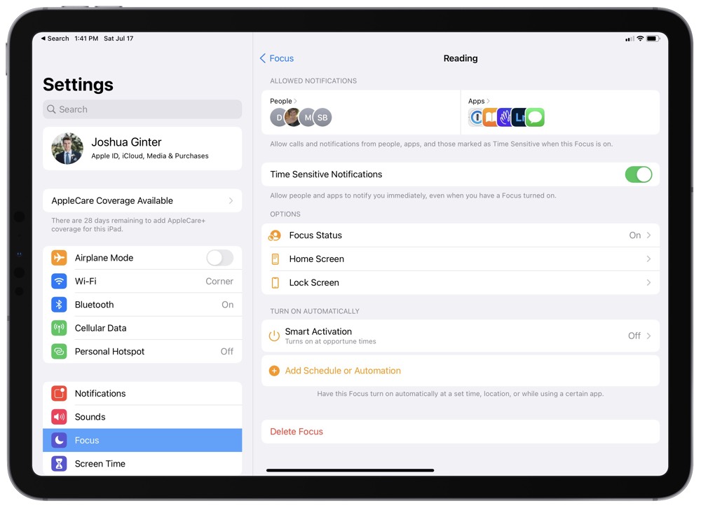
Reading limits iPadOS to my “Recreation Page” and the App Library. All dock apps are still available, so messaging, personal email, and Safari are available across all focuses. I also have the Reading focus set to “Smart Activation,” whereby iPadOS determines an opportune time to set the focus based on location, settings, and my behaviors.
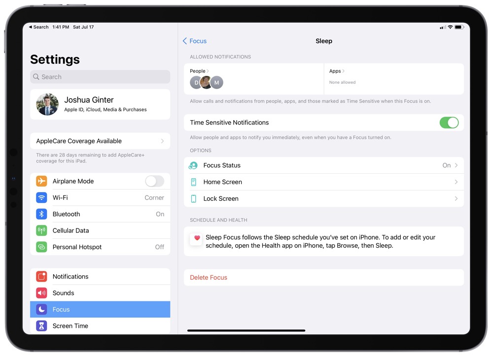
Sleep is basically the old Bed Time/Do Not Disturb setting. However, one major difference is the ability to allow certain people to notify you immediately. My parents and my wife are now allowed to get through the notification blocker instantly, where in iOS 14 and before I had to tell them to call twice within three minutes to get through.
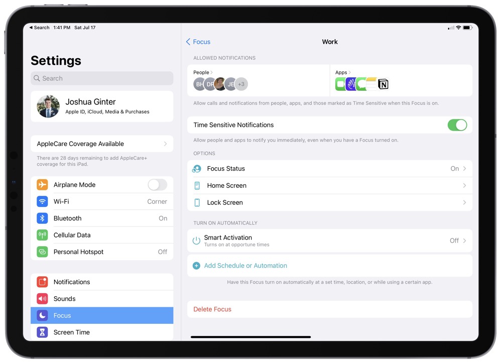
Work limits iPadOS to my “Working Page.” I’ve also included additional app inclusions for Notes, FaceTime, and other apps I may find useful throughout the working day.
Focus modes work great with the App Library option in the iPadOS dock — should an app not be available for instant access on the limited home screen, you can quickly find the required app in the App Library. Plus, the little App Library animation is to die for.
All in all, the ability to add widgets and multiple app icons to your home screens really catapults Focus features to the forefront of iPadOS 15. I’m very excited to see how others implement Focus modes on the iPad going forward.
Wrap Up
We went into June’s WWDC largely expecting a major overhaul to iPadOS’s multitasking features and other improvements for productivity on the iPad. Widgets on the home screen was of course inevitable as well, but it appears to be all the small features that combine to make new some major productivity strides on the iPad.
Extra large widgets dominate every home screen they’re stationed on and prove to be more valuable than just for media apps like the TV and Music apps.
Multiple instances of app icons enables you to add an app to multiple home screens. This will save endless swiping from screen to screen to find the Files app while you’re working on a writing task or sending a personal email to a friend.
And Focus modes line all these features up for a knock-out productivity punch — being able to limit your iPad to only the apps you need for your specific area of focus is sure to mitigate distractions, minimize navigation around the device, and ensure you are honed in on the task at hand.
These home screens and their respective widgets, apps, and focuses are sure to change over time, especially as more apps gain access to the extra large widget.
Increasingly, your iPad can be the iPad you want it to be at just the right time.
