HEY Email: How It Has Disrupted My Email Workflow

Although I didn’t realize it at the time, my email workflow was ripe for disruption. A quick smattering of my email behaviors includes, but is not limited to:
- Marking emails I’ve read as unread to act as a reminder to reply at a future time.
- Keeping emails in my inbox to reference at certain points in the future.
- Having multiple email addresses to confront different needs; I’ve long maintained a separate email for personal use, work use, marketing use, newsletter use, and a separate email for my Apple ID.
- Having to decide between archiving or deleting emails based on a perceived level of importance per email received.
- Avoiding all sorts of email newsletters that have been raved about by friends and colleagues for fear of clogging up my email.
I find it somewhat embarrassing to admit that I didn’t know how bad my email habits had become.
My email habits have culminated after years of trial and error.
- I tried Mailbox’s “Snoozing” features, where you snooze an email until a certain point in the future in order to achieve a zen-like Inbox Zero.
- I tried to send emails to Things if they housed a task.
- I tried archiving everything instead of archiving or deleting certain types of emails.
- I tried filing and setting up rules for different senders to keep a more calm primary inbox.
None of these things ever worked for me.
- Snoozing an email just delays the inevitable and provides a false sense of Inbox Zero security.
- Sending an email to Things to act as a task just moved the task from one inbox to the other — it didn’t make completing that task any easier.
- Archiving every email (instead of deleting unneeded emails) led to a bunch of email clogging every search I’d make for an old email.
- Setting up folders and rules for handling different types of senders worked well for a while, before I signed up for a new IMAP service and the service automatically created a whole whack of extra email folders for organization.
My email habits and workflows were nothing to write home about. I hadn’t reached a point of email bankruptcy just yet, but I also know I have never been able to take advantage of the technology like others have tried.

HEY has disrupted nearly every element of my email workflow. HEY has allowed me to experience a new level of email productivity, and it has even created a new sense of zen-like Inbox Zero in my Imbox, without archiving, deleting, or snoozing.
HEY has actually created enough breathing room in my email life that I’ve searched out new newsletters to subscribe to. I’m no longer afraid of adding to my email inbox.
HEY is my favorite new service to launch. Ever. I’ve worked with and tested all sorts of services doing this job for The Sweet Setup, and HEY is the most revolutionary product I’ve ever tried.
I’m absolutely smitten with HEY.
The Screener: An Assistant for Your Mail
Our office’s actual mailbox — you know, the one with flyers and coupons for the local co-op — is a short walk down the street and my boss uses the mailbox as an opportunity each morning to go for a short walk. Once he returns, he’ll walk from desk to desk in the office dropping off letters and paraphernalia as he goes. Sometimes the stuff he drops on my desk is important. Sometimes it’s trash. Sometimes it’s so urgent, it was due yesterday.
I’ve often imagined what it’d be like if my boss knew exactly which things were important to me and which things were a waste of time.
That’s HEY’s Screener, and it’s awesome. It’s like having an assistant sifting through the weeds without having to put in any effort.
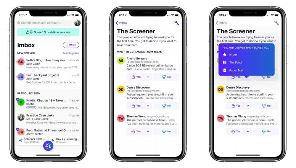
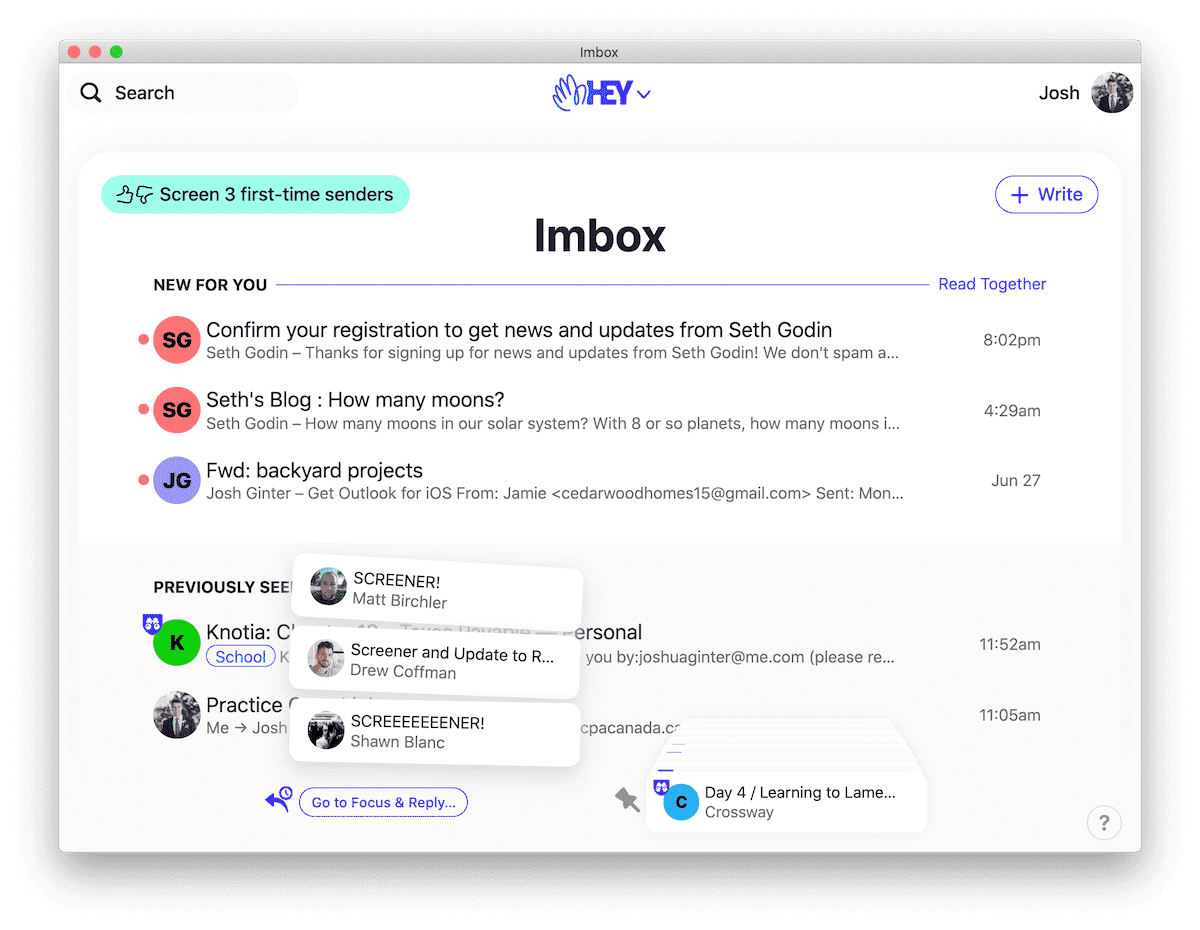
The Screener is most active in HEY’s first week or two. Each sender comes in — whether they’re daily, weekly, or monthly senders — and you have to decide whether their stuff is worthy seeing on a regular basis. If you hit “No” in the Screener, you’ll never see emails from that sender again.
To me, this is better than unsubscribing from a sender.
I’ve found myself checking my “Screened Out” section at least once a day in the first week of HEY use. A perfect example is a Facebook message — I almost never use Facebook Messenger, but I have two or three contacts that insist on talking through Facebook’s messaging app. So while I don’t want an email hitting my inbox every time Facebook suggests a new friend for me to follow, there are times where it’s nice to see if I’ve missed something. “Screened Out” is great for that.
The other nice part about Screener is the ability to automatically send a specific sender’s emails to your Imbox, Feed, or Paper Trail. In short:
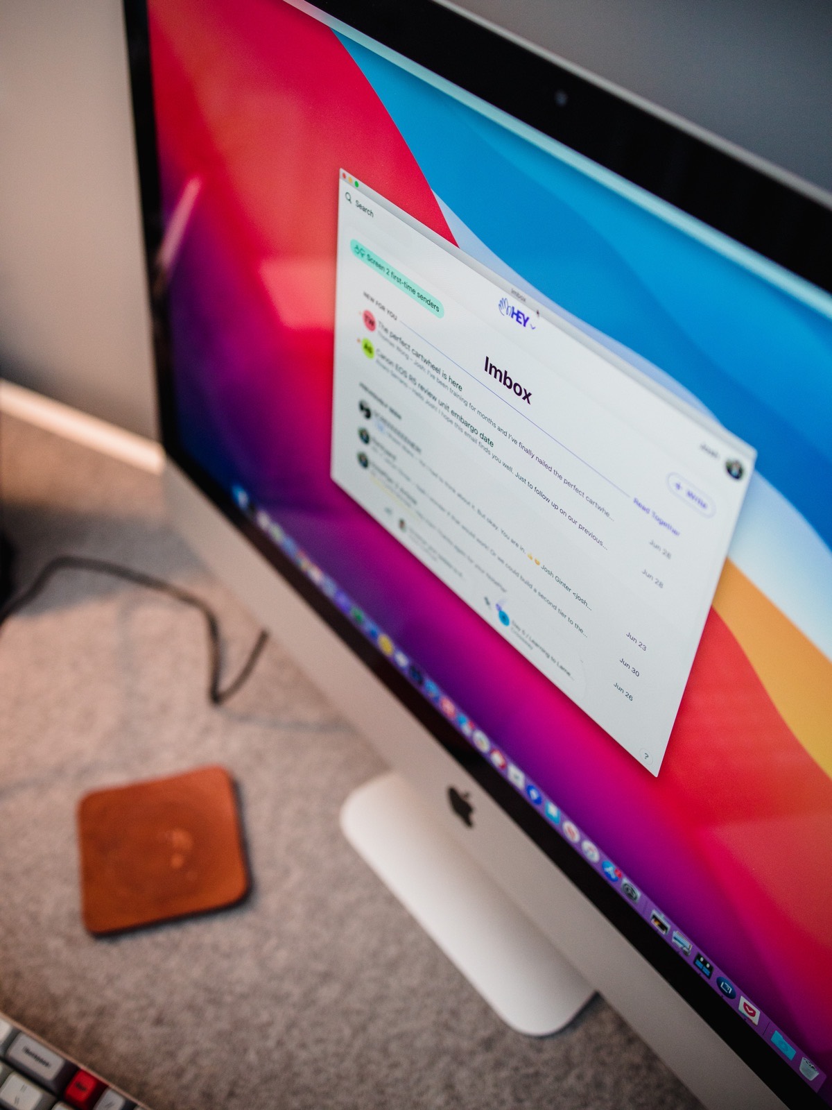
- Imbox stands for Important Box. It acts as your default inbox and is the default screen when you open the app.
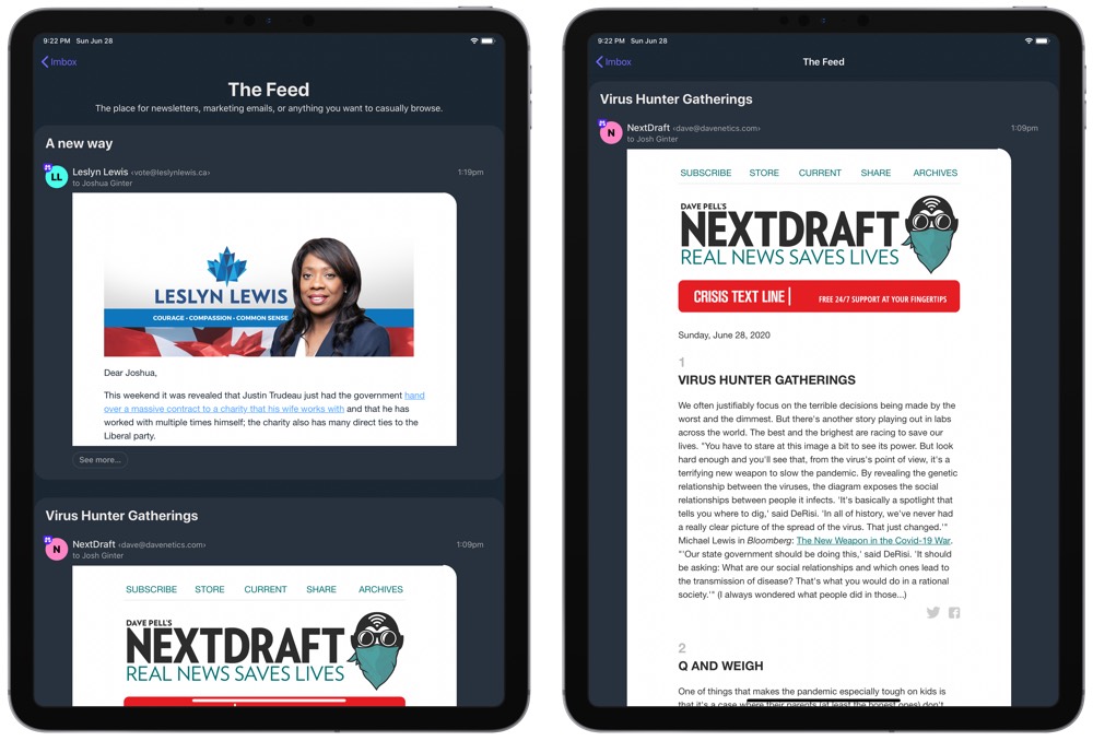
- The Feed is an inbox designed for marketing emails or newsletters that you may want to read but are not important to read immediately.
- Paper Trail is an inbox designed for receipts, transaction emails, and confirmation emails that you may need to reference quickly at some point in the future.
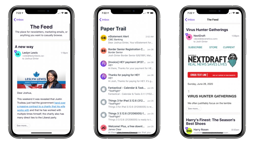
So those flyer letters that show up in the mail that house a great deal on a tool you’ve been looking at can be sent off into a specific pile that you can read at the end of the day, all without going through the mental overhead of putting it into that pile at the beginning of the day.
I find this tremendously powerful, and it has had an under-the-radar impact on my constant need to search for old emails as well.
The Screener is a far superior tool to unsubscribing in entirety.
The Power of Piles: Reply Later and Set Aside
My habit of saving emails I know I’ll need to reference at some point in the future had grown out of hand. I’ll often receive an email in the latter half of the year discussing a financial decision made that will need to be addressed six months later, only to leave that email in my inbox for the entire six months.
I could file it into a folder somewhere, but then I won’t remember I have that email — it’ll be zipped off into oblivion and never scanned again.
This happens to my inbox all the time — at any given time, I’ll have 30 or more of these types of emails clogging the end of my inbox.
HEY has fixed this problem with Set Aside.
Upon reading an email, you can handle an email in HEY in a few different ways. If you do nothing, HEY will send the email to Previously Seen, a river of email designed to act as a combined archive and sent folder all in one. You can opt to label an email for categorization if you prefer, or you can opt to send that email to the Feed or Paper Trail if those are better spots for it.
You can also send an email to your Set Aside pile, which is a small area at the bottom of your Imbox screen that houses any email you may need to reference at a future time.
To me, the beauty of Set Aside is in the idea that it neither clogs your inbox but also doesn’t whisk email off into cyberspace never to be seen again. Set Aside emails are great for keeping something nearby until I need it. And if that moment never comes, it also never gets in my way.
Same goes for Reply Later. At the top, I noted how I often mark read emails as unread emails to act as a reminder Monday morning to revisit the emails and respond.
In HEY, Reply Later eliminates this habit. Instead of marking an email unread, Reply Later creates another little pile of mail that neither clogs up your inbox nor causes mental overhead. When you’ve got time to reply to emails — or if enough time has passed to allow you to digest and think of a thoughtful reply — HEY puts all these emails in a convenient spot.
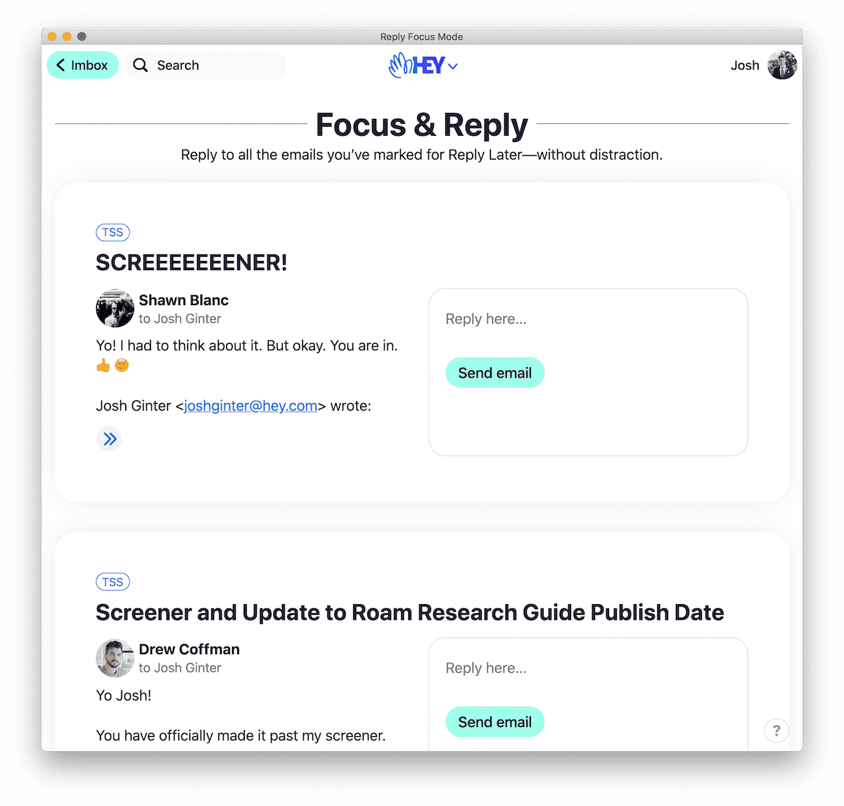
Reply Later also houses Focus & Reply, which effectively lets you sprint through any emails you need to reply to. Focus & Reply puts each Reply Later email into a list. You then type your response, hit CMD + Return to send, and immediately hop into the next email.
Focus & Reply is ideal for Monday mornings, or for the day after an important deadline day.
Overall, Reply Later and Set Aside are two features that almost skeumorphically represent my actual, physical mail workflow. A letter or invoice or flyer or correspondence comes in and it immediately hits one of two different piles: one that I have to deal with immediately, and another I plan to reference when it’s time to pay the bill.
Modern Email Niceties: Clips and Stickies
I have an email from 2016 in my inbox that I reference every couple months; it just sits at the bottom of my inbox with a flag next to it (one of those email experiments where I tried flagging all the emails I thought were important) and reminds me every day to find a better place for it.
I’ve never really found a better place for it.
In HEY, that email has been nicely clipped and sent to the bottom of my Previously Seen list.
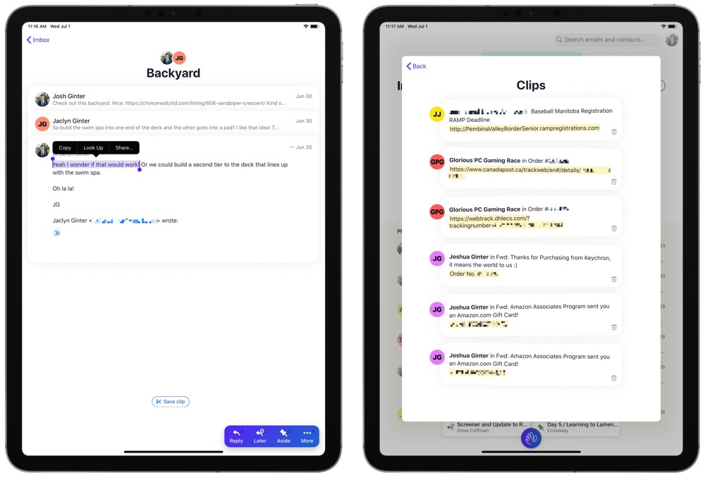
HEY provides the ability to highlight a specific part of an email and save the “clip” in a separate view to be referenced later. I imagine this would be extra handy for URLs, phone numbers, physical addresses, or other sorts of metadata floating through an email. Then, when it’s time to reference the highlighted clip, you can view all your saved clips in an easy to consume Clips list in the upper right corner of the app.
I’ve found this particularly handy for emails with package tracking URLs, key codes, and for the aforementioned email I have to reference a few times a year.
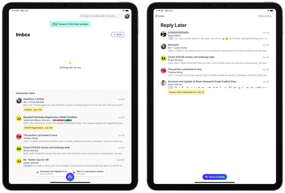
Stickies are another great feature I didn’t know I wanted until HEY put them in front of me.
In your Imbox, you can right-click (or tap and hold) to Add a Sticky to the email or thread. Once a sticky has been created, it shows up directly below the email right in your Previously Seen section, acting as a bright yellow call out for your eyes to divert to.
To me, this has been disruptive.
Accountancy is a profession completely governed by deadlines. There are no less than 21 different tax deadlines to hit in the first 6 months of each calendar year. If an email comes in regarding a filing deadline a month or two down the road, I’ve found myself keeping that email in my inbox until around the time the details in that email become applicable.
In short order, Stickies have quickly changed the constant mental overhead of scanning through my inbox to find emails applicable to the next upcoming deadline. After reading an email, I’ve found it super easy to add a sticky to an email in Previously Seen that simply puts the type of file (T1, T2, GST, etc. — you know, tax return types) and the applicable deadline. Once there, the Stickies act as a bright call out quickly bringing to light any email that’s applicable for the next deadline.
Both Clips and Stickies are two features I had no idea I wanted. They’re not specifically designed for workflows like mine, nor are they perhaps the best feature for what I’m using them for. But they’ve quickly supplanted anything I’ve previously used and have helped clear out my Imbox and eliminate mental overhead of a long, pending email inbox.
Other Features Worthy of Recognition and Features I’m Missing
In a Twitch video, Basecamp founders Jason Fried and David Heinemeier Hansson discussed a range of HEY’s initial feedback after its first week and a half of existence.
There’s a segment in the interview where both Fried and Heinemeier Hansson talk about how HEY is currently a Version 1 product — HEY houses the features the Basecamp team wants in the first iteration of the email service, but the app is certainly going to see some iteration and evolution going forward.
With this in mind, I find it interesting to look around HEY and figure out what the Basecamp team considered must-have, V1 features. A non-exhaustive list:
- Though HEY doesn’t have too many notifications pinging your phone, you can set HEY to ping you on a per-sender basis. I liken this to having a “Favorites” list of email senders.
- You can rename a thread if the subject line becomes convoluted and hard to follow.
- All Files is much like Outlook’s files section, where you can find all file attachments in all emails in a nice chronological list. You can filter this list if you’re looking for a specific sender.
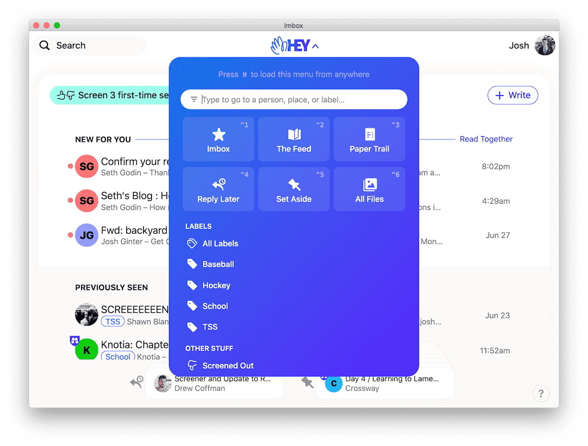
- If you insist on categorizing and tagging emails, HEY has “Labels” that provide a little bubble label at the bottom of each email in your Imbox or Previously Seen section. I’ve found it particularly handy so far to search for emails by label rather than for specific emails in HEY’s search bar.
- Each contact is given an individual card in HEY’s contacts list, providing an easy to view option where you can set notification and filing settings on a per contact basis. You can also see all emails to and from that particular contact in this view.
- If a particular sender sends you multiple emails a day, you can bundle that sender’s emails into a single line, eliminating redundant clutter in your Imbox or Previously Seen sections.
- HEY provides the ability to merge threads and emails that carry the same topic. So if you are talking with three different people about your kid’s upcoming baseball schedule, you can merge all three email threads into one to de-clutter and organization your inbox.
- Perhaps the most underrated feature: HEY’s annual subscription cost includes 100GB of email and attachment storage. You can use this storage to send large files as email attachments to your recipients. It doesn’t matter if your recipient has a HEY email account — HEY provides an easy-to-use URL to click and download your attachment, eliminating the need to send attachments via Dropbox or WeTransfer.
And with all the niceties come a few features that I think I’m missing; “think” because so much of my email workflow has been disrupted that I may be wrong in thinking I want the following:
- Screener-wide and Imbox-wide notifications: I don’t receive so much email that “I’ll check email when I check email” — which is to say, I want to know when an important email hits my important inbox (“Imbox”). I’d also like to know, though I think this is less important than Imbox notifications.
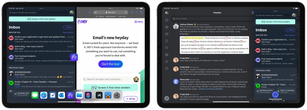
- Better iPad Feature Support: HEY is very much a Version One native app across the iPhone, iPad, and Mac, but it’s particularly poor feature-wise on iPadOS right now. There’s no multi-window support, no keyboard shortcut support, and no Shortcuts or other iPadOS-specific support to be found. Now, as Heinemeier Hansson and Fried discussed, it was important to the Basecamp team to build HEY as a web app first and branch out from there. I wouldn’t be surprised if we see proper native apps in the near future (the placeholder labels for keyboard shortcuts are already placed over top buttons in the app — the shortcuts themselves just don’t do anything at this point.)
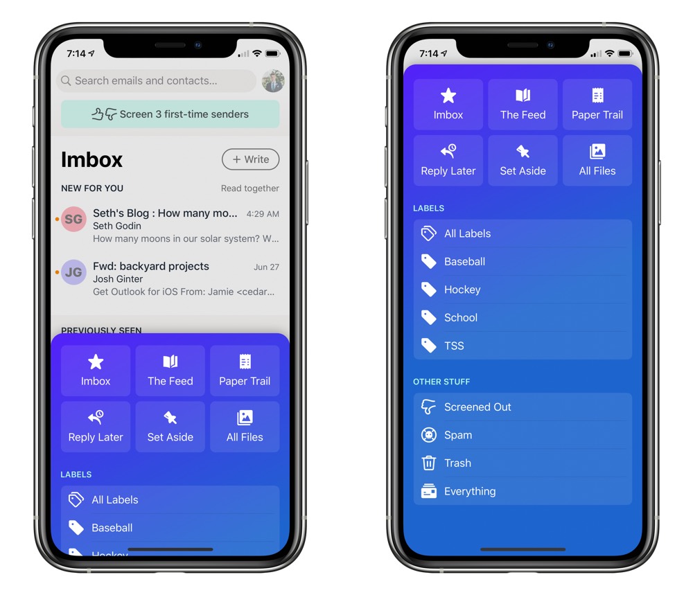
- iPhone Module Swipe: It’d be great to be able to move between the Imbox, the Feed, and the Paper Trail all by a quick swipe, especially on the iPhone. Instead, as it is right now, you have to tap the HEY button, tap into your module/inbox, then hit Imbox to go back to your Imbox. This is ripe for some evolution.
- Some Sort of Archive Import: I get the whole “This is a chance at a fresh start!” mentality — for anyone using the same email addresses for many, many years, there is likely to be an inordinate amount of terrible email to pull into HEY. However, if you do need to search for old emails quite frequently, the addition of HEY to your email workflow doesn’t eliminate your need for your old email service. I’d be completely fine with an on-the-side app that just searches those old email services. Whatever the case, I’d be genuinely ecstatic if I could kick all my old email addresses to the curb.
These are the three things I’m clamoring for. Said another way, I’m very happy with the decisions made for HEY V1.
It sounds like custom domain support is being worked on as we speak (I’m so excited to transport my work email into HEY) and Fried and Heinemeier Hansson seemed to hint the Basecamp team was at least considering some form of multi-user or family support (I’d love to secure a new email address for my wife). Ether way, HEY’s roadmap appears to be long, winding, and experimental.
Wrap Up
To say this is a glowing first impressions review would be an understatement — in just two short weeks, HEY has shown itself to be the most revolutionary app or service I’ve ever tried.
While I may not be alone, I also know many folks who feel otherwise.
Which makes a lot of sense, I think. Email is one of the oldest digital technologies and it’s worked a specific way for a very, very long time. There will be some deeply engrained email habits out there, and old habits die very, very hard.
I also recognize that HEY likely works for a specific type of emailer. HEY appears to thrive with a multitude of daily email and may feel out of place for someone who has either worked out their email workflow, someone who incessantly unsubscribes from anything unworthy, or someone who relies on other forms of communication to get their stuff done each day.
HEY also costs money — a cool $99/year to be exact. Though you can opt to spend $349/year for a 3-letter email address (like [email protected]) and a whopping $999/year for a 2-letter email address (like [email protected]). That $999/year price tag yields you one of 1,352 2-letter permutations, so you better get cracking. The first $99 subscription fee is probably the most important, as it secures your specific email address for life; if you unsubscribe in the future, that email address will still be yours and yours alone.
For anyone used to free email services, $99 may be a hard pill to swallow. I’ve been paying for Google’s G Suite services just to have a custom domain email, so the $99 wasn’t all that far off from Google’s offering.
In short, I feel $99 is a reasonable price. You may disagree.
HEY is a brand new approach to a very old workflow and technology. How HEY subverts and disrupts or how HEY runs into impediments and stumbling blocks will be very personal to your specific workflow.
I initially wrote HEY off, as I thought there was no way the weird Screener and three-pronged inbox approach would be beneficial for my relatively light email workflows.
After two short days, I was sold.
I expect, as long as HEY is around, I’ll be a HEY customer.
