Photos in iOS 13 and iPadOS: A Big Leap Forward in Rediscovery of Your Favorite Photos

Apple seems to make changes to the Photos app each year. iOS 12 introduced the For You tab, replacing the Memories and Shared tabs from iOS 11 (Memories was only around for one year, as it initially debuted with iOS 11). Better facial recognition hit in iOS 10, and Live Photos hit with the debut of the iPhone 6s.
I’m a sucker really — I think I say Photos gets better and more useful each year, proclaiming that little can get better in the app.
Obviously, an app can always get better, and iOS 13’s Photos app is the proof.
People shoot a boatload of photos these days, which are mostly snapshots — not necessarily artistic shots — with the sole purpose of documenting our lives. I attribute this as much to all the other metadata the iPhone can attach to a photo — a location, a date, a time, and darn it, even the weather, the number of steps you took during the day, the specific song you were listening to when you snapped the photo, and who is in the photo — as much as the want or need to document life. Regardless, we have so many photos on our iPhones these days.
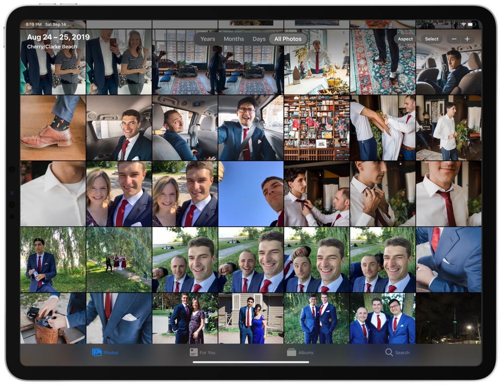
Apple has made its goal clear with iOS 13: Showcasing and resurfacing those photos to relive your treasured moments. With all that metadata attached to a photo and with the video element of Live Photos always intact, it’s even more enjoyable to take a stroll down a photographic memory lane.
With every iteration and every change to the Photos app in iOS comes change and confusion. Every year, it feels like you have to relearn how to use Photos, where your most recent photos are situated, and how to share those photos with friends and family.
Hopefully, the following can provide some clarity.
Get Our Best Photography Tips & Workflows
Transform your photos and edits from average to awesome with our in-depth, mobile photography course. It’s jam-packed with training, ideas, and lessons that can literally transform your photography overnight.
The All-New Photos Tab
If my comment about Apple’s goal being to help you relive your photographic journey, then read the introductory paragraph on the company’s marketing page for the new Photos tab:
The Photos tab has been redesigned to help you find, relive, and share your favorite memories. Using on-device machine learning, it intelligently hides similar photos and reduces clutter, like removing screenshots and receipts, so you can focus on your best shots. You’ll also see your library come to life with auto-playing Live Photos and videos.
The top of the screen showcases a new Years/Months/Days/All Photos pill navigation bar, allowing you to zip through different timeframes in your camera roll.
All Photos is kind of like your camera roll (or in iOS 13 parlance, Recents), but in the Photos tab with your latest photos and videos placed chronologically at the end of the view.

Navigating through to Days begins iOS’s machine learning application to your photos. Photos automatically groups your photos by date, allowing you to pinpoint a specific day on the calendar and view all photos from that date. If you know precisely when you snapped a specific photo, Days is your tab.

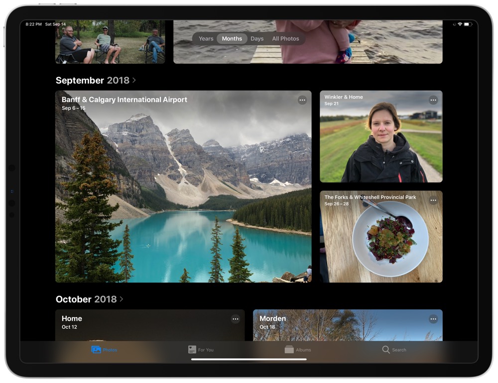
I find Months to be more useful though. Moving the navigation pill into Months sorts your photos into like-minded photos within a specific month. This means you don’t get an August 2019 section, but rather groupings of photos from within August 2019. Each group of photos is labeled with the general location the photos were taken and the time at which they were taken.
iOS picks a hero image to denote the specific month, which can be a photo, an auto-playing Live Photo, or an auto-playing video. Tapping on a specific month drills down into that month and automatically moves your navigation pill into the Days tab. This navigational element feels natural and makes a lot of sense, and the auto-playing Live Photos as hero images provide a distinct level of personality.
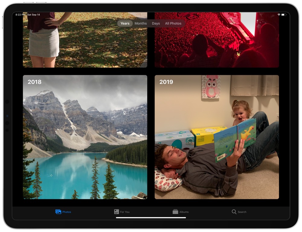
Of course, navigating the pill all the way to the left moves you into the Years tab. In the past, the Years tab would have been relatively useless — the iPhone and synced camera rolls hadn’t been around for too long. With each passing year, however, the Years tab becomes that much more useful.
The Years tab breaks your photos up a lot like the Months tab, but photos are broken into specific years only without any location titles or more granular timeframes. Like Months, every year gets its own hero image (although I haven’t been as happy with the automatically-chosen hero image as I have been with the Months view). Tapping any year drills down into the Months tab, where you can continue your discovery.
Within the Photos tab, there’s a lot that feels natural — a testament to how smooth all the machine learning and intelligent iOS features are working under the hood. Especially in the Months tab, it’s very easy to catch yourself scrolling through the auto-playing Live Photos and videos as though you were scrolling through your entire life on Instagram. It’s catchy, personable, and in many ways, touching. There’s a lot to love and a lot to discover in this new Photos tab.
The New For You Tab
For You debuted last year in iOS 12 and has continued to be refined in iOS 13. And like the new Photos tab, there’s a lot going on behind-the-scenes.
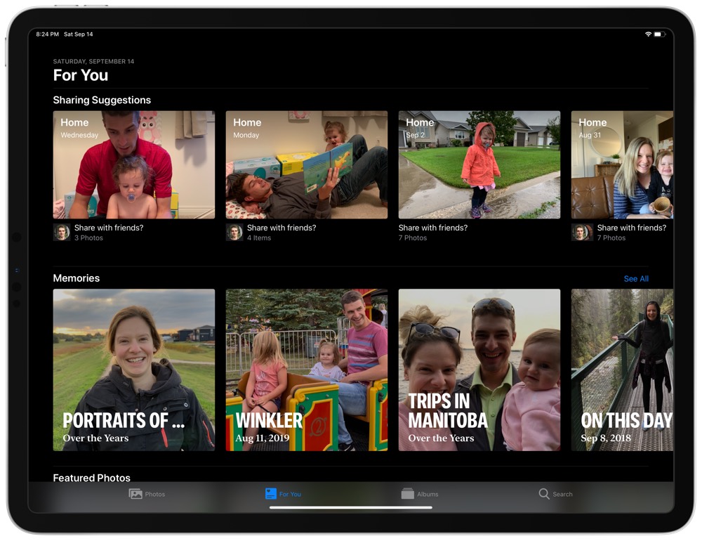
For You is broken into a few sections.
Sharing Suggestions: Groupings of photos separated logically and titled by location, which iOS recommends you share with friends or family. Tapping into any photo group provides the photos iOS expects you to want to share together, the ability to add more photos to the group, and a Next button to select individuals to share with.
Memories: iOS does a lot of under-the-hood categorizing of your photos and a lot of this is shown off in Memories. Tapping on any memory provides a collage of photos that fit the genre, such as On this Day, or Portraits of… — the former showcasing photos from this specific day from past years and the latter showcasing photos of the same person. The auto-playing videos in these collages are particularly awesome.
Featured Photos: Photos that iOS believes to be your favorite photos, or perhaps best photos, are showcased in this section. I’d say iOS does a stellar job of picking these photos — I’ve either shared or loved all of the images that show up in this section.
Effect Suggestions: This is one of the coolest sections in the For You tab — iOS combs through your photos and selects photos it deems to be good fits for Live Photo effects. These photos may work well for a Loop, Bounce, Long Exposure, or Portrait Lighting effect, which the Photos app auto-showcases in the Effect Suggestions section — essentially, you can see a preview of the effect suggestion on the suggested photo. Like Featured Photos, I think iOS does a pretty good job of selecting useful photos to which to apply an effect.
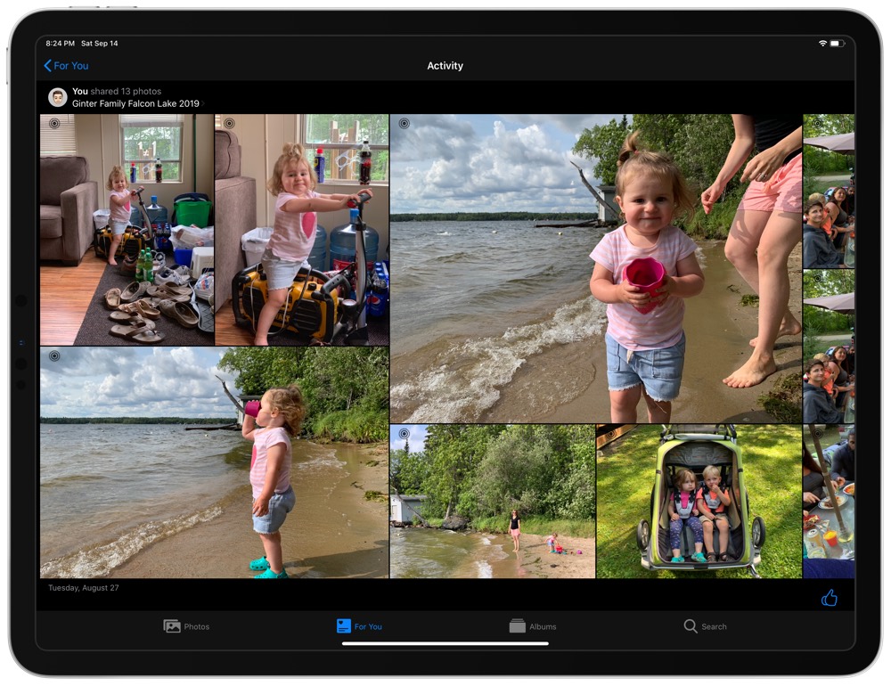
Shared Album Activity: Inside of this section, Photos provides a quick navigational element to jump into any of your shared albums that have had recent activity. After tapping into a shared album, you can scroll left to right to see all the shared photos from all recipients in the album.
Recently Shared: Somewhat self explanatory, the Recently Shared section provides a look at groups of your recently shared photos. From what I can tell, photos that have been given an iCloud link for sharing are shown here. Individual photos that have been shared (say, through an iMessage) are not shown in this section.
A lot of under-the-hood machine learning power is seen in the Memories and Effect Suggestions sections, making these great sections to get lost in. iOS does an increasingly wonderful job of combining photos and videos into memory montages — case in point, after tapping on any memory, the header image can be tapped and iOS will generate a memory video, complete with audio, that will almost surely bring a smile to your face. You can change a lot of the details of these auto-generated memory movies, but they’re so good right off the hop that I doubt most people will bother making their own short videos.
The Albums Tab
To my estimation, there hasn’t been too many changes to the Albums tab in iOS 13. Tapping Albums in the bottom row shows you a quick overview of all your albums (be they albums you created yourself or app-created albums from the likes of Lightroom, Pixelmator Photo, or Darkroom), an overview of your shared albums, an overview of the different people and places in your photos, and a list of the different media types in your library. This view is functional, simple, and pretty easy to understand.
In fact, the Albums tab is the one tab I’ve always felt I can rely on to not change between iOS iterations. When Apple got rid of the camera roll in a past version of iOS, you could count on the Albums tab to be mostly the same as the previous version. When I downloaded the iOS 13 public beta and couldn’t immediately find the camera roll, it was the Albums tab that bailed me out by showing a Recents section.
Filtering through your photos and videos is helpful in the media list the app provides. This is especially handy for finding screenshots, panoramas, or Portrait Mode photos.
On the downside though, the Albums tab is bound to fill up with crummy auto-app-created albums, especially if you find yourself experimenting with different photo apps from the App Store. In order to delete an album, you have to hit See All, and then Edit in the top right corner. Why WhatsApp has a specific photo album all to itself is beyond me.
The Search Tab
The Search tab, well, searches your entire photo and video library. Easy peasy.
The power of search inside the Photos app has evolved over the years. Even visible inside the search field are the words Photos, People, Places…, simply stating you can type any location in the search field to find all the photos you took at that specific spot.
Once you’ve made your search query, the Photos app breaks down the results into a photo grouping of all the photos that fit the query, different Moments from that search query (think the Memories section in the For You tab), and then a Places section that categorizes the filtered photos by location.
The All-New Editing Features
The iOS Photos app is more than just a “search and sort” app for your photos. So while you don’t feel like you’re actually in Photos when you are editing a photo, in reality, you are.
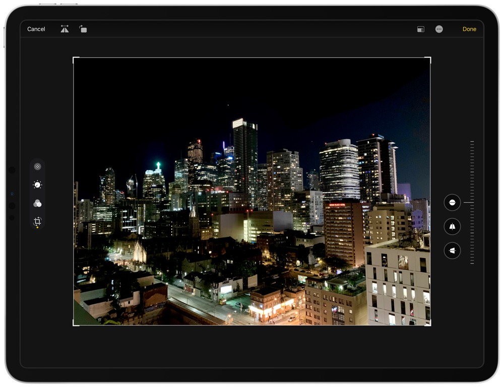
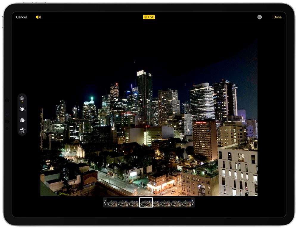
Bringing a photo to the forefront provides a few different options in the top-right corner: Share, Love, Delete, and Edit. Tapping the Edit button brings you to an updated iOS 13 editing view. On the iPad, this view is designed for a two-handed approach — on the left, you can tap through exposure and color adjustments (which updates the tools on the right side), filter adjustments, and cropping/leveling adjustments. If the photo is a Live Photo, there’s also an option on the left side to trim the length of the video element of the Live Photo.
Exposure and Color Adjustments
Almost all exposure and color editing options are found in this section.
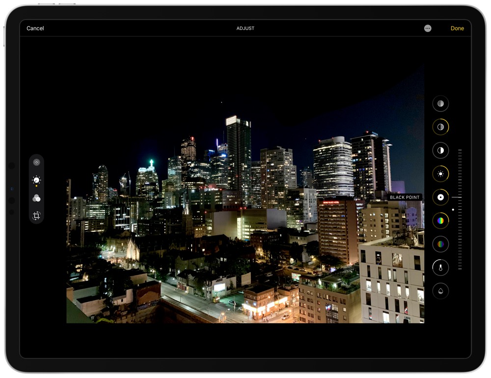
- An Auto button to quickly enhance your photos. I’m overall fairly happy with how iOS quickly enhances my photos, but your own editing preferences will apply here. Tapping the Auto button a second time undoes the adjustments and brings you back to your original photo.
- An Exposure button, which provides a sliding toggle to increase or decrease the overall brightness of your photo.
- A Brilliance button, which appears to change the overall contrast of the photo alongside a host of other changes. Decreasing iOS’s brilliance adjustment does much more than the standard contrast slider in Lightroom, for instance.
- A set of buttons to adjust your Highlights and Shadows.
- A Contrast button which solely targets the photo’s contrast (unlike brilliance).
- A Brightness button that, like the Brilliance button above, changes the exposure amongst other edits to perform a smoother edit.
- A Black Point button that effectively alters the tone curve of the photo, increasing or decreasing the impact of blacks in the image.
- A set of buttons to adjust Saturation and Vibrance.
- A set of buttons to adjust Warmth and Tint — good for adjusting white balance in your photo.
- A set of buttons to adjust Sharpness and Definition — Definition, to my mind, is a lot like Clarity in Adobe Lightroom.
- A Noise Reduction button to smooth out the noisy and grainy parts of a photo, especially helpful for low-light images.
- And finally, a Vignette button for providing brighter or darker exposures to the outside areas of your photo.
New Portrait Mode Editing Features
When editing a photo that was taken in iOS’s Portrait Mode, the contextual menu on the left side of the iPad (bottom on an iPhone) adds a cube-like button. Moving into this mode allows you to change the lighting on your Portrait Mode photo.
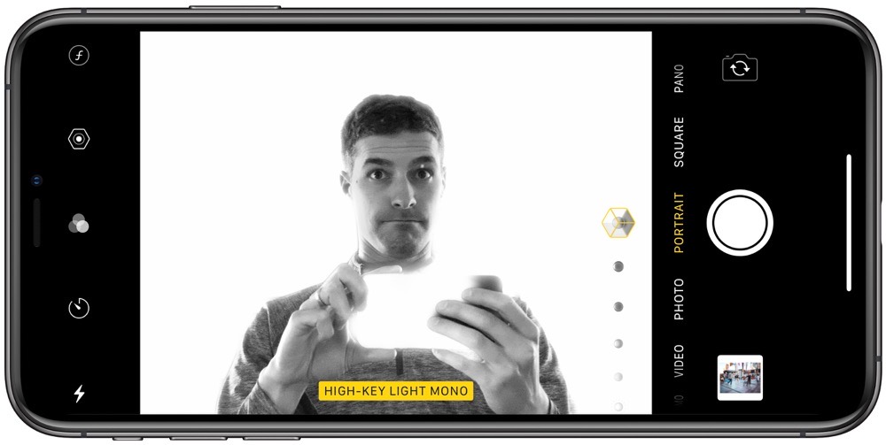
Apple has made a great deal of these Portrait Lighting features over the last few years. iOS 13 includes the same Portrait Lighting features as past iterations of iOS (natural light, studio light, contour light, stage light, and stage light mono) and includes a brand new High Key Light Mono feature, which is great for shooting black and white studio style portraits.
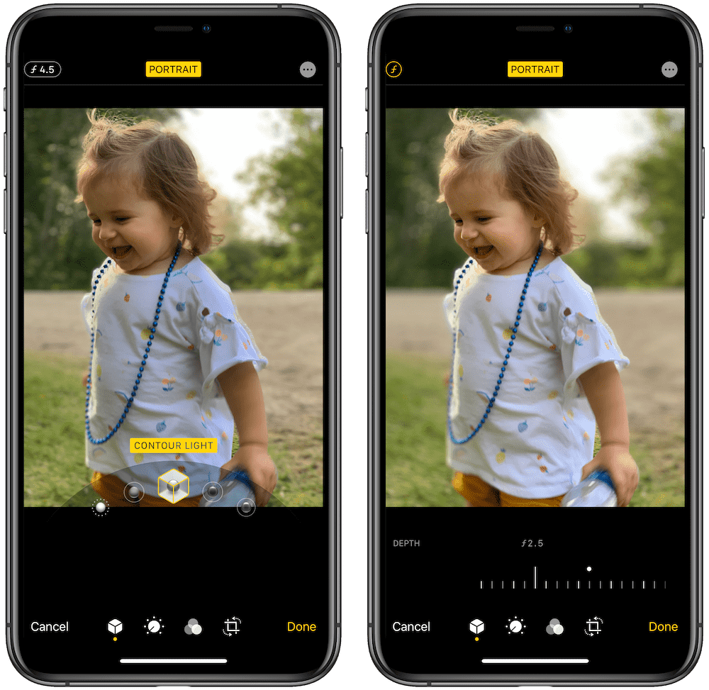
As in the past, Portrait Lighting features can be changed after the fact — you can shoot a Portrait Mode in the natural light setting and change both the f-stop and the Portrait Lighting effect in the edit menu well after you originally shot the photo. However, High Key Light Mono requires the photo to be shot in iOS 13 — any Portrait Mode photos you shot in iOS 12 and earlier will only have the initial Portrait Lighting features available.
Filter Adjustments
The second (perhaps third, if a Live Photo) option on the left of the iPad is the filter adjustment button. Tap this button to bring up a slider on the right side of the screen to scroll through all the different pre-made photo filters built right into iOS 13.
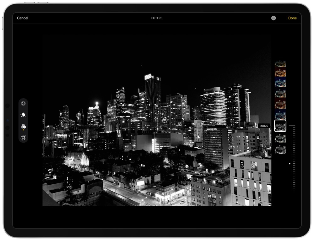
Filters have been a hit for a long, long time at this point, so filter adjustments feel like a necessary element to any photo editor these days. However, these built-in filters always feel overdone to me — they are either too this or too that, stepping outside of the realm of real life.
I have never used a built-in iOS photo filter.
All New Video Editing Features
What’s crazy about all the new video editing features in iOS 13 is that they effectively replicate the same toolset for editing still images. Want to crop your video? Covered. Want to apply a built-in filter? Covered. Want to reduce noise, increase brilliance, and increase definition? Yep, that’s covered too.
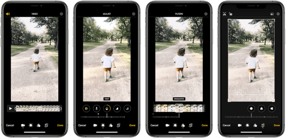
Nearly every feature and tool for editing photos can be found in the same editing interface for videos. Even trimming the video is done with the same module as trimming the video element of a Live Photo.
I’m personally very photography focused, so I’m really just discovering these video editing features for the first time. But if anything, the impact of editing a video — especially color, exposure, and contrast — feels larger than the impact on editing a still image. To me and my little library, these video editing features have had a greater impact than the same editing features for photos.
In the hands of a videographer? Well, it would have an exponentially greater impact.
The iPhone 11 Pro and its three-camera system may still be playing catch up when compared to a competing smartphone like the Google Pixel, but for all intents and purposes, the iPhone has the benchmark smartphone video camera on the market right now.
And iOS 13 has the editing features to back it up.
Another Year, Another Round of Improvements
So it goes: With each step of evolution in the iOS world comes another wave of changes (I hesitate to say all changes have been improvements, but most have been) to the built-in Photos app.
In a way, what may be the biggest change this year is the ability to sidestep the Photos app for the first time when importing images. Finally, after what feels like a millennia, Apple will allow users to import their photos from an SD card directly to their photo editing app of choice.
Apple has left good reason to continue the process of importing directly into the Photos app before sending elsewhere. The curation capabilities of Photos in iOS 13 is commendable and far exceeds the ability of an app like Adobe Lightroom to resurface a long lost favorite image.
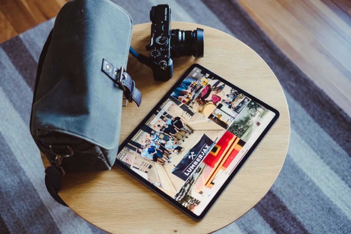
There are always ways to improve an app, but Photos is inching toward a precipice. There are many elements of the built-in Photos app that will be changed merely for change’s sake, not for improvement’s sake. Apple did a fine job in determining the correct features to improve this year.
Get Our Best Photography Tips & Workflows
Transform your photos and edits from average to awesome with our in-depth, mobile photography course. It’s jam-packed with training, ideas, and lessons that can literally transform your photography overnight.
