Some First Impressions of the iPadOS Public Beta
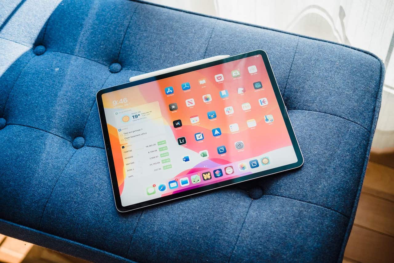
It’s for science!
At least, that’s what I had to tell myself in order to justify installing the iPadOS public beta last week. For all intents and purposes, this is a “public alpha” with a wide variety of bugs I don’t remember encountering in past iOS public betas.
But with a few tweaks in the workflow, I’ve been able to work around a range of the iPadOS public beta bugs to get a better understanding of what Apple’s tablet OS will be before September.
It’s early, so features will change to be sure, but I’ve been surprised about a few of the iPadOS features I’ve used often and others I haven’t used at all.
Day One in Depth Course
Discover how to use every function and feature within Day One. Also! Get expert tips and tricks for additional workflows and ideas for how to use Day One for increasing your productivity, creativity, and organization.
The iPhone-Sized QuickPath Keyboard
Perhaps this is especially exhausting on the larger 12.9-inch iPad Pro, but thumb typing in portrait mode is the very definition of excruciating. My short, stubby thumbs have to stretch beyond their physical parameters to type the word “the.”
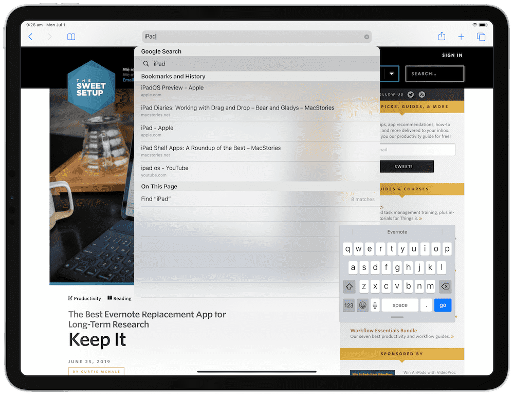
It’s interesting Apple didn’t re-debut the split keyboard we saw in past iterations of iOS, but this new iPhone-sized swipe keyboard is dramatically better and has become my default keyboard when using the iPad anywhere other than a desk.
Understanding how the QuickPath Keyboard works has taken a little bit of effort, but once you understand a lift of your finger constitutes hitting the space bar, you can hammer out sentences faster with one hand than ever before.
The ability to move the keyboard around to any spot on the iPad is amazing — not only is it instantly customizable for all the different thumbs in the world, iPadOS even adapts its on-screen elements to fit where you’ve put the keyboard. Messages move above or below the keyboard so you can always see everything you need to see.
Files and External Drive Support
The single biggest element keeping my Mac on my desk and not taking an adventure to eBay has been external drive support. I have an aging LaCie D2 Thunderbolt 2 drive on my desk that houses my photo collection. Over the past year, I’ve had no problem importing photos to Lightroom on my iPad, which then syncs over to the cloud. But keeping a physical copy locally at home means plugging in to a hard drive through the Mac and manually offloading the photos.
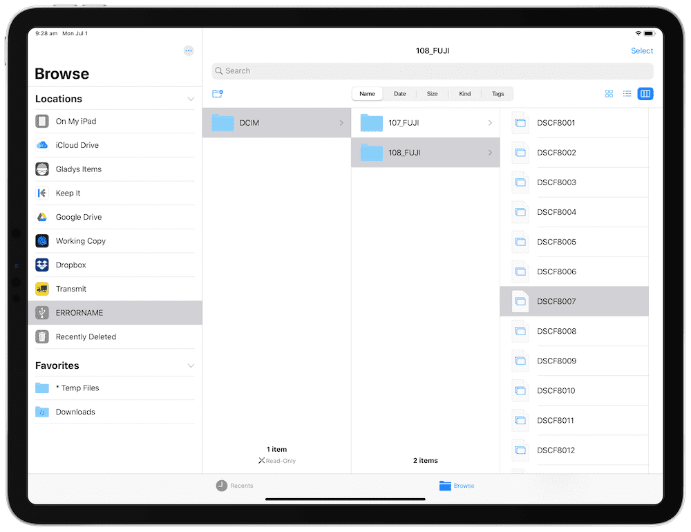
Alas, my LaCie D2 Thunderbolt 2 drive doesn’t mound yet on iPadOS (it has Thunderbolt 2 and USB 3 I/O, so a USB-A-to-USB-C adapter didn’t allow the drive to mount). Plus, the iPadOS public beta is not yet able to see Fuji raw photos, meaning I wouldn’t be able to transfer photos over to the LaCie even if it could mount.
I’ll chalk this feature up as one I expect to test extensively as the beta improves over the summer. In the meantime, I really have nothing new to report.
The Apple Pencil Screenshot Gesture
Did anyone ever think screenshots would become such an extraordinary feature used by so many? I often receive screenshots of emails or links in Safari rather than the actual email or link itself. To me, taking and sharing screenshots is somewhat of a “hack” feature that has turned mainstream, and Apple is fully embracing the hack by making it a feature.
iPadOS’s Apple Pencil screenshot feature is so liberating to use. Grab the Pencil, swipe from the bottom left corner to the middle of the screen, and you’ll instantly enter into screenshot annotation mode, complete with an array of updated annotation tools to mark up what you see.
Apple has added a few annotation tools that I never expected to use but have ended up using far more often than I imagined.
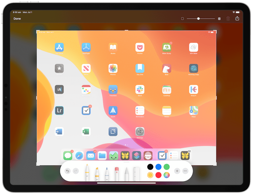
First, when you drag the Pencil from the bottom left corner and enter annotation mode, you can change the opacity of the screenshot by scrubbing a slider in the upper right corner.
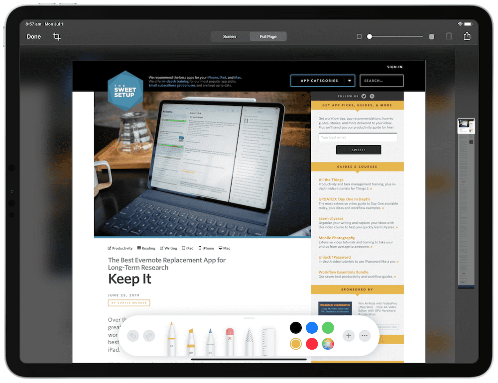
Second, when you snap a screenshot of a webpage in Safari, you are given the option to save just the current screen or the entire webpage. This generates an extra long screenshot, but it instantly eliminates an app like Picsew, which sewed multiple screenshots together to form an extra long screenshot file.
Do be aware, however, that a “full page” screenshot actually creates a PDF file (at least in the public beta version) rather than an image file. This is likely the preferred filetype destination anyhow, but any shortcuts you may have built which utilize screenshot image files may need to be tweaked when using the full page feature.
The New Slide Over
Slide Over feels completely broken on the iPadOS public beta, which may act as a major red flag when I’m trying to use it. But in general, I’ve never been much of a Slide Over user, and I no longer expect the new Slide Over features to change my usage.
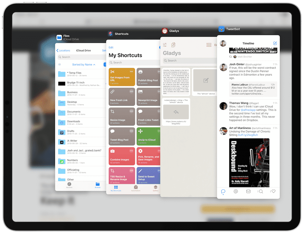
In short, Slide Over is still very much Slide Over, just with multiple apps at the ready. You can throw a variety of apps into Slide Over and leave them there rather than having to drag them individually into Slide Over from your dock like in iOS 12.
But what I’ve found annoying is that if you put an app in Slide Over and then use that same app in Split View, iPadOS takes that app out of Slide Over. With all of the iPadOS features of having multiple instances of an app open at once, I expected to be able to keep one Messages conversation open in Split View with another open in Slide Over. At this point at least, this isn’t the case.
Again, Slide Over is very, very buggy right now, so perhaps a smoother experience would allow for more experimentation. But as it stands right now, I don’t see myself altering much of my Slide Over usage when iPadOS officially debuts.
The New iPadOS Home Screen
I was taken aback when the iPadOS public beta first loaded on my iPad — icon sizes are much smaller than I expected.
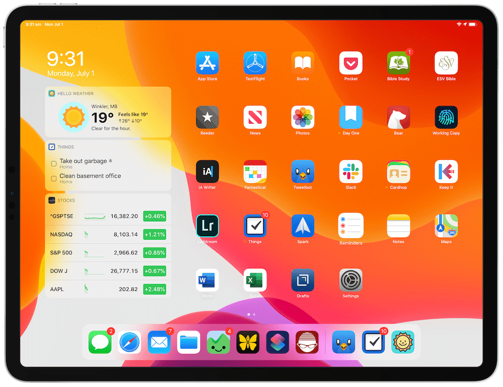
But all of the prior first impressions around the web hold true:
- Having smaller app icons means being able to have more icons on the home screen — a total win.
- Sliding in Today Widgets from the left side of the screen is really cool, even if the widgets have difficulty updating at this point in time. This provides a level of “live” functionality we’ve never seen on the iPad home screen before.
- However you decide to arrange your home screen icons, they’ll be in the same spot in both portrait and landscape orientation.
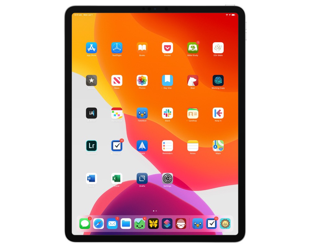
Now, am I the only person who finds the home screen in portrait orientation to be a bit inefficient? There’s an entire swath of the home screen sitting empty both above and below your home screen icons, somewhat arbitrarily grouping your app icons in a giant square in the middle of your portrait display. It feels off to me.
It’s fairly clear that iPadOS is being developed more specifically for landscape orientation use, so I don’t begrudge anything here. But the portrait orientation home screen feels like an after-thought right now.
Desktop-Class Safari
Desktop-class Safari really, truly is the hallmark feature of iPadOS. This is the single update that will change how people use the iPad, where they use the iPad, and for what they use the iPad.
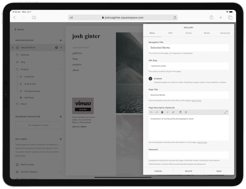
The changes to Safari are instantly felt. For one, you no longer see mobile-optimized sites, especially annoying on the 12.9-inch iPad Pro. But the ability to more easily function inside WordPress, or the ability to use the Squarespace editor are complete and total wins for iPadOS.
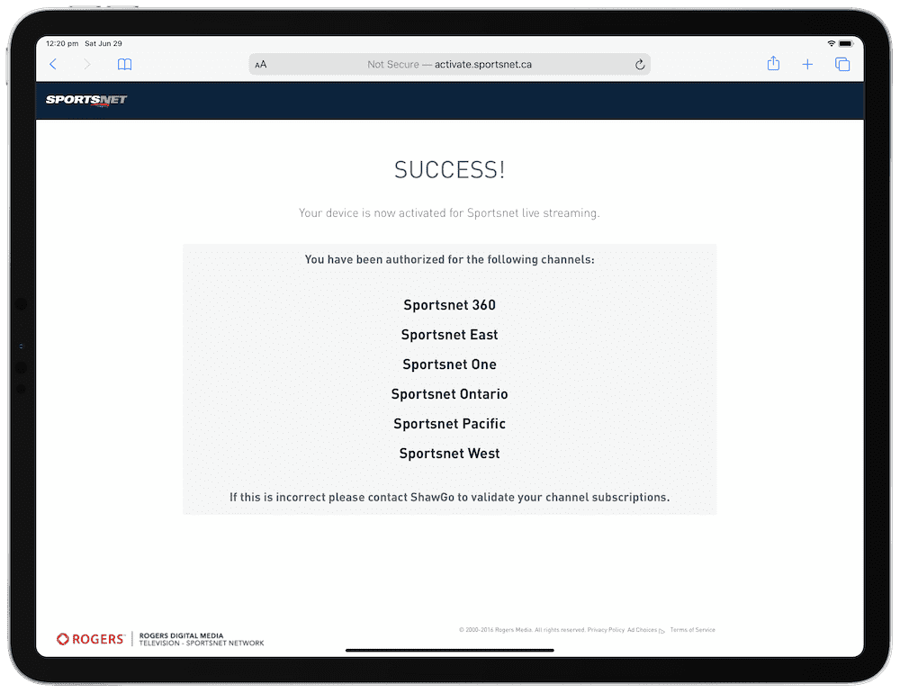
It’s odd, but the area I instantly felt the updates to Safari was when signing into a digital TV account for the Apple TV. Here in Canada, if you subscribe to satellite or cable TV and that subscription includes channels like, say, Sportsnet, you have to go to a specific website, type in a code, and sign in with your satellite or cable TV account to unlock those same channels on the Apple TV. This account seems to reset or sign me out at least once every two weeks, and I’ve always had difficulty authorizing the Apple TV via an iPhone or iPad. With a brand new Safari browser in iPadOS, the entire experience has been a dream.
Again, my workflow here is small potatoes, but I can only imagine the power of a desktop-class Safari in the hands of a power user.
Bonus: New York Font in Safari Reader Mode
Ready for the under-the-radar feature of the day? Apple has brought its coveted New York serif font from Books to Safari’s Reader Mode, instantly making Safari Reader Mode 1,000% more comfortable for reading.
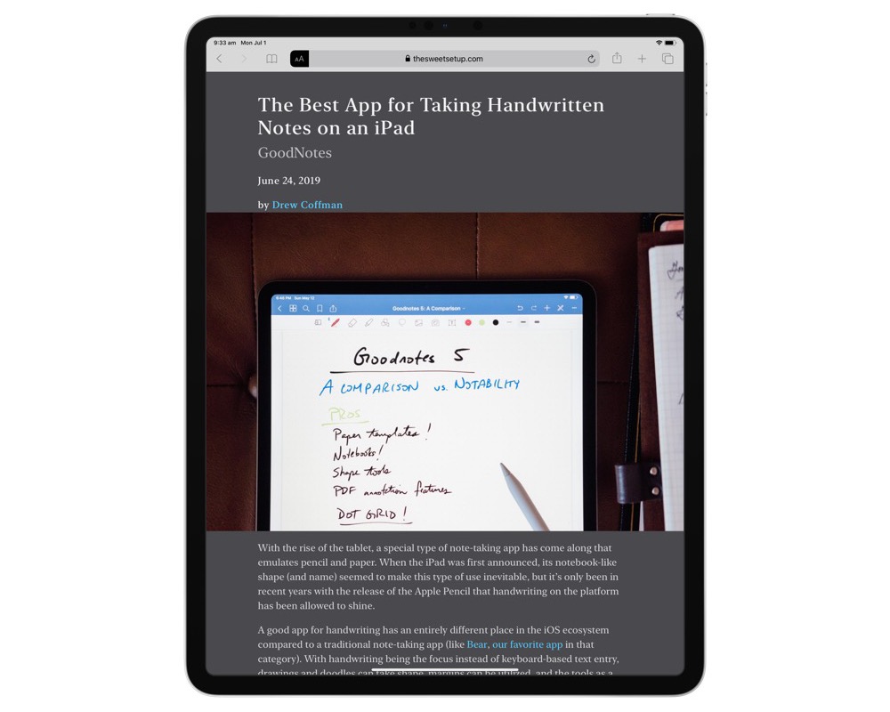
I don’t think I’ve used Safari’s Reader Mode once prior to the iPadOS public beta, but with the debut of New York as a font choice, you can bet Safari Reader Mode will become a default for reading text-based blogs in the future.
Wrap Up
There’s a lot to iPadOS and there’s a lot to the public beta which is either not functioning or not yet included. I’m excited to try out mouse functionality in the future, and I’m equally excited for external drive support to be functional.
But to reiterate, this is beta software at its finest. Ulysses struggles to load on my iPad and I’m petrified of there being a syncing issue, so I’ve returned to my Mac for all my writing in the last week. Dark Mode is significantly more buggy than the regular Light Mode so far, so I’ve opted to stay away from Dark Mode for the time being (and, admittedly, I don’t understand all the fuss around Dark Mode). And battery life has been OK, but not great.
For those who can wait, though, I think it’s safe to say September will usher in a new age for the iPad.
Our Must-Have, Most Used Productivity Apps
We spend an inordinate amount of time sorting through hundreds of apps to find the very best. We put together a short list of our must-have, most-used apps for increasing productivity.
