Ulysses 13 debuts: deadlines, keywords, and code block support
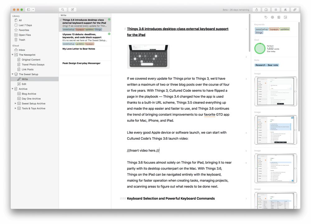
It’s no secret around here that all of us at The Sweet Setup love Ulysses — it’s our pick for the best writing app for Mac, iPhone, and iPad, and for a few members of the team, Ulysses is the home for all research, quotes, and reading highlights. Ulysses has a few core features that make it great for extending beyond mere writing; features like goals, keywords, and the range of attachment options available for each sheet help to bring the best to your writing workflow.
Ulysses 13 focuses on updating a few of these core features to bring more of your writing process into the app, as well as a few improvements for technical writers who need to showcase code blocks in their writing.
Stop losing your ideas and notes to multiple apps…
An online course to help you save time, organize your notes, and master the best writing app for Mac and iOS: Ulysses.
Daily Goals and Deadlines
Inside Ulysses’ attachment bar is its handy goal setting feature — simply input a number of words on a sheet-by-sheet basis and Ulysses will help you track your progress.
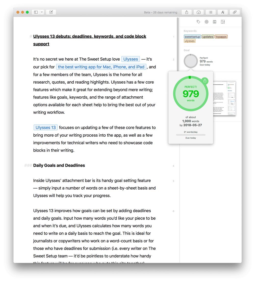
Ulysses 13 improves how goals can be set by adding deadlines and daily goals. Input how many words you’d like your piece to be and when it’s due, and Ulysses calculates how many words you need to write on a daily basis to reach the goal. You can even track your goal history and export the statistics as a CSV file. This is ideal for journalists or copywriters who work on a word-count basis or for those who have deadlines for submission.
Colored Keywords
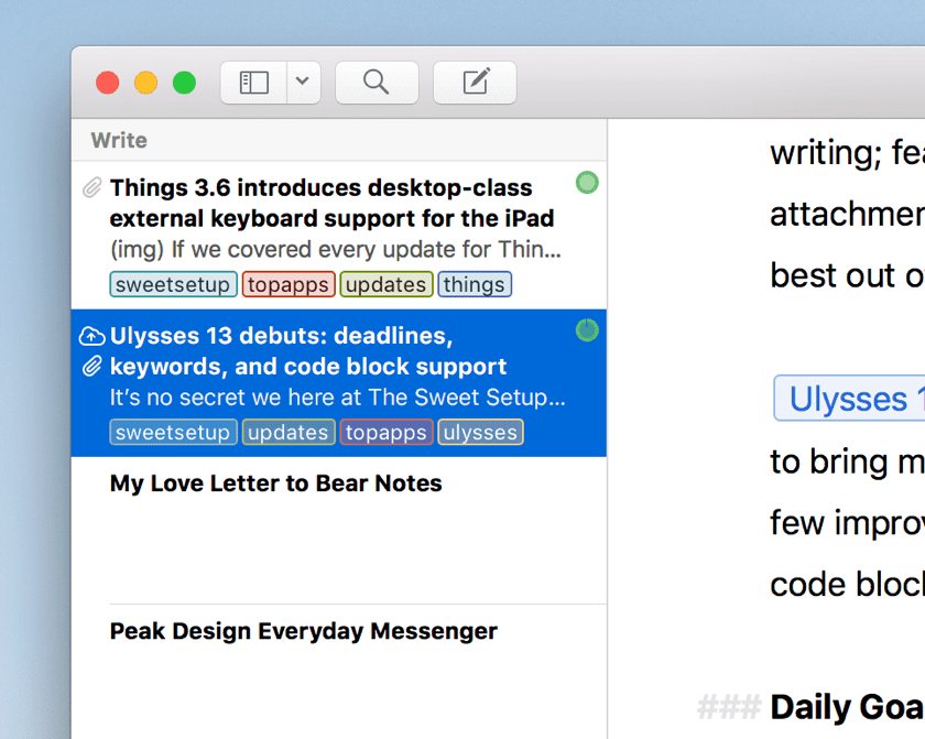
For those who use Ulysses for research, or for those writers who use Ulysses’ keywords to tag sheets for organizational purposes, Ulysses 13 introduces colored keywords. In the attachment view, simply hit the keyword button and create and edit keywords on the fly.
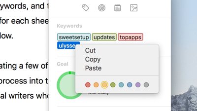
Are colored keywords a ground-breaking feature? Likely not for those who use Ulysses solely as a writing app. However, for those who use Ulysses for research or as a note-taking app, colored keywords will act a lot like the new custom tags and TagCons in Bear. I personally use Bear for all my research and note-taking, but the principle is the same: drop in some interesting information and tag it (or, in Ulysses, set a keyword) to organize it appropriately. Ulysses’ colored keywords are sure to bring a dash of color to the sidebar, making it easier to quickly find the tagged sheets you’re looking for.
Code Blocks
Ulysses has always done a wonderful job of putting your writing first — links are hidden in blocks behind text rather than the URL being shown inline with the rest of the text, footnotes are stored behind a block rather than quirky Markdown or HTML-based text being shown inline, and images are stored in an “img” block or as a thumbnail preview rather than as an inline URL. All these decisions bring your writing to the forefront and eliminate extra distractions.
However, when it came to code, Ulysses has always been a bit of a pain. Any bits of code in your text would require a backtick to open and close the code snippet and to distinguish it from the rest of your text. Although code block support existed, inserting code blocks quickly inhibited any writing flow you aimed to achieve.
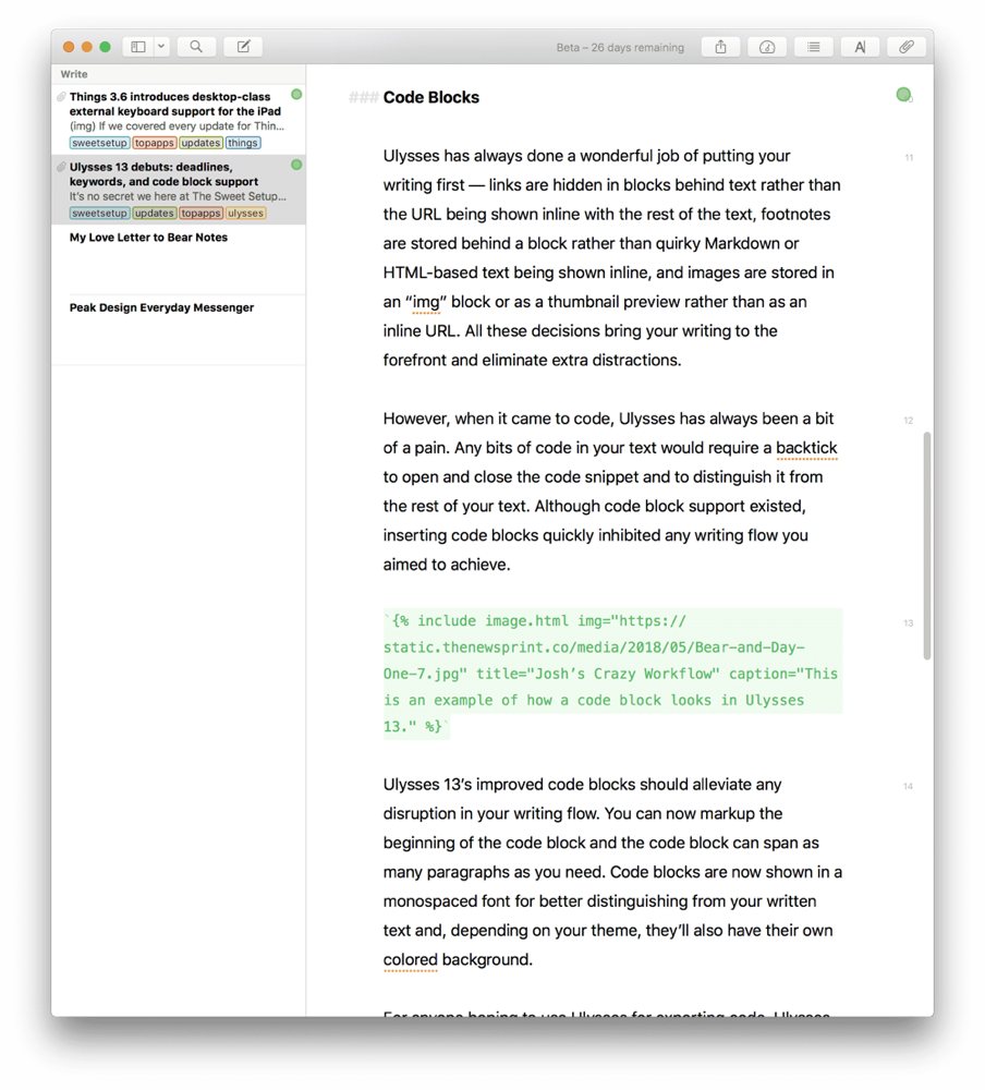
Ulysses 13’s improved code blocks and syntax highlighting should alleviate any disruption in your writing flow. You can now markup the beginning of the code block and the code block can span as many paragraphs as you need. Code blocks are now shown in a monospaced font to better distinguish it from your written text and, depending on your theme, they’ll also have their own colored background.
For anyone hoping to use Ulysses for exporting code, Ulysses 13 can now import and export code to GitHub-style fenced blocks. Plus, you can use code blocks inside external folders as well.
A Few Other Handy Features
Ulysses 13 has a few other improvements and features that are sure to keep writers happy.
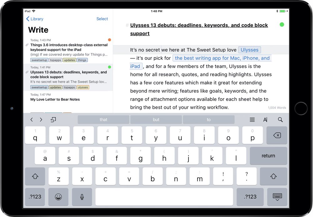
If you prefer to write on your iPad or iPhone with an external keyboard, Ulysses 13 introduces improved typing speeds for when an external keyboard is attached. The iPad’s focused environment is ideal for writing and this improved external keyboard support is welcome news.
If you’re one to drag an image into your writing, Ulysses 13 now supports full-color image previews right in line with your text. Grayscale images are generally less distracting, but full-color previews certainly give your writing an extra level of style.
And, if you are making use of macOS’ and iOS’ growing use of URL schemes, Ulysses 13 introduces a new shortcut for copying X-Callback URLs to each of your sheets. I recently outlined how I use Bear, Ulysses, Things/Fantastical, and Day One in my research and information-based workflow, and URLs are fundamental to my organizational process. Having a quicker way to copy a sheet URL inside Ulysses is going to speed up this referencing workflow.
Wrap-up
Ulysses 13 keeps the pace and direction firm with its latest improvements. Daily goals and deadlines are, kept where you can find them rather than jamming them in your face. Colored keywords can be used to organize and search for written material, but aren’t required for maintaining organization and structure in your writing library. And, the code block improvements are great for writers who want to use Ulysses in a technical environment without having to jump to a separate app for their code needs.
All these improvements are sure to keep current Ulysses users happy and will open the doors for new types of writers to experience Ulysses’ fantastic writing environment. Ulysses 13 continues to be our pick for the best writing app for Mac, iPhone, and iPad.
Stop losing your ideas and notes to multiple apps…
An online course to help you save time, organize your notes, and master the best writing app for Mac and iOS: Ulysses.
