I Tried to Migrate to Todoist; It Didn’t Go Well
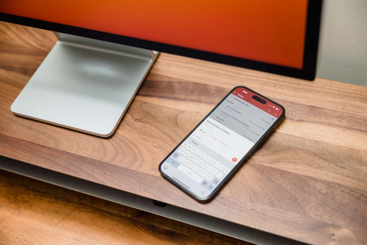
This post can only start one way, and that’s with a confession. This article was originally going to be about how to effectively migrate your tasks and workflows from Things over to Todoist. That all fell apart a few weeks after migrating because Todoist was driving me crazy — and ultimately send me running back to Things.
Now, I firmly believe that chasing The Perfect App is a path that leads to madness, since nothing will ever totally satisfy all of your needs. It’s a vicious cycle that just leads to constant transition phases at best, and needless additional costs as you pay for more apps and services at worst. Here at The Sweet Setup, we like to figure out what great software exists, but the intention is never to have readers switch to whatever app we’re talking about that day.
Craving Change
I’ve been an ardent Things user for what feels like forever. My App Store receipts show I bought Things 1.0 back in 2010, and it’s definitely the task manager I’ve spent the most time with since then. Over the past three years, I’ve never even looked at another app seriously. But, something happened in early 2023 where I was noticing a bunch of updates to Todoist, while it felt that Things was not changing much at all. Was it falling behind? Was I falling behind?!
So I made the move. The migration wasn’t interesting, as I basically recreated what I needed by hand, and left the history in Things.
The Honeymoon Period
Todoist drew me in with a bunch of features that I wasn’t getting in Things. To their credit, Todoist does have some nice features that I would love to see adopted by Things in some way or another.
To start, the share extension on iOS is so much better. While Things lets you save something quickly, it really just wants you to add to your inbox, and then you can sort it out later. Todoist is more full-featured, letting you set a due date, time, assign tags, and more. You can also just save it to the inbox with a single tap like Things, but if you want to do more, it’s easy to do.
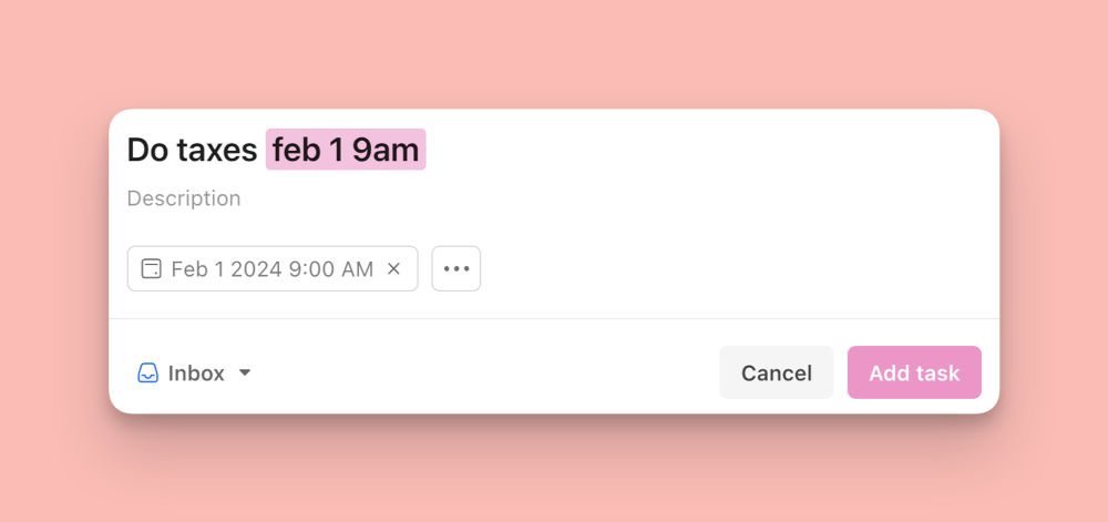
Making this easier to do is Todoist’s excellent natural language processing. So if I want to set a reminder to do my taxes on February 1 at 9AM, I can simply type “Do taxes feb 1 9am” into Todoist and it will understand what I mean, and assign the due date appropriately.
Then there is just more customization available in Todoist. Want to sort your today view by due time? How about by project and then each project by due time? Or how about filtering out home projects while you’re at work? All of those are possible in Todoist, but not Things. Maybe you want to remove some things you don’t ever use in the sidebar or you want to choose a different accent color for the app. Heck, maybe you can’t read the text and want to increase the size. Todoist does all that, and Things simply doesn’t.
Throw on an API that I could use to automate task creation from basically any other app I use, and Todoist had a definite appeal.
It All Fell Apart
I will admit this is the most subjective thing I could possibly say here, but I just kinda disliked how Todoist felt to use in comparison to Things. It was perfectly functional and reliable, but I just didn’t enjoy using it. If you made me get specific on what didn’t work, it was a combination of two things: tactility and data density.
One of the best aspects of Things is how satisfying it is to do basically anything in the app. Checking off a task has a satisfying thunk to it, and moving things around (like a task from one project to another) is super intuitive, and everything just works how you’d want. This is all even more impactful on the iPhone and iPad apps where the feel of an app makes even more difference.
I hadn’t fully appreciated how much those interactions mattered to me until they were gone, and Todoist simply didn’t match up. You could drag tasks around, but not to everywhere you wanted and you could only grab them from a small block of pixels, not the whole thing. Oh, and you can only drag them around from the “project” view, not the “today” view where you (or at least I) spend most of your time. This is one example, but it’s pretty indicative of my whole experience: Todoist can do all the things that Things can do, but it’s not as pleasant to actually do in the app.
It turns out that the generally joyful UI of Things was more important to me than I realized, and a longer feature list couldn’t win me over.
It didn’t hurt that Todoist has a subscription cost plan, while I paid for Things 3 back in 2017 and it’s been free to use ever since, so Things is the far more cost efficient option as well.

Where This Leaves Us
This article has been exceptionally subjective, and it would be shocking if it resonated as well with everyone the same. Things fans might be cheering, while Todoist fans may be utterly confused why I would hold how an app feels to use in higher regard to what the app does.
I think the lesson here is that when multiple pieces of software solve your particular needs, then it comes down to the intangibles over which is right for you. While I’ll be the first to admit that Todoist has more features than Things, I don’t really need any of those features to get my work done, so the more fuzzy aspects of product design have more sway in my decision-making process.
🚀 When Everything is Always Busy…
The Complete Guide to Margin (Get Your Time Back)
If you struggle to keep up with all your tasks, your busy schedule, and just feel overwhelmed…
Get Instant Access to our 2-part framework for restoring margin and breathing room (starting today).
Even if things feel overwhelming, you’re not sure where to start, and you’ve already been there, tried that…
Inside our popular community membership, join us for the Margin Reset. Stop wondering why it’s so difficult to keep breathing room in your life. Finally break free from the overwhelm…
You’ll get instant access to the entire course library ($5,000 value), including our popular Focus Course, Margin masterclass, Time Management masterclass, productivity templates, and more…
- Our simple, 2-part framework to restore margin
- How we use these frameworks to take off 9 weeks paid vacation every year
- How to get more breathing room in your own life (starting now)
- Calm Inbox (email management masterclass)
- All the Things (productivity course)
- Productivity & Time Management Templates
From Busy to Not Busy
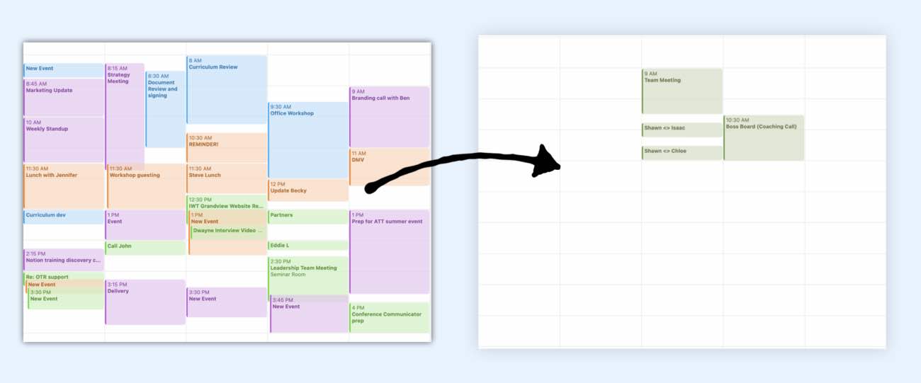
All this, and more, inside the Focus Club Membership
Join 300 focused members who have access to $5,000 worth of our best courses and masterclasses, the Digital Planner, a Private Chat Community, Monthly Coaching Calls, and much, much more…
