A Few Weeks With the Always-On Display and Dynamic Island in the iPhone 14 Pro
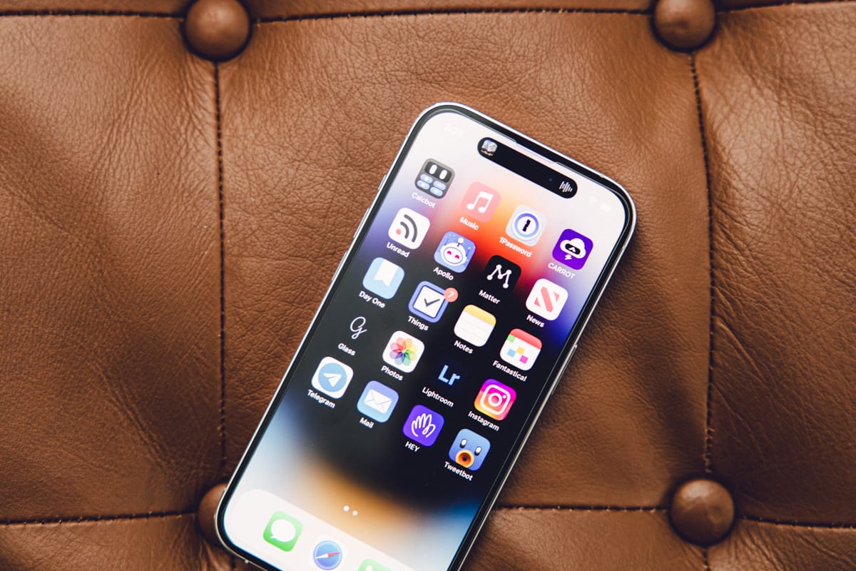
The iterations are getting smaller, there’s no doubt about it. iPhone 12 Pro to iPhone 13 Pro included a substantially better battery, a smaller notch, and the standard camera improvements. I say “standard camera improvements” because Apple’s largely just playing the physics game here rather than the technology game — take a look at how much bigger the camera lenses are on the back of the iPhone 14 Pro and you’ll see where the year-over-year-over-year improvements are truly coming from.
Whether the Dynamic Island and the always-on display are considered major, paradigm-shifting features is entirely up to you; Dynamic Island certainly points to a different sort of notification future for the iPhone. But if it stays in its current version, Dynamic Island will be yet another popover notification style in iOS 16 and that’s it. (I very much expect Dynamic Island to majorly evolve as more iPhones adopt the hardware; I’m speaking here solely with the vision that nothing changes for the standard iPhone 14 line.)
The always-on display is the most stark, most polarizing, most immediately noticeable change from previous iPhone generations. As colleagues have put, Apple is battling decades of muscle memory for the always-on display. If the display lights up, a notification has come in that needs to be dealt with. If the display is off, you’re in the clear. Always-on in the iPhone 14 Pro dramatically alters this muscle memory and has quickly put some folks offside.
You can view this how you want to view it.
The Always-On Display
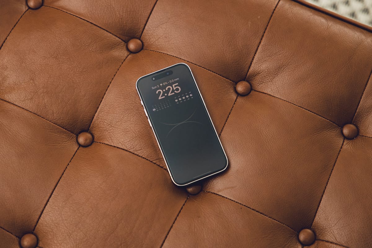
I love the always-on display. Yes, I catch myself looking over thinking a notification has come in because the display has lit up. Yes, I find this distracting on occasion. Yes, I’m concerned about the hit on battery life.
But how many of the folks who have enough of an issue with the always-on display who are thinking about turning off the feature also happen to have an Apple Watch? How many of those folks know exactly where their notification status is at, at all times of the day?
I’m on the other side of this coin — I’ve tried many different Apple Watch variants and I’ve sold them all off. Every year I’m tempted to buy an Apple Watch, only for that temptation to cool after a week or two. I’m in the same boat again this year and there’s no Apple Watch in the mail for me. (Though these Apple Watch Ultra reviews are really getting to me.)
I’m one of those guys who needs to look at his iPhone to see what kind of notifications are awaiting me. I don’t have an Apple Watch to confirm where I’m at for the day.
The always-on display in the iPhone 14 Pro has quickly eliminated a major feature I thought I would enjoy with the Apple Watch. When sitting in a MagSafe or wireless upright charger, the iPhone 14 Pro has this silent notifying ambiance — a quick glance to see if anything new has come in and off I go with the next task. If a song is playing via the Music app, controls are there at a touch of a button, as are all the song details. And presumably, when Live Activities hit iOS 16 later on this year, the same will be said about how quick and easy it is to check the score of the game or check the status of that food delivery.
Honestly, I don’t feel the always-on display goes far enough! I was disappointed when the screen turned to black at night. Turns out, a Sleep Focus mode automatically turns off the display after a set period of time, acting exactly the same as any prior iPhone before it. I wanted to see Apple pull off the same sort of Night Mode setting you see on the Apple Watch, where the Watch effectively becomes a mini alarm clock. Alas, the only way for the iPhone to stay lit up all night is to have no focus mode or alarm set at all.
Admittedly though, there is most certainly some sort of battery hit due to the always-on display. Like every other reviewer out there, it’s hard to put an exact thumb on the impact of the always-on display on battery life. But where I would have a whale of a time killing the iPhone 13 Pro’s battery during a regular day, I most certainly can kill the iPhone 14 Pro’s battery on a regular day. When traveling into 5G regions, using navigation and using data for all sorts of quick searches, I’d regularly kill the iPhone 13 Pro. There’s simply no hope for the 14 Pro — it immediately goes onto the charger in the truck when we’re driving out and about.
For me, the always-on display has provided the iPhone with a new level of utility. In the always-on display, the glanceability of the Apple Watch comes to the iPhone. If I ultimately end up with an Apple Watch, perhaps my tune will change.
For now though, my iPhone is more useful than ever before.
The Dynamic Island
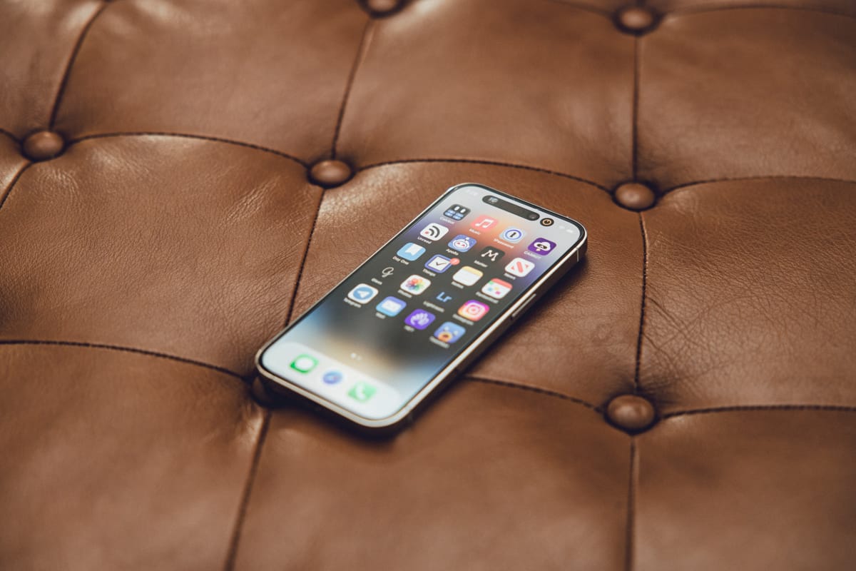
The iPhone 14 Pro’s Dynamic Island is just a little less useful than the always-on display — at least in my book. In its current iteration, the Dynamic Island represents a huge amount of potential — a new way to interact with notifications, the ability to stay up to date on Live Activities without having to beam into an app, and a new way to showcase iOS-specific animations. Right now though, a few things keep it from being really useful.
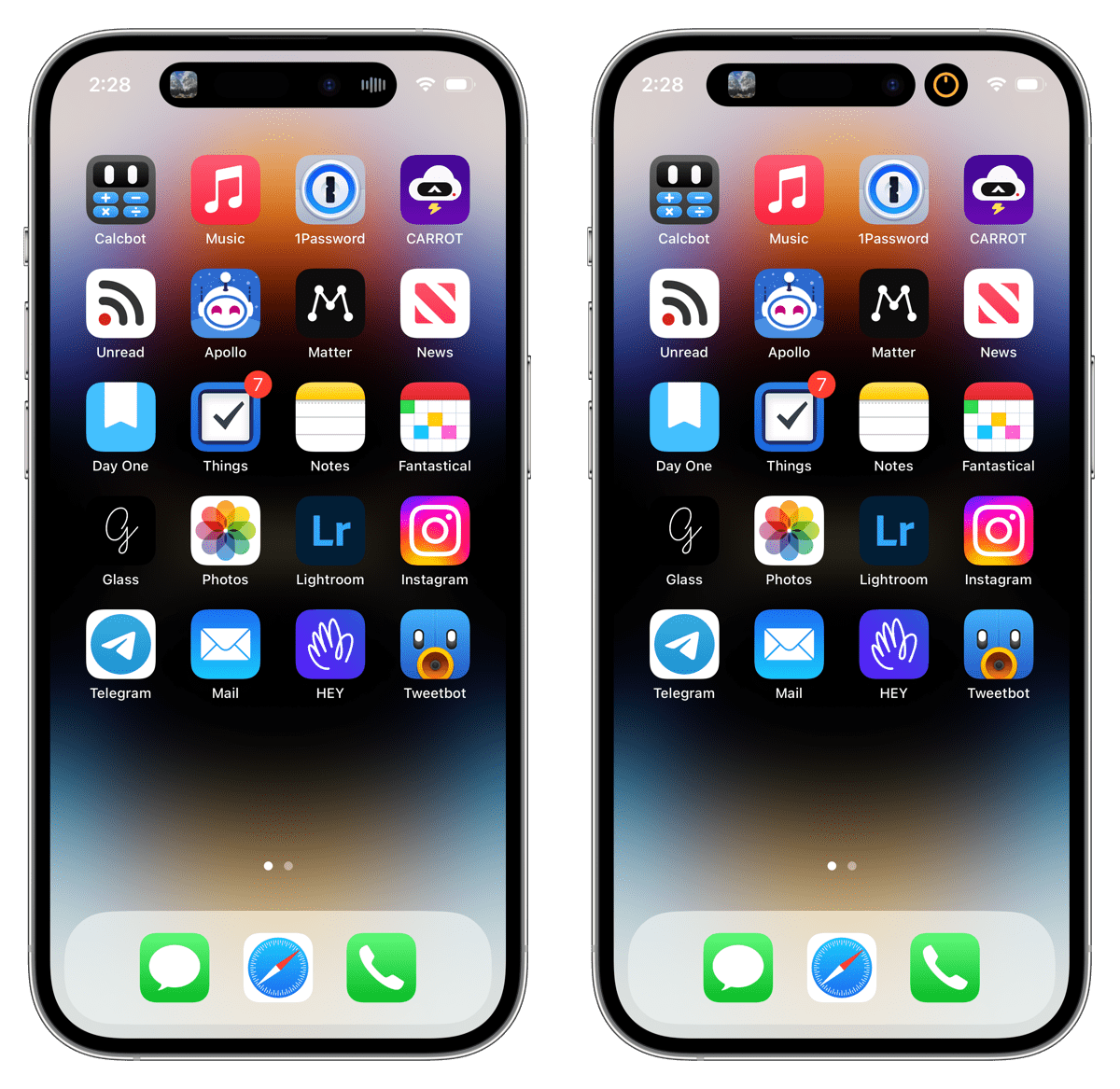
First, Dynamic Island is yet another notification interface. When you plug in the iPhone 14 Pro, the Dynamic Island expands to show you the current charge and that the iPhone is charging. When you connect a pair of AirPods, the Dynamic Island shows you which set of AirPods connected with a cool little image. When a phone call comes in, you can tap on the green or red buttons to take or decline the call. This is all so easy and so whimsical to use.
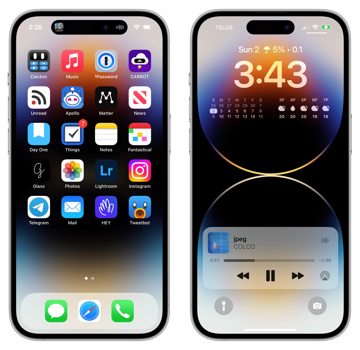
On the other hand, when a text messages comes in, the old notification UI banner slides in from the top of the iPhone — past the Dynamic Island no less — and intrudes even further into what you’re doing. When music is playing and you swipe away from the Music app, the Dynamic Island beautifully expands to show you album art and a visual EQ-thingy on the right. But when you unlock your iPhone on the Lock Screen, the interactive Now Playing UI stays on the bottom of the Lock Screen. Swipe into your iPhone and that UI goes into the Dynamic Island, where you have to long press to find the same Now Playing UI. And I dare you to view how some apps treat notifications while you’re actively in that app — the Dynamic Island is completely skipped over in apps like Telegram right now, for instance.
The Dynamic Island is messy right now. That’s all.
The iPhone 14 Pro is a transitionary device into a future of Dynamic-Island-only iPhones — a future where Apple can refine its notification interfaces into one whimsical UI centered around the front facing camera.
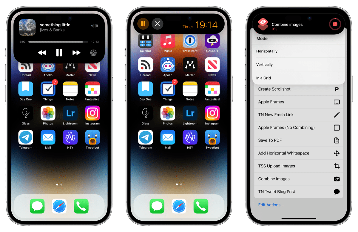
Second, I find myself constantly misusing the Dynamic Island. When music is playing and you tap the Dynamic Island, the iPhone zips you into the Music app. When a timer is running and you tap the Dynamic Island, the iPhone zips you into the Clock/Timer app. You have to long press the Dynamic Island to bring up the useful Now Playing button interface and the Timer interface for starting and stopping the timer.
As Nilay Patel stated in his great review on The Verge, this feels exactly opposite how Dynamic Island should react to a tap. A tap should bring up the Dynamic Island UI, not take you to the app. And a long press should take you to the app, not bring up the Dynamic Island UI.
All in all, Dynamic Island is a unique and beautiful way for Apple to maintain a high quality front facing camera and all the software whimsies surrounding FaceID, but it’s still a bit of a beta product at this point. I’m excited to see where Dynamic Island goes from here, but I’m not finding it paradigm-shifting in day-to-day use so far.
Wrap Up
There’s a lot to love inside the iPhone 14 Pro — more so than many year-over-year upgrades in the last few years, I’d argue. An always-on display, vastly superior front-facing camera and Dynamic Island, an incredible 48MP main camera with improved low light performance, a brighter display for bright sunny days, and (mostly) the same all-day battery life we’re now accustomed to thanks to the iPhone 13 Pro — that’s an impressive list for a year-over-year upgrade.
But I do find myself feeling quite opposite many of the initial reviews out there.
A) I’m absolutely keeping the always-on display on, as it wonderfully updates unobtrusively in the background and is fully controlled through various Focus modes you create.
B) The Dynamic Island is kind of neat, but not yet a feature you should upgrade to the iPhone 14 Pro for. It’s so much fun to see in action, but simply not yet used in enough ways to be considered a paradigm-shifting feature. Maybe in the future. Maybe in the future.
The Sweet Setup Staff Picks for 2022
We spend an inordinate amount of time sorting through hundreds of apps to find the very best. Our team here at The Sweet Setup put together a short list of our must-have, most-used apps in 2022.
