A First Impressions Review of the Planck EZ 40% Keyboard

I’ve officially gone off the deep-end — after a year or two of trying out different mechanical keyboards, I’ve made the deepest of dives into the world of 40% keyboards.
40% keyboards are as their name sounds — they sport 40% of the keys you’d find on a regular full-size keyboard and rely heavily on programmable layers to meet all key function needs. So while a 40% board omits the top number and function rows, number pad and arrow keys, and other navigational keys, you can still program capabilities into the keyboard to reach these functions in a small and light package.
The Planck is a specific type of keyboard — created by Jack Humbert — that sports an ortholinear key grid (rather than the standard staggered key layout found on 99% of other keyboards) and a 40% layout. Planck keyboards are often bought as a build-it-yourself kit, but you can purchase a pre-built Planck EZ from ZSA, the makers of the popular Ergodox EZ mechanical keyboard.
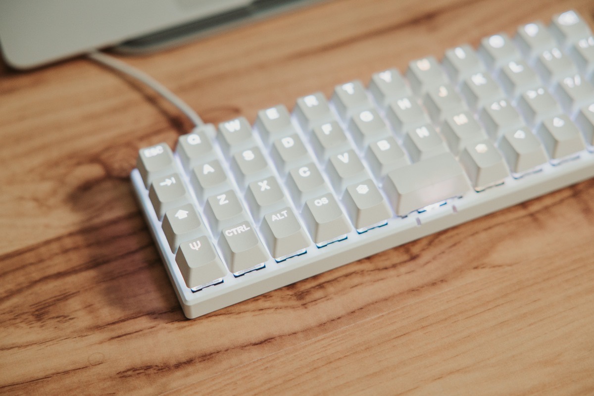
This layout is incredibly unique, even jettisoning the right shift key to make room for the enter key.
It was the lack of a right shift key that scared me away from the Planck keyboard when I first started down the mechanical keyboard path a year or so ago. The idea of holding down the left shift key for all keys seemed impossible and certainly didn’t seem to be worth the finger gymnastics required. In theory, the Planck looked enticing, but I could never imagine the mental overhead in dealing with a single shift key.
Recently however, “Tap Dance” was introduced for the Planck EZ. With Tap Dance, you can program a single key to perform four different functions. Similar to QMK‘s Quantum functionality, a single tap would produce one result, a hold would present a second result, a double tap would produce a third result, and a tap-and-hold would produce a fourth result. With this in mind, I immediately viewed that right-hand Enter key as a viable Tap Dance candidate that could reintroduce the right shift key to the Planck keyboard.
With Tap Dance, the Planck EZ went from being a non-starter 40% keyboard to an “I really want to try this” 40% keyboard.

Lastly, ortholinear — you can go down long rabbit holes on whether the ortholinear grid key layout is superior to the age-old staggered key layout we all know and love. Staggered keyboards, it can be argued, are glued to the past — keys are staggered up and to the side, which allowed for mechanical typewriter arms to avoid catching one another as the arms clanged the physical paper. (The same argument could be made about the QWERTY layout, but I’m not here to get into keyboard debates today.)
Ortholinear, meanwhile, has no need to adhere to the past. Instead, keys are aligned in a grid and lessen the amount your fingers need to travel to hit keys like the the “Y” or “B” key.
All of these features team up in the Planck EZ, the single most unique keyboard I’ve ever laid my hands on. Below are my first impressions, and my inevitable justification of the Planck EZ’s bigger brother, the Moonlander.
Build Quality, Key Switches, I/O, and Keycaps
The Planck EZ can be ordered through ZSA Technology Labs, a Canadian company that builds keyboards by hand in Taiwan. This production process yields a high quality level that permeates across the keyboard, across the software experience, and across the entire buying process.

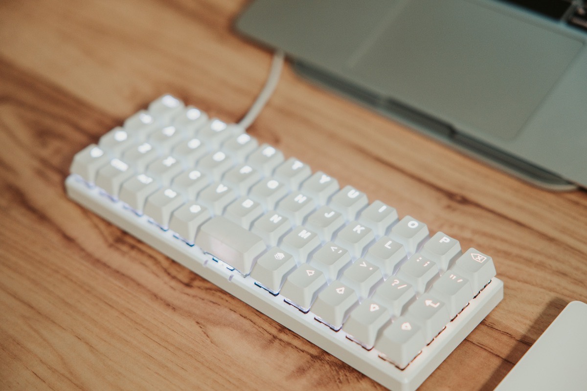
The base of the Planck is made of hard plastic and is thin and light — so thin, it provides excellent shine-through of the RGB key switches above.
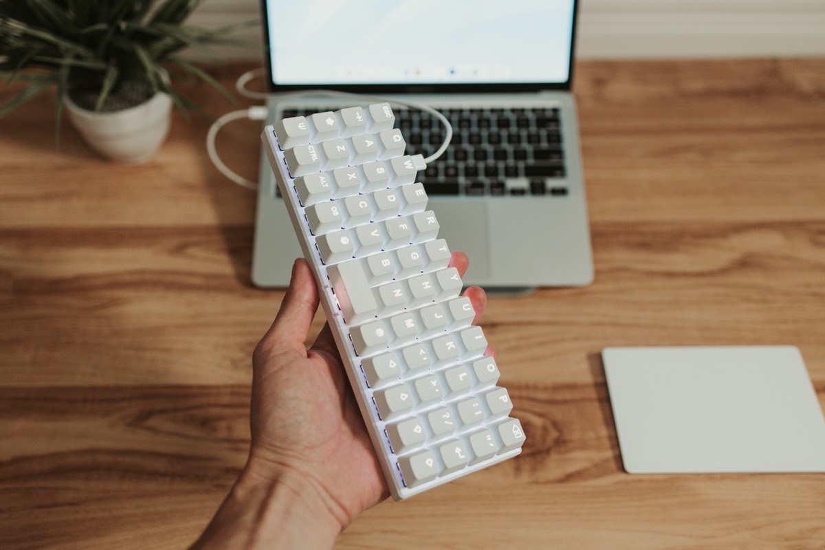
The keyboard is impressively light, potentially leading some to question the overall quality. However, in comparison to other plastic keyboards in my collection (like the Keychron K3), the Planck EZ feels of exceptional quality. I like the approach chosen here — the keyboard begs to be thrown in your bag and to use on the go, so weight savings are welcome.
Symmetry fans, take note — the board is completely uniform from top to bottom and left to right. There are no bottom bumpers that tilt the keyboard up at an angle, nor are there any keys that cause the board to be asymmetrical. Each key cap is a uniform profile (OEM Row 3), allowing you to move keys around the keyboard without worrying about irregularly shaped keys disrupting your tactile workflow.
The only notable disruption in symmetry is the placement of the USB-C port. The Planck connects via USB-C only, with a short USB-C/USB-C cord provided in the box. Some may either not have the open USB-C port available on their computer or would prefer a bluetooth option, so the Planck EZ will not be an option (without purchasing or using a USB-A/USB-C cable or adapter). On the other hand, a wired-only experience eliminates all connectivity headaches and ensures the wonderful RGB colorplays don’t destroy battery life.
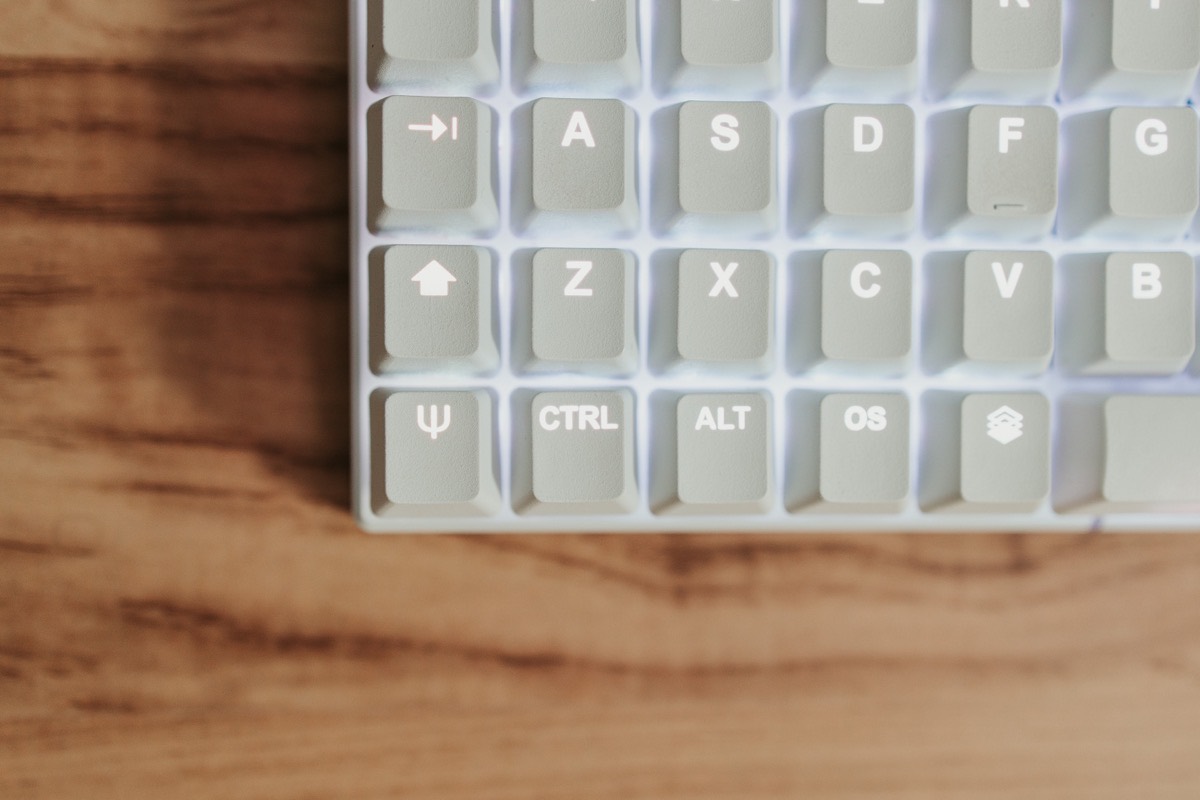

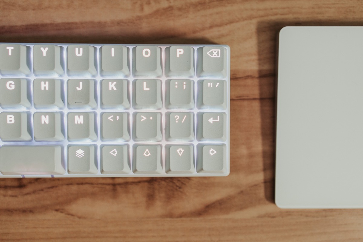
Keycaps are made by Taiwanese manufacturer Tai-Hao and are customized fully for the Planck EZ. Keys are made of PBT plastic, include double shot legends made specifically for the Planck, and are positioned right overtop the RGB lights for maximum color effect. The QMK key itself is a sight to behold, as are the custom Raise and Lower keys for getting to your programmable layers.
The keycaps feel fantastic and sturdy, though I am concerned my white keycaps will get dirty over time. I’ve already noticed a slight darkening of the “F” and “J” keys after only 2 weeks of use.
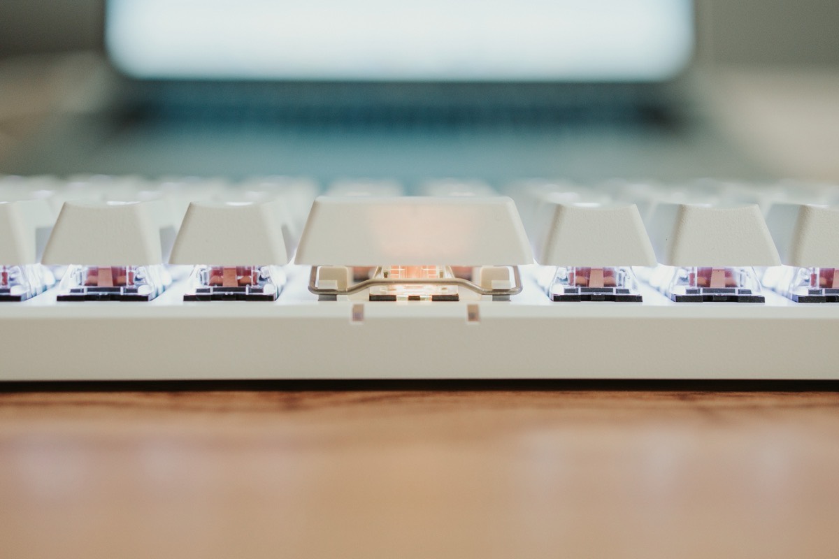
Stabilizers are solid right across the board, minus the space bar. The space bar is stable, fine. But it’s oddly easy to remove the key — just a small bump upwards and the space bar can pop right off.
As far as key switch options go, you will be hard-pressed to find a keyboard with more switch options than the Planck EZ. ZSA provides 16 different Cherry MX and Kailh switch options, from the classic Cherry MX Blues to the surprisingly-hard-to-find Kailh Box Brown switches.
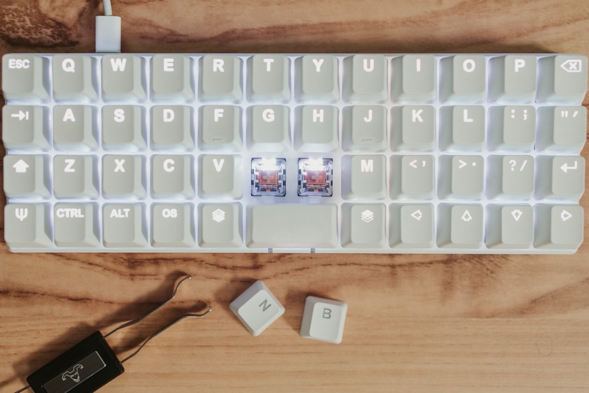
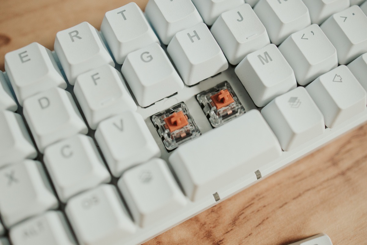
I opted for Kailh Thick Gold/Bronze switches — I’ve really enjoyed the hefty clack of the Keychron Optical Orange switches on the Keychron K3 (60gf actuation force on those switches), but I’ve found they are a little heavy for long writing sessions. I wanted that clickety-clack, but with a little less heft. So far, the Thick Golds (50 gf) have been perfect. I don’t know if I want to type on anything else anymore. Plus, if you want to try other switch options not offered at the point of purchase, you can easily swap out switches down the road thanks to the hot-swap sockets included on the PCB.
From a physical material perspective, no corners have been cut in the Planck EZ. The keycaps are custom and feel fantastic. The symmetry looks slick on a desk. The key switch options are some of the most diverse selections around. And — depending on who you are — you may even find the wired-only experience to be superior to the various wireless options available from other manufacturers. In my mind, if wiring up enables me to take this keyboard more places (as odd as that sounds), I’m game.
The 40% Layout
Looking at stock images and photos of the Planck EZ will surely be daunting. As I’ve noted multiple times already, there’s no right shift key. There’s also an irregularly-sized space bar, a horizontal arrow key layout, and misplaced Escape and Tab keys.
First impressions and first usage do leave a specific taste in your mouth with this keyboard, but it doesn’t take long to understand the power hidden beneath the Planck EZ’s minimal 40% layout.
That power all hides behind the Raise and Lower layer keys nestled beside the space bar.


By and large, these two keys act as special shift keys. For instance, holding down the Raise button and hitting the E key provides the number 3, not all that unlike a regular keyboard where the 3 is situated right above the E. If you hold Lower and hit E, you’ll get the # character, again exactly as if you press Shift and 3 on a regular keyboard. There’s a method and rationality to the Planck EZ’s madness and, if you’re used to the general layout of a full-sized keyboard, you’ll likely quickly understand the Planck’s general layout.
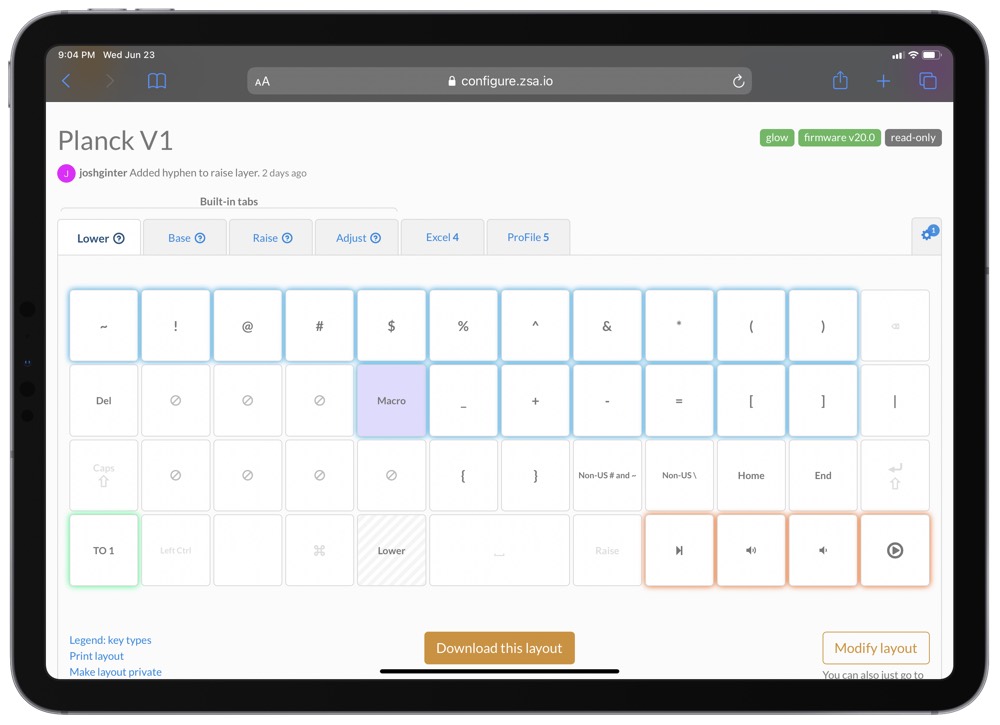
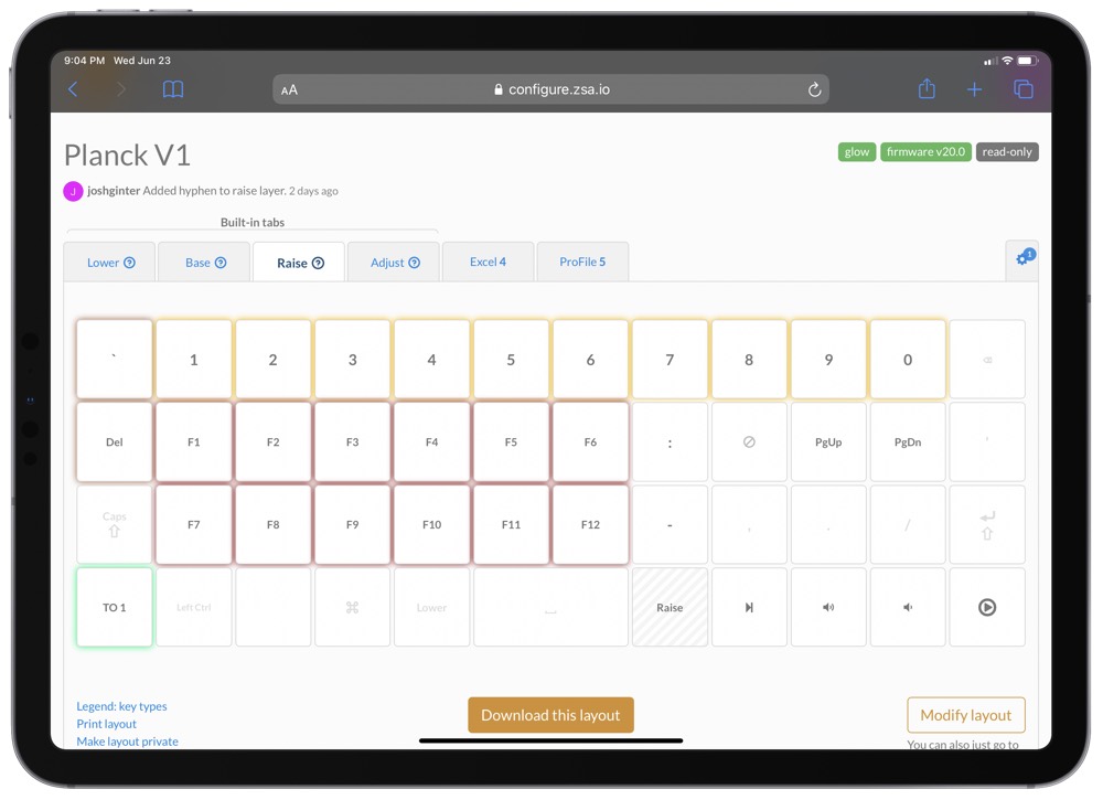
Of course, the default Raise and Lower layers are only the tip of the iceberg. Since each key can perform four different functions, you could actually customize the Raise and Lower keys to enter separate layers if you were to, say, hold it down, or tap it once, or tap it and hold it down. The Planck EZ can carry over 30 programmable layers (!!) to provide a keyboard layer for every specific need.
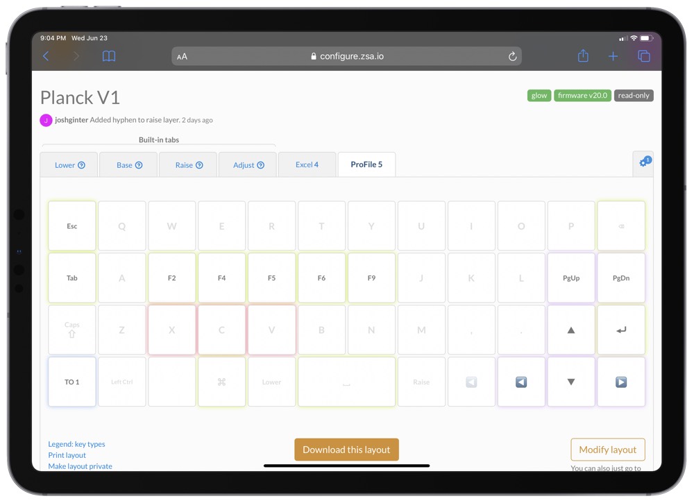
I’ve found I prefer to use the QMK key in the bottom left corner to unlock additional layers. I currently have it set to enter my “Excel” layer if I quickly tap the key, and I have it move to a “ProFile” layer (named after the tax software we use in the office) that helps me navigate tax forms with ease.
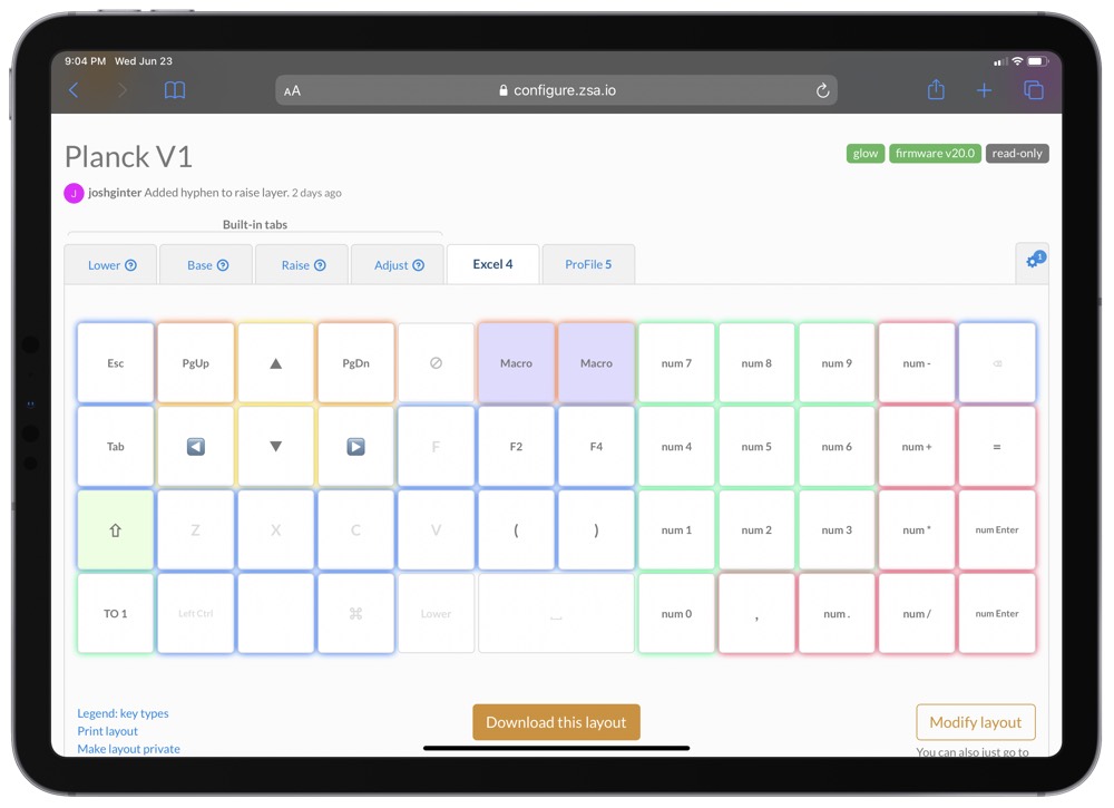
The Excel layer is a classic example of how much power is hidden behind the Planck’s 40% layout. On my right hand, I have a number pad setup, complete with all operators, decimals, and multiple enter keys (old adding machines I grew up on had large return keys, so I had to dedicate two keys to the enter function).

On the left, I have navigational arrow keys setup on WASD, page up/down navigational keys for quickly moving through a worksheet in Excel, two dedicated F-keys for jumping into a cell’s formula bar and for locking cells in a formula, and macro keys to move quickly between worksheets in an Excel workbook. The layer is simply fantastic for quickly jumping around an Excel worksheet and is something nearly impossible to program in a more standard keyboard.

Just looking at photos, I’d forgive you for looking at the Planck EZ with the assumption that it’s lack of dedicated keys were a sign of insufficient power. But after just a few weeks of heavy typing, I’ve come to realize this type of layout is more powerful than any standard keyboard I’ve ever typed on. Customization combined with minimal hand movements (after muscle memory, of course) make for a powerful typing workflow.
Oryx and the Planck’s Programmability
All the Planck’s customization is housed inside Oryx, a dedicated web app. Building a keyboard is more than soldering components and installing key caps — it’s also about programming the keyboard to function how you’d like. The combination of Oryx and Wally (the simple program that flashes the Oryx-generated file onto your keyboard) should completely squash any apprehension you have about programming your own keyboard.
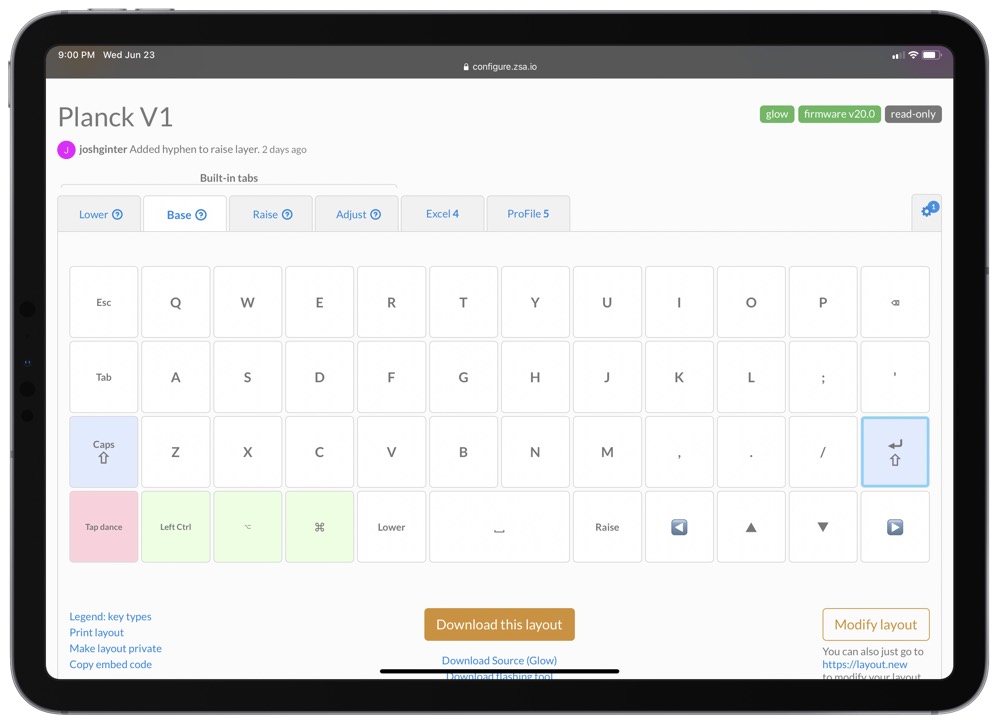
You can play with Oryx yourself even without a Planck keyboard. Go to configure.zsa.io and look around at all the shared layouts. You can quickly see different layouts, but also how those layouts are entered (such as a One-Shot Layer, or a Tap Toggle layer) and how each key can be colored to denote which layer you’re in.
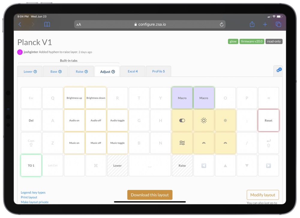
Essentially, Oryx is a click-and-select configurator. Click on a key, type in the function you want the key to perform, and move onto the next key. It’s wildly simple. You can also choose a per-key colour if you want to visually tell apart the keys in your layers, and you can do so by copying the color of other keys and pasting them onto other keys (a la Format Painter for your Microsoft Word aficionados). Oryx is a fork of the original open-source QMK software, which offers a similar configurator and tools for flashing your keyboard, but the ZSA team add a level of polish and ease-of-use that make it much easier and enjoyable to use.
Once you have your layout complete and ready for your keyboard, you compile the layout in the browser, download it to your computer, and use Wally to flash it to your Planck. A quick restart of the keyboard will you have your latest layout up and running on the Planck.

Once you have flashed your custom layouts to the Planck, those layouts live on the keyboard. This means you don’t need an app like Karabiner on the Mac to operate in the background, and it means all your keys work as expected on the iPad if you plug into Apple’s tablet. (Though, I’ll be curious to see how the new Globe key will work for custom keyboards in iPadOS 15). Once flashed, the Planck is literally plug and play. Wonderfully simple.
Other First Impressions
The more I use this keyboard, the more I fall in love with it. It’s easily the most powerful keyboard I’ve ever used. It’s easily the best feeling keyboard I’ve ever used. And it also happens to be portable enough to take basically anywhere I want.
There are, however, some more intricate impressions I have to share.
- I’m not certain I’m faster on the Planck EZ than on a standard full-sized keyboard. After two weeks, my typing speeds on an ortholinear board have largely returned to normal and I now feel uncomfortable on a staggered keyboard. However, switching back and forth between the Excel layer, the ProFile layer, and the base layer, where each layer has different arrow key layouts, has made for a lengthier muscle memory formation process than I’d like. Without a doubt, I have lost efficiency in my first two weeks with this keyboard.
- Which isn’t to say my typing speed has faultered — I was back to normal typing speeds in less than a day, which was certainly less time than I was expecting given all the YouTube reviewers suggesting it would take weeks to get used to.
- Despite some colleagues suggesting the four-key horizontal arrow key layout is superior, I cannot come to grips with this type of arrow key layout. I have tried again and again to get used to it and I just can’t. I jump into that ProFile layer a lot for a standard T-shaped arrow key layout.
- The Planck EZ can play sounds for each key and has some robotic chimes upon startup. I’m here for the startup chimes, but I find the per-key sounds to be much too nerdy for my taste.
- I’ve never been an RGB keyboard kind of guy — like the per-key sounds, I find RGB to look extra superfluous. However, I’ve come around on the Planck EZ. You can set each key to any color you’d like, allowing you to find the perfect variety of colors and backlighting to keep you in the zone. My personal favorite is a very simple purple-y-white backlight with a simple yellow flaring cycling through the keyboard. It’s simple, elegant, and exceedingly bright.
- In general, the RGB lighting on this keyboard is bright — keys aren’t perfectly uniformly lit, but the brightness of each key’s backlighting is seriously impressive.
- The little LED indicators below the space bar are great for telling which layer you’re in, if you don’t have per-layer or per-key colors set. I need to find out if there’s a way to indicate if you have Caps Lock set or if I could set the LED indicator for special programmed layers.
- It took a good deal of experimentation to determine the optimal “Hold” time in the Planck’s custom settings. In short, you have to define exactly what a “tap” and a “hold” are in terms of length. The default timing for a tap was far, far, far too long for my liking, and I cut the time almost in half. This does sometimes, however, result in a “hold” when I meant a tap, especially if I’m indecisive in the key I want to hit.
- Tap Dance and it’s four functions per key functionality is really cool, but it does result in a very slight delay when inputting functions. For instance, if you have multiple functions set to the “J” key, the Planck will wait to insert the letter J until it knows you aren’t going to double tap or tap and hold the J for other functionality. Overall, the delay isn’t majorly distracting, but it does carry the potential of throwing you off if your hold time is too long.
Wrap Up
Of all the keyboards I’ve written about so far (the list is growing!), I could spend hours writing about the Planck EZ. There’s so much to these 47 keys, it’s almost overwhelming.

And in most respects, I don’t think the Planck EZ gets a fair shake from would-be buyers. The layout looks daunting and the marketing page — though extraordinarily well-designed for a keyboard manufacturer — doesn’t do an overly great job in quelling fears about the Planck’s functionality. People hear “Only one shift key” and immediately check out. I’ve had more clients than I can count ask me how an accountant could use a keyboard like this, and their eyes glaze over when I start to describe layers and programmability.
Either I need to become a better storyteller or a new marketing swing needs to knock down some of the fears folks have with small keyboards. (It’s likely the first option, mind you.)
But I genuinely think this keyboard would have a better rapport if more people tried it. The transition period has been significantly shorter than I anticipated and the power behind the layers has exceeded expectations. It hasn’t taken long to get comfortable inside Excel on a single layer of keys.

I also think the Planck EZ is a slippery slope into the new Moonlander MK 1 from ZSA. The Moonlander is the Ergodox’s seeming successor — an ergonomic, split, ortholinear keyboard with thumb clusters for the ultimate in productivity, efficiency, and ergonomics. I’ve obsessed over the Moonlander for months and the Planck became the trial run for whether I could use the Moonlander in an accounting and tax setting.
After only a few weeks, I have concluded on two things:
- The Moonlander would more than meet any needs I have for the office and would likely carry a shorter transition time than the Planck EZ.
- The Moonlander likely has too many keys for my liking.
All other keyboards have too many keys. The Planck EZ just had to show me all the waste on all other keyboards.
