Using Craft Notes for Study and Preserving Long-Term Knowledge

I’ve been going to school for 10 years. It’s been a long, long road, full of all sorts of amazing lessons, few of which have anything to do with the actual content I’m studying. These 10 years of school have been a testament to the “The journey is the destination” mentality.
As I enter the last six months of this post-secondary journey, I find myself looking for ways to preserve what I’ve learned. There are so many reasons to preserve what you’ve learned, from the future need to reference, for future connective thought, for future discovery and re-learning.
And I want to preserve the journey in as beautiful a way as possible.
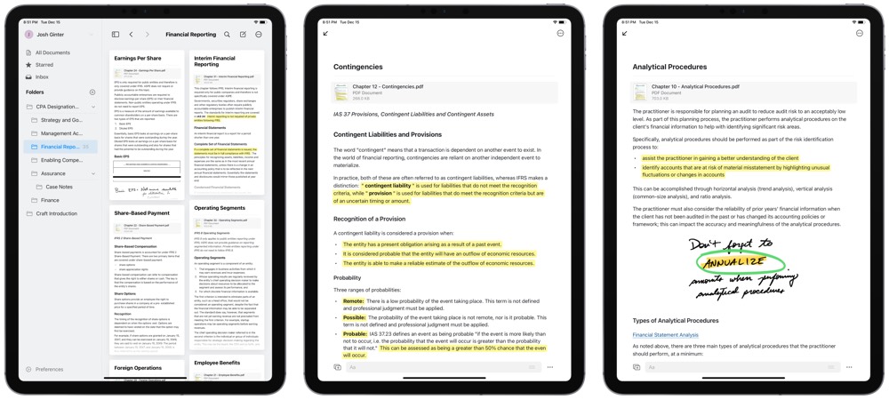
Craft is the final step in a giant workflow I’ve nestled into since my first years as a post-secondary student in 2009. Craft is a more beautiful solution than I ever thought possible, with features seemingly perfect for the type of studying and long-term knowledge preservation I’m looking for.
Craft, An Introduction
It’s hard to exactly pinpoint Craft’s app category. It’s a note-taking app, to be sure — the app handles text in blocks (much like Notion) that can handle all sorts of bulleted lists, Markdown text, images, sketches, code blocks, PDF files, rich link previews, and more.
But Craft is much more than a simple note-taking app. The app’s collaborative features are simple and easy to use, making for a unique writing environment for multiple individuals to craft something together. Sharing your work to others is also possible within Craft — you can provide a private link to friends or family to look at and comment on your work.
It’s also a knowledge wiki, of sorts. Craft has the ability to create pages within blocks, to backlink to other pages, and to connect your different documents to synthesize your work.
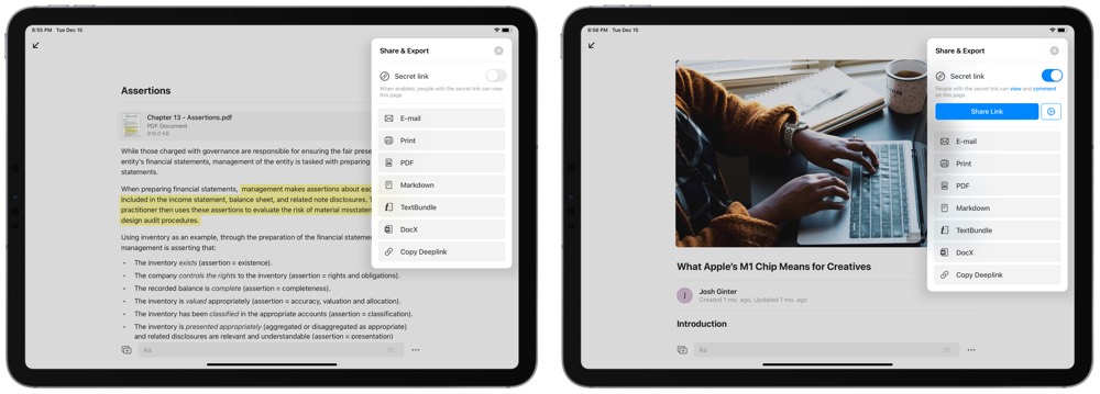
Craft is also a word processor, in a way. Once you’ve created your documents and pages, you can export the final result as a PDF, a Markdown document, a TextBundle, or a Word document.
I’m most interested in those last two features — the knowledge wiki and the word processor — but Craft doesn’t have to suit you in the same way. Craft is wonderfully flexible for a native app that has such incredible polish.
Craft’s Beautiful, Native Design and Experience
Craft reminds me a lot of Things 3.
That is some of the highest-praise I can give.
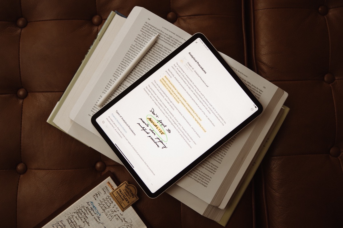
From the start, Craft showcases its flexibility in a simplistic combination of whitespace, typography, and splashes of color. You can change the app’s accent color and app icon in the app’s settings, though I’m not sure what’s wrong with the defaults, myself.
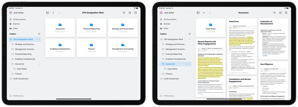
The initial view on all of the iPhone, iPad, and Mac is a document drawer. You can manage your documents in folders in a pane on the left side of the display and you can jump into any document card on the right.
Tapping into a document showcases another view of whitespace and typography, with color splashes in tappable page blocks that you can customize to your liking and beautiful image galleries nicely formatted to fit comfortably in their own block.
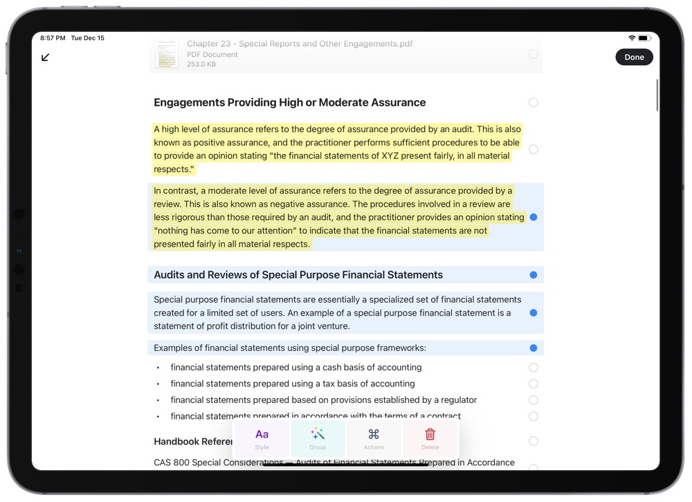
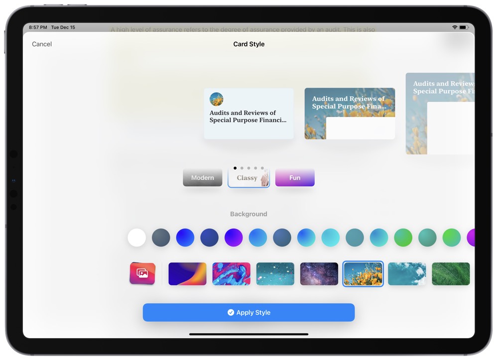
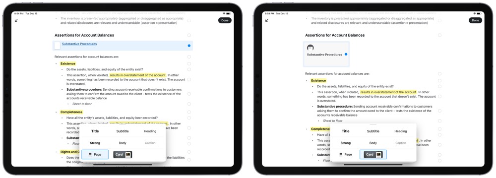
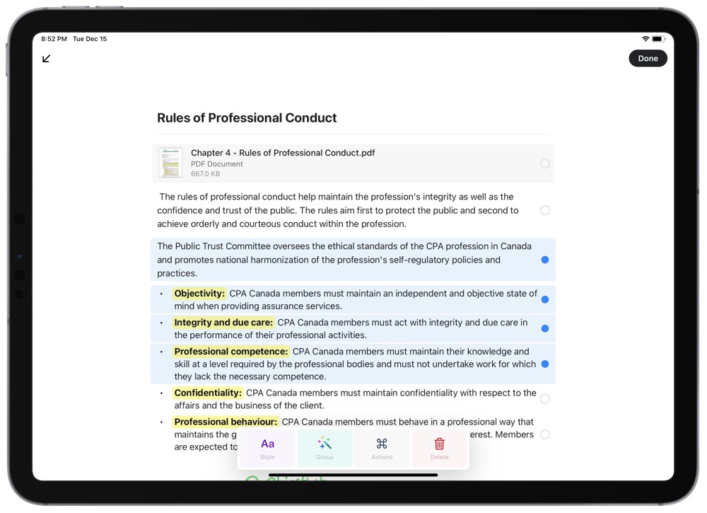
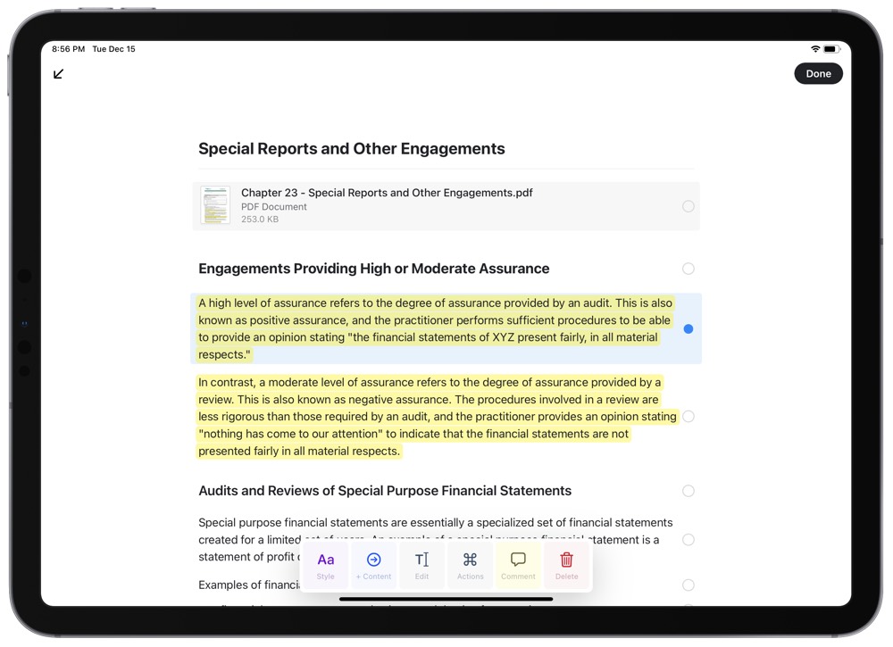
Selecting blocks is pretty cool, especially on iPad. A quick and short swipe to the left on any block quickly selects the entire block and provides you with options to style the content, jump to the content’s individual page (á la Roam Research), act on the content, comment on the content, or delete the content. Using the quick swipe gestures, you can select multiple blocks and style or comment on them accordingly.
A block can be turned into a “Card,” which has its own Card Style view. You can adjust these styles to fit your personal taste, and they are presented simply as a block within the rest of your document text. Tapping on any card jumps you straight to that page and you can jump back to where you came from by tapping the back arrow in the corner.
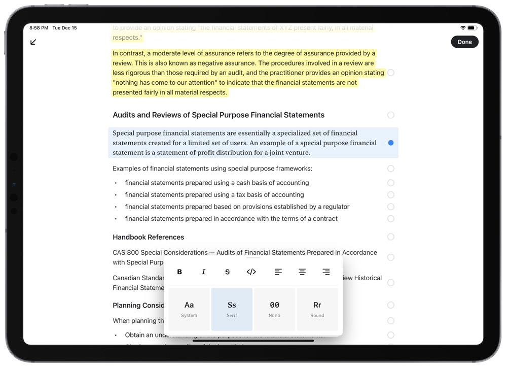
Of course, these pages can all be styled in one of four different fonts, with the serif option being my personal favorite. You can quickly style text with different colored highlights, strong or italics (though, oddly, no underlining), and different text colors. I use bolded and highlighted text all the time (CMD + Shift + B being the keyboard shortcut for highlighted text) and the multi-colored highlights bring out the most colorful parts of Craft’s design.
And the entire app is native — there’s no web app to be spoken of and everything runs natively on your iPhone, iPad, or Mac. The result is a fast, iOS and macOS-ready app that has design chops fit for a king.
Everything about Craft has taste and polish — the design makes you want to find a way to use the app, even if you don’t have a direct need for it.
Pages, Blocks, and Documents
These are somewhat hard to keep my head wrapped around, but the terminology starts to bake itself in after awhile. Here’s the Craft team’s breakdown of the terminology:
- Every paragraph in Craft is a
Block, and every block can have its [sic] own content. So in other words a paragraph can act as a piece of text, and as a title of a note — allowing you to create a simple structure. - Blocks that have content are called
Pages. They can be styled the same way as any regular block would be, but if you tap on them, you navigate inside them. Documentsare, well, documents. These behave very similarly as they do in your filesystem. You can star them, move them into folders, and so on.
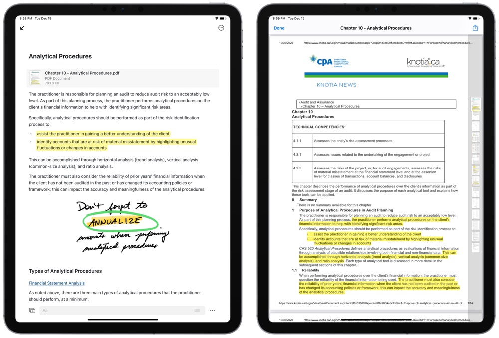
Coming up with a structured approach is difficult no matter which app or service you’re using — you don’t know how your needs are going to build out over the next few months or years. It’s no different in Craft — as I work through this knowledge preservation step of my studies, I’m not sure I’ve yet discovered the best way for structuring everything.
So far, I have folders for each major section of designation work. From there, each main topic or competency has its own page. Inside, I’m using subtitles and headers to break apart topics within each competency and I’m attempting to insert backlinks to other pages that relate to the current page.
However, since you can create these page-within-a-page pages, I can see there being multiple ways to structure your files and work.
Our Must-Have, Most Used Productivity Apps
We spend an inordinate amount of time sorting through hundreds of apps to find the very best. We put together a short list of our must-have, most-used apps for increasing productivity.
Block Types and the Sketch Block
The greatest strength of these block-based note-taking apps like Notion and Craft is the ability to house all sorts of content-types in line with other content-types. One block can house Markdown text, the next a PDF, and the next a sketch completed on the iPad. This block-based workflow is tremendous for study.
As I noted above regarding my document structure, each topic or competency has been given its own page. This page houses notes, PDFs, screenshots, links to other competency pages, diagrams, formula blocks, and more — essentially anything I’ve come across on that respective competency.
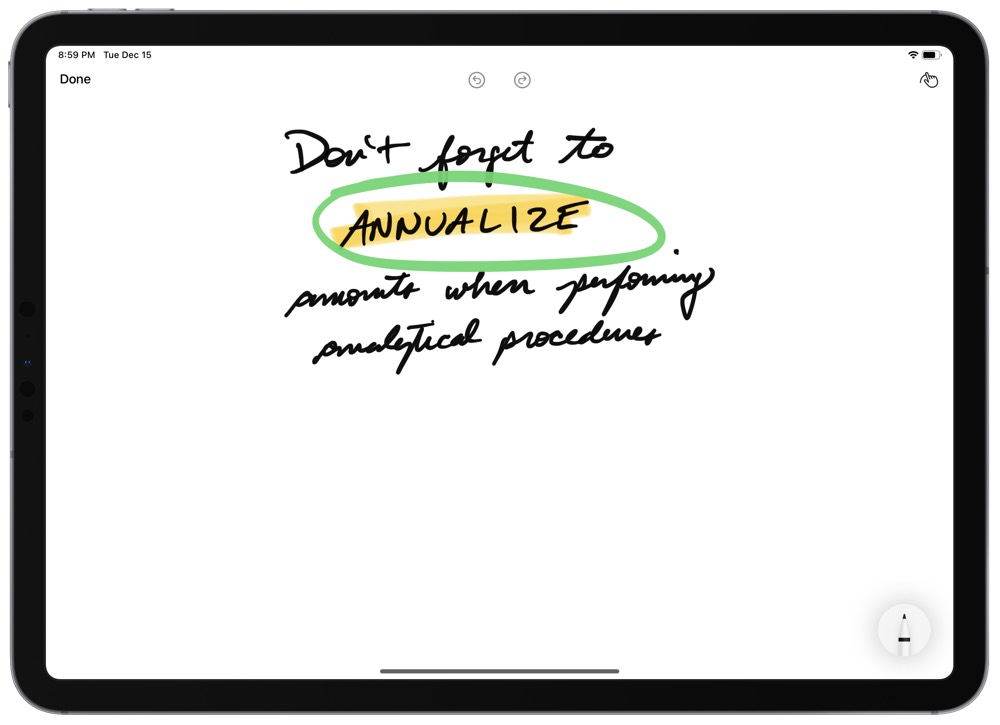
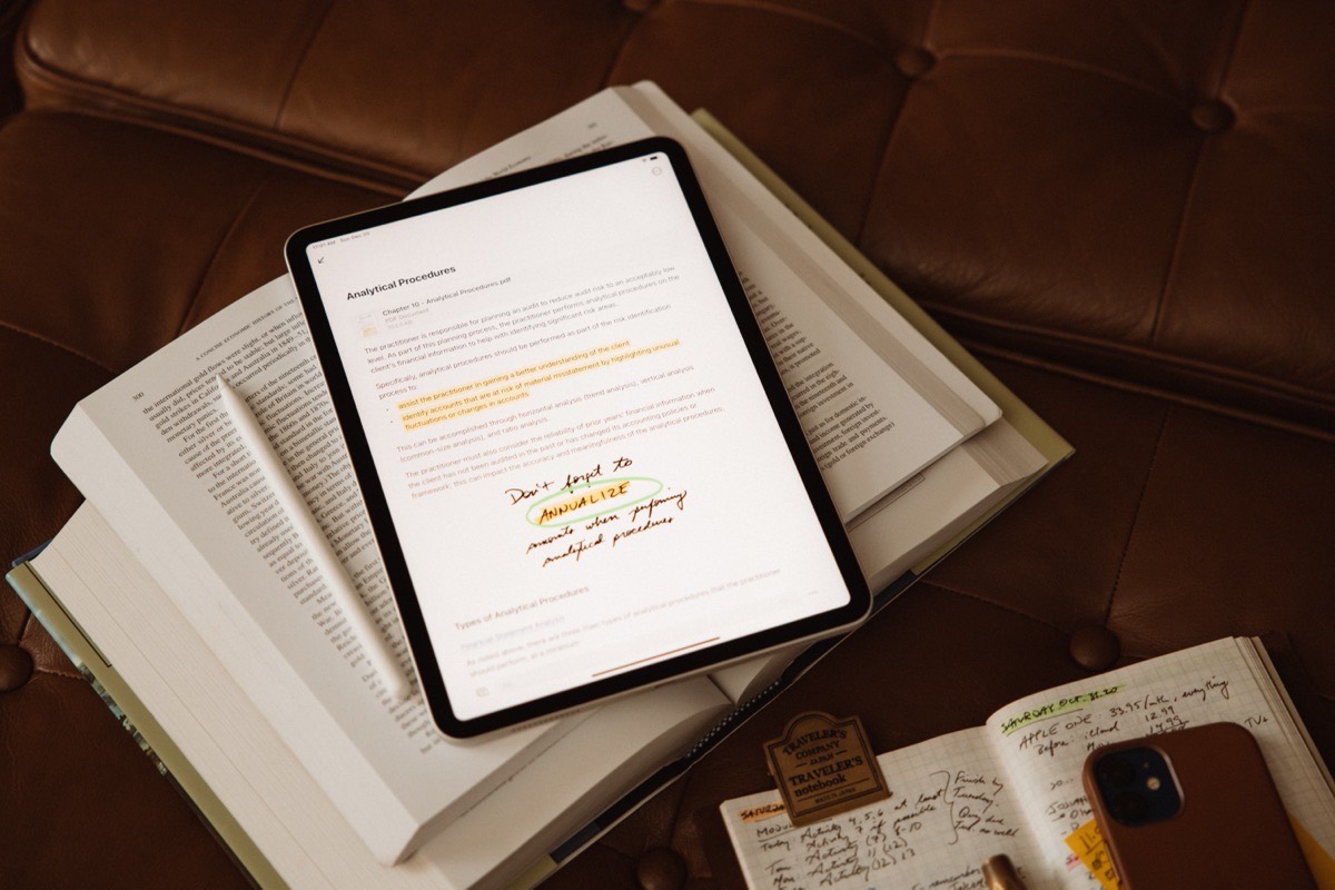
The most powerful block type for my use is the sketch block. On iPad, you can quickly insert a sketch block by tapping the dd Block button above the keyboard and tapping Sketch. Craft provides an iOS-default Pencil-ready view for handwriting or drawing out your ideas as you see fit.
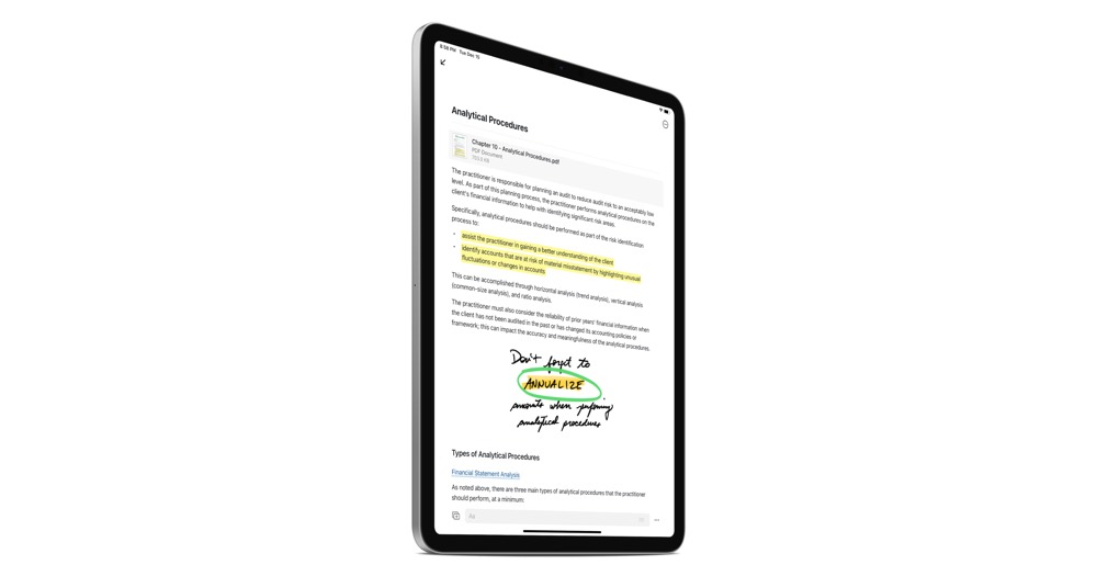
By so easily implementing this sketch block type, Craft makes itself the best app for studying that I’ve found. As you review for your next big exam or assignment, you can peruse your typed out notes, create a sketch block, handwrite whatever it takes to ensure you remember the point, and leave the sketch block simply in line with the rest of your studies. Handwriting is still the best way to learn, and Craft provides the option to both type and handwrite to ensure comprehension.
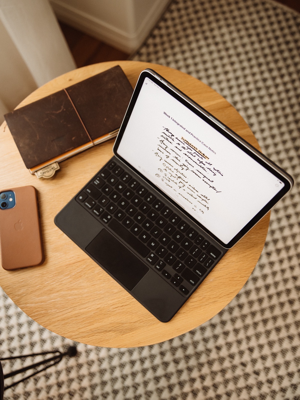
This, to me, is the single biggest benefit of using an app like Craft for study.
Collaboration
Though I find little need to collaborate on my personal studies with colleagues, Craft’s collaboration features are impressively well done and worthy of mention.
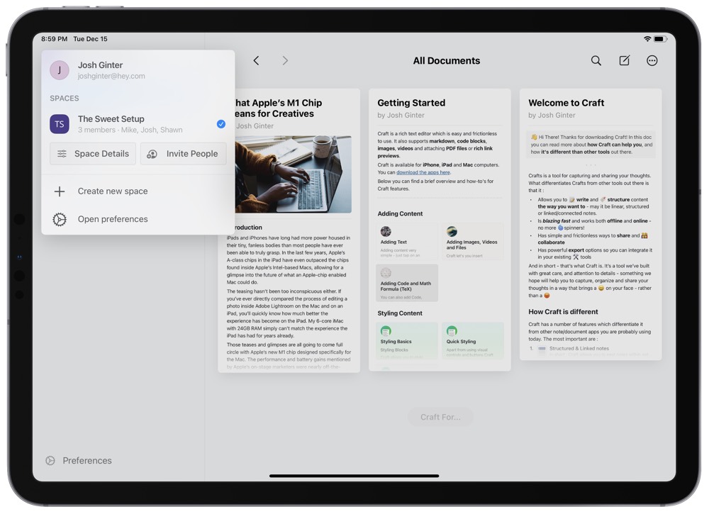
Craft’s main collaboration feature is as expected — by creating a shared workspace with another individual who has subscribed to Craft, you can work on documents together in real-time. An indicator in the top right corner showcases which changes were made at what times, and Craft provides a color-coded in-line indicator to show who worked on what. In my testing with Mike Schmitz here at The Sweet Setup, sync was fast and reliable.
Second, Craft allows you to create a private link to any page in the app. Once shared, the recipient can peruse your work on a page on the web and even provide feedback in a comments section — all without needing to sign up for Craft. To an extent, I can see this working great for students — a quick private link can be sent to your trusted colleagues to provide feedback.
Export
Craft supports multiple formats for exporting your work. You can export Markdown files, PDFs, TextBundles, or Word documents, which should cover 99% of one’s exporting needs.
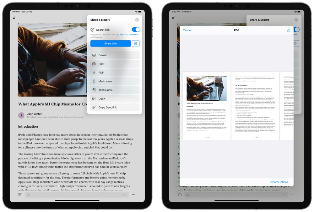
Once I’m done crafting each individual page for each competency in my studies, my goal is to put this exporting feature to the ultimate test. Ideally, my goal is to export each page as a PDF that can be stored and referenced in the future. PDFs seem to be ubiquitous and durable when it comes to digital evolution. By providing PDF exporting options, Craft ensures your work is likely to be around for decades to come.
Other Miscellaneous Points of Flattery and Contention
My list of features to shout praise for is pretty long, so I’ll shorten it up a little:
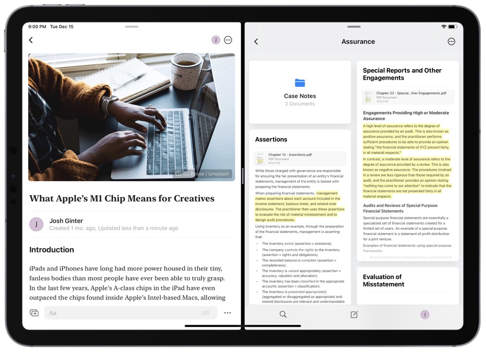
- “Native” for iOS and macOS means Craft supports the latest iOS-specific features like Multi-Window, Split-View and Slide Over. Craft adjusts window size wonderfully for Split-View on the iPad, and the app handles sketch and image blocks very well on the iPhone as well. Drag and Drop also works very well on the iPad, and is really the only option you have for importing content from other iPad apps.
- Craft has pretty strong keyboard support on the iPad and even has its own custom “Keyboard Shortcuts” window that you can dive into when you hold down the Command button on iPad. Using the arrow keys, you can jump between blocks. Hit Enter to jump into the block’s content and hit
CMD + .to escape out of the block’s content. You can move blocks around by holding down the Command key and using the arrows, and you can go back a view by holding down Command and using the left arrow. There are some hiccups for keyboard support here and there, but this app can say keyboard support is a strength and not a weakness. Of course, like Notion, you can use the slash command (/key) to quickly find all sorts of styling and content options for a block, all without having to click or tap any buttons.
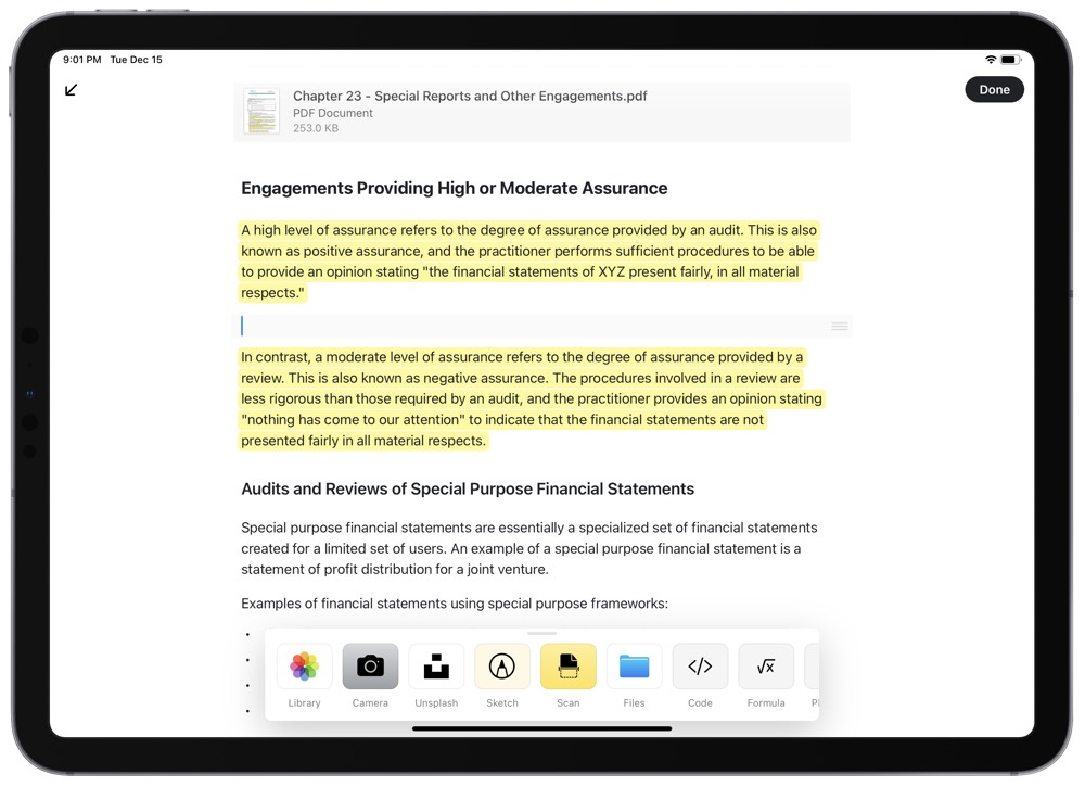
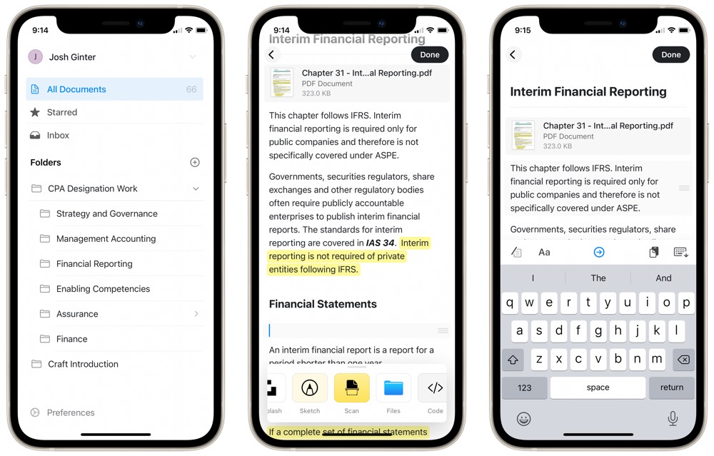
- On the iPhone or iPad, you can quickly scan documents into a specific block by adding a “Scan” block type. For students, this will be particularly great for adding in printed materials to your personal knowledge wikis.
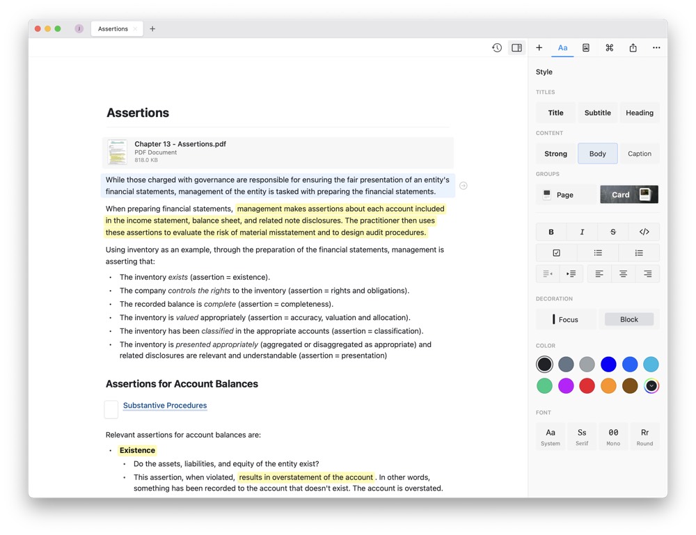
- The Mac app has its own editor view unique to the Mac app. Much like Pages, Craft has a variety of styling features in the right sidebar while you work in a document.
And, of course, there are some things that need work:
- Craft is not designed to be a cloud storage app. A subscription to the app provides “unlimited use,” but unlimited use means 100,000 blocks and 10GB of storage. If you’re only going to house text in Craft, 10GB should be plenty. And 100,000 blocks is a large sum to utilize. But, it’s not infinite. I reached out to the Craft team and they stated they’re open to adjusting these limits if they find users running into the limitations. Nevertheless, they specifically said they do not want to become Dropbox.
- It took an extra few minutes to figure out how to collaborate directly with a teammate. In short, you need to create a new workspace that is shared amongst other Craft users. This isn’t immediately obvious in the app.
- Craft isn’t the least expensive app subscription available and finds itself somewhere between the cost of Bear Notes and Roam Research. Bear Notes costs $15 annually, Notion prices in at around $48 annually, and Roam Research costs $165 annually. Craft comes in at $45 annually, nicely alongside Notion, but it’s not as inexpensive as Bear if you’re looking to save a few bucks.
- Finally, I’m semi-disappointed not to find a proper importing feature. Were I to want to move entire libraries of content from an app like Bear or Keep It (or more mainstream apps like Evernote or OneNote), there isn’t an immediate workflow to bulk import past notes.
Wrap Up
I’ve never been truly giddy to write a long story about how my study habits have evolved over the years. Post-secondary studies are usually a somewhat-fleeting moment of a person’s life and major habits or workflows do not always translate into the next chapter of one’s career.
But the way Craft so effortlessly fits into the last stage of this study workflow has made me want to dive into other facets of study to showcase how well other apps fit into study habits. PDF Expert, desktop-class Safari on iPad, and GoodNotes all find themselves in the same category of usefulness.

Craft may be the pinnacle of these apps though. It seems perfectly designed to bring all forms of content and knowledge into a consolidated document that can be manipulated in an endless number of ways. And it does so with perhaps one of the best app designs available on the App Store today.
I’ll be touching base soon regarding the rest of this study workflow, but rest assured: Craft is the icing on the cake. This is one of those few apps you want to make room for once you’ve seen it in action.
Our Must-Have, Most Used Productivity Apps
We spend an inordinate amount of time sorting through hundreds of apps to find the very best. We put together a short list of our must-have, most-used apps for increasing productivity.
