Review: The Peak Design Everyday Messenger Bag (V2)
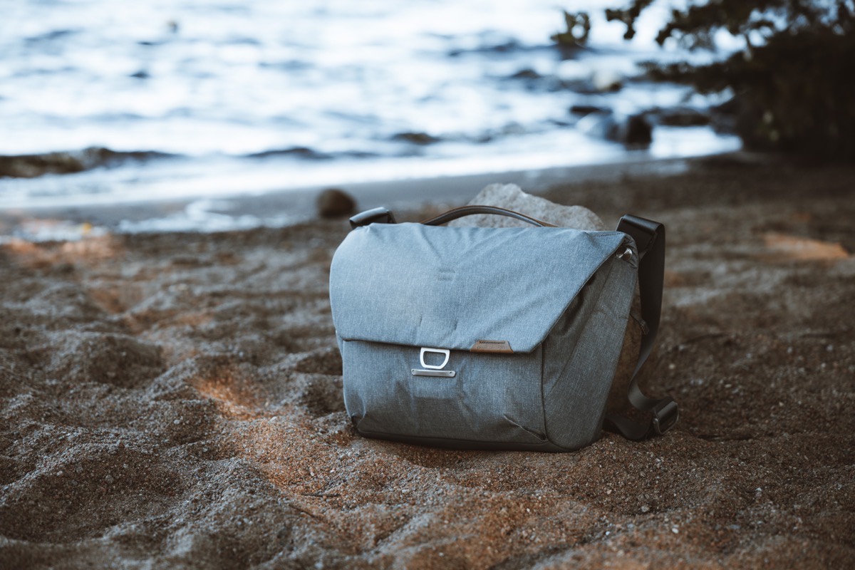
Our original review of the Peak Design Everyday Messenger (dated September 20, 2018 — or basically, what feels like eons ago) was pretty positive, alluding to the bag’s perfect Flexfold dividers, neat tricks like tripod sleeves and top flap access, and a somewhat large size for carrying a healthy amount of camera kit or everyday-carry belongings. That bag was awesome and checked off a remarkable number of boxes for me.
Two years later and Peak Design has released Version 2 (though, I beg to call this Version 3, as my first review of the Everyday Messenger was actually the second iteration of the bag that carried the latest version of Flexfold dividers and a new colorway), designed specifically to address some of the shortcomings of the original Everyday Messenger:
- The bulky, squared-off design
- Somewhat small laptop and document storage sleeve
- Less functional internal organization inside a compartment that tended to fall open too easily
- A shoulder strap that was prone to slipping across your back if carried across your shoulders
- A flap that flared out and away from the main body, making used bags look less pristine and more worn
The Everyday Messenger V2 clearly aims to address all of these shortcomings, while still maintaining what made the original EDM so great.
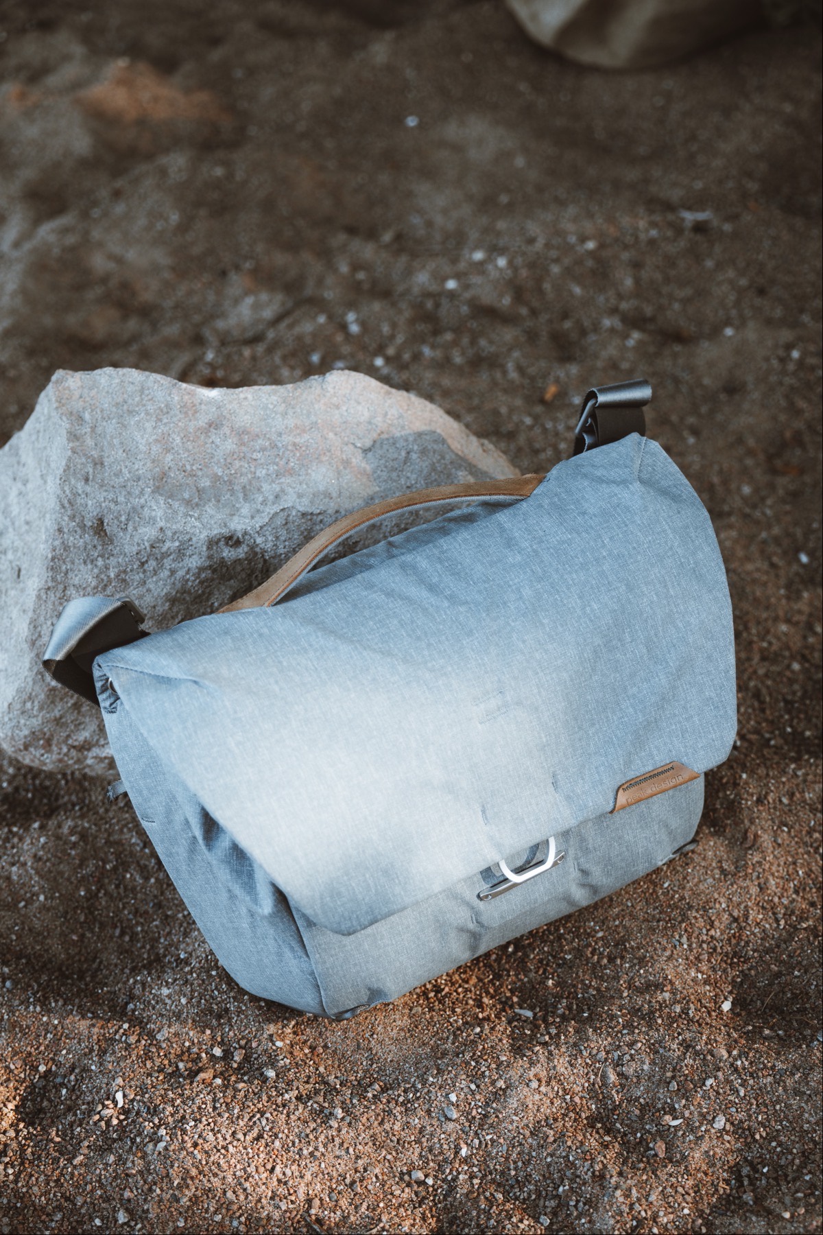
In large part, the EDM V2 succeeds.
However, I feel there were a few compromises made along the way that lessen the appeal of the bag for me, specifically.
Editor’s Note: Peak Design sent this bag for the purposes of review. As with all of our reviews, the following is my honest thoughts of the bag.
Design, Build Quality, and Materials
The original Everyday Messenger utilized a weatherproof 400D nylon canvas with high-density padding underneath to ensure a durable, take-anywhere design that could battle the elements if needed.
The Everyday Messenger V2 one-ups the original and now sports a 100% recycled and Bluesign certified material, providing not only durability and weather-proofing, but also ensuring sustainability. This is a tremendous accomplishment on Peak Design’s part.

The improved materials also come in a refined form factor. Where the original Everyday Messenger was a tad boxy, the second generation Everyday Messenger has a much slimmer and sleeker profile. The bag sits and feels better on the hip and the flap tends to stay in place far more than the previous Messenger. I’m not sure if I’m correct in saying it, but it almost feels like the bag is “rounded off” to properly sit on your hip or back — this is probably the most comfortable messenger bag I’ve carried on or across my shoulders.
On the other hand though, the refined form factor has resulted in a few compromises I find myself missing from time to time.
First, the Everyday Messenger V2 only comes in a 13-inch size, eliminating the larger 15-inch size that could carry a full 15-inch MacBook Pro (presumably 16-inch MacBook Pro as well) and which had more internal storage capacity.
Second, gone is the top zipper panel that opened directly from the top of the bag to provide instant access to your camera inside. I used this instant access zip all the time on the old Everyday Messenger and I miss it whenever I take this new bag out for a bike ride or stroll.
Third, there’s no longer a dedicated tripod sleeve for carrying a tripod on top of the bag. With the original Messenger, you could slide one of the tripod’s legs into an interior sleeve built into the top flap and you could secure the tripod to the bag with a rubber band and a locked MagLatch. The Everyday Messenger V2 has jettisoned this tripod sleeve and rubber band, and instead opts for Peak Design’s now ubiquitous CordHook connectors instead. Strictly my opinion: The old tripod sleeve was a far superior method for carrying a tripod than the new CordHook connectors.
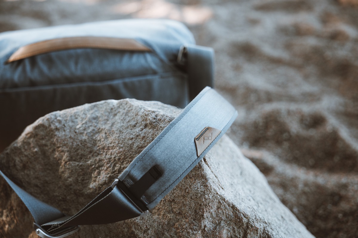
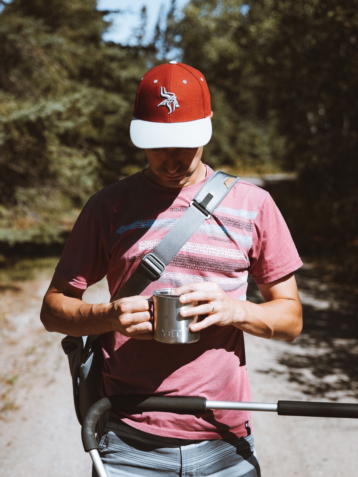
The Everyday Messenger V2’s strap is superior to the original’s, with the latest edition utilizing the same seatbelt material, the same sliding adjusters that are found on Peak Design’s camera straps, and an improved aesthetic and design.
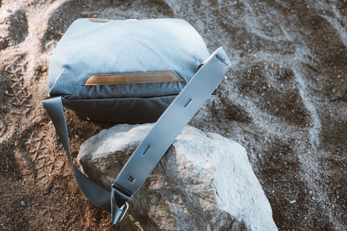
On the backside of the strap, the new Everyday Messenger sports a more tactile material, ensuring the strap doesn’t slip on your back as often. Perhaps of all improvements to this latest bag, the non-slip shoulder strap is the most noticeable — I know a few folks who completely disregarded the Everyday Messenger because of the poor comfort of the strap. They’ll be quite happy with this new design.
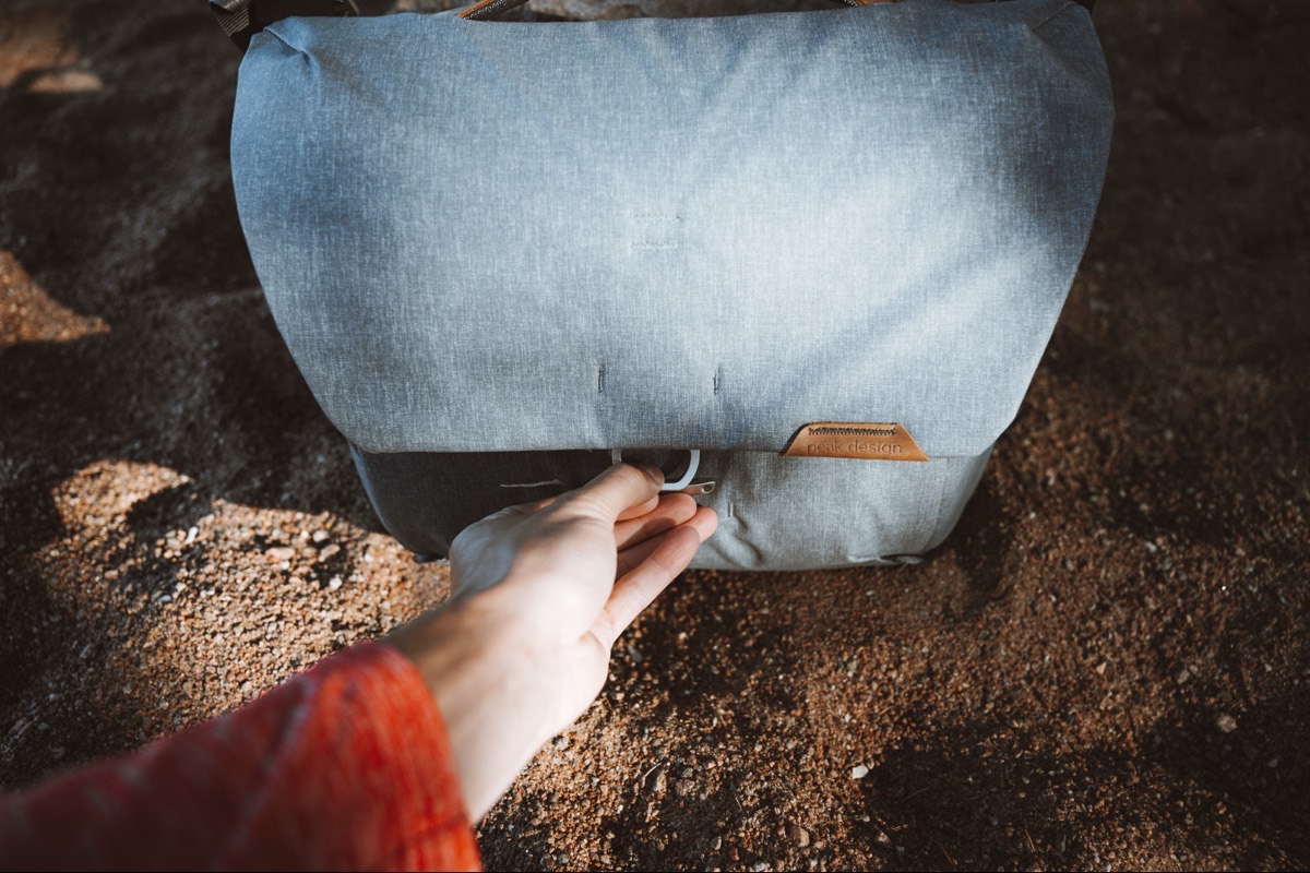
The former MagLatch was never in need of a major overhaul and is one of the most unique ways of providing more internal storage capacity. The Everyday Messenger V2 carries on with the MagLatch, but it has been updated with a sleeker, more rounded design. The rounded design fits the rest of the bag’s updated aesthetic and, in my opinion, feels better in the thumb or index finger when pulled to open or close the bag at different increments.
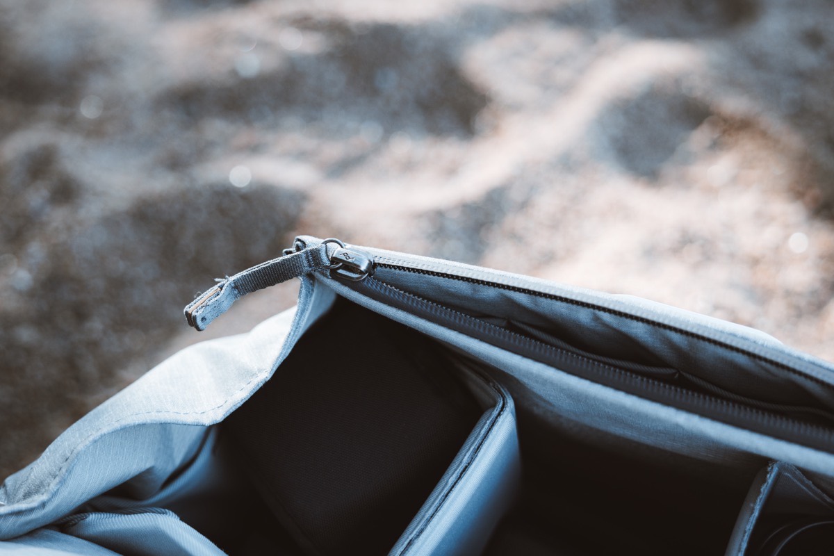
Zippers have also seen a refinement in this second generation Everyday Messenger. Zippers stood as one of my hallmark complaints of the original bag — they felt very, very regular, and provided little extra compared to how they were marketed. This second generation bag is vastly improved, with the front-facing storage sleeve closed off with a weatherproof zipper that is big, durable, and slides nice and smoothly.
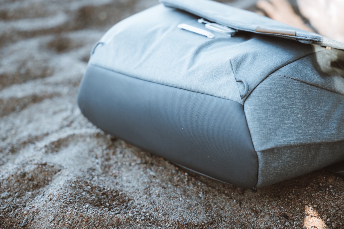
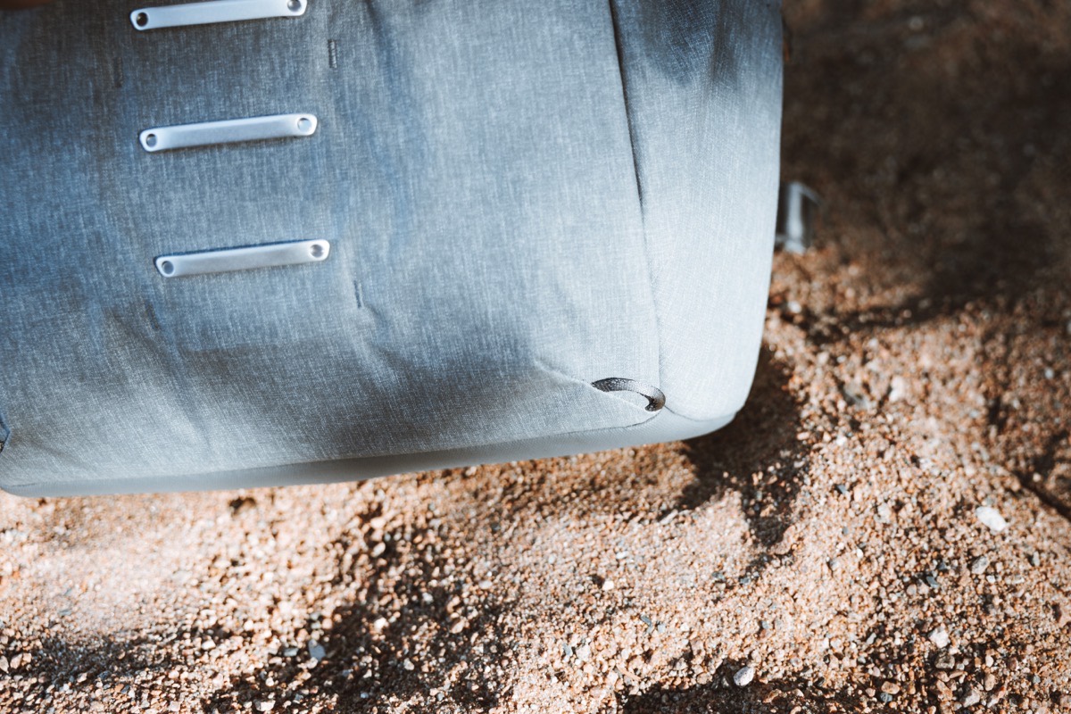
The bottom of the bag maintains the same synthetic/leather material of the prior Everyday Messenger, ensuring the bottom of the bag doesn’t get wet if you place the bag in dew-drenched grass or accidentally in a puddle.
My last comment about the exterior design and materials has to do with the change in flap sturdiness. The new Everyday Messenger’s flap constantly wants to close on itself, making it a near-requirement to use two hands to put anything into the bag. If the bag is loaded such that it can sit straight up (which I feel is more difficult with this bag than with the prior Everyday Messenger), the top flap naturally falls down into an almost-closed position. You can’t pinch or even bend the flap to stay open as you work with two hands inside the bag — the flap will simply fall onto your wrists and forearms and block your vision of what you’re doing inside the bag.
This isn’t terrible, but the former front organization section in the prior Everyday Messenger has been cast aside for a pocket format in the Everyday Messenger V2.
This is another change I’m disappointed in with the latest bag.
Internal Organization and Flexfold Dividers
The former front organization flap in the Everyday Messenger V1 was a near-perfect way of providing instant access (and visual recognition) of accessories, batteries, and other doodads stored inside. Here’s a photo from our past review:
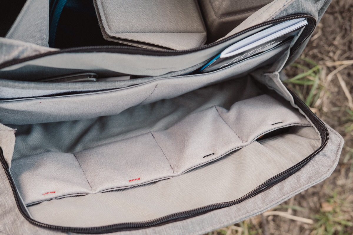
The biggest drawback of this flap was that, when fully opened, it could fall and strew all your stored accessories out and onto the floor or table.
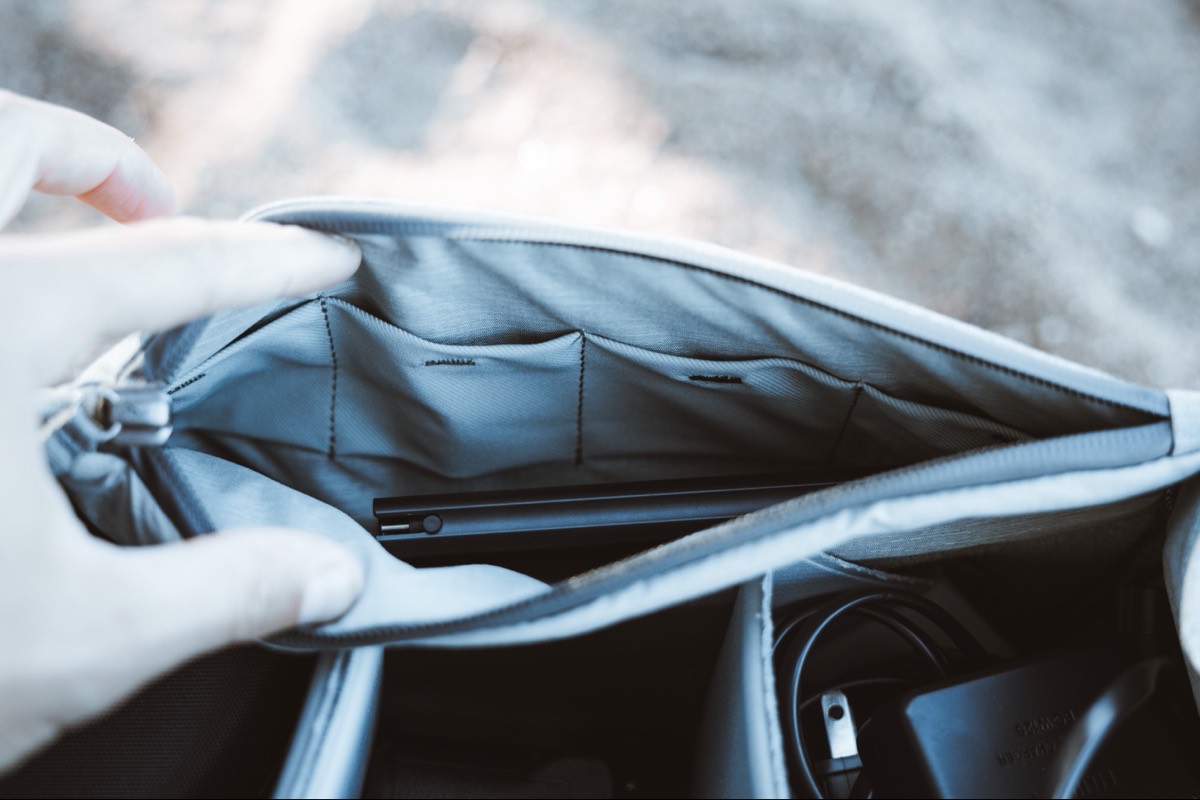
The Everyday Messenger V2 maintains the visual cues (specifically, the black and red stitching in each of the sleeves to mark charged/empty batteries and SD cards), but the front flap section is no longer a flap section at all.
Instead, we’re left with a six-inch deep pocket designed to store batteries, SD cards, and other accessories. It’s significantly smaller and less capable than the prior front organization flap. At most, I can keep an iPhone, a Field Notes book, and a spare pen or two alongside a few extra batteries and SD cards. Before, I remember keeping small tripods in the front sleeve (like Manfrottos PIXI Mini). The pocket format provides less expandability for this front pocket and I’m left leaving accessories like a battery charger sitting loosely in one of the Flexfold Dividers instead.
Plus, there’s still no pen sleeve, something I wished for last time around as well.
I find this front organization sleeve the biggest disappointment in the Everyday Messenger V2.
Get Our Best Photography Tips & Workflows
Transform your photos and edits from average to awesome with our in-depth, mobile photography course. It’s jam-packed with training, ideas, and lessons that can literally transform your photography overnight.
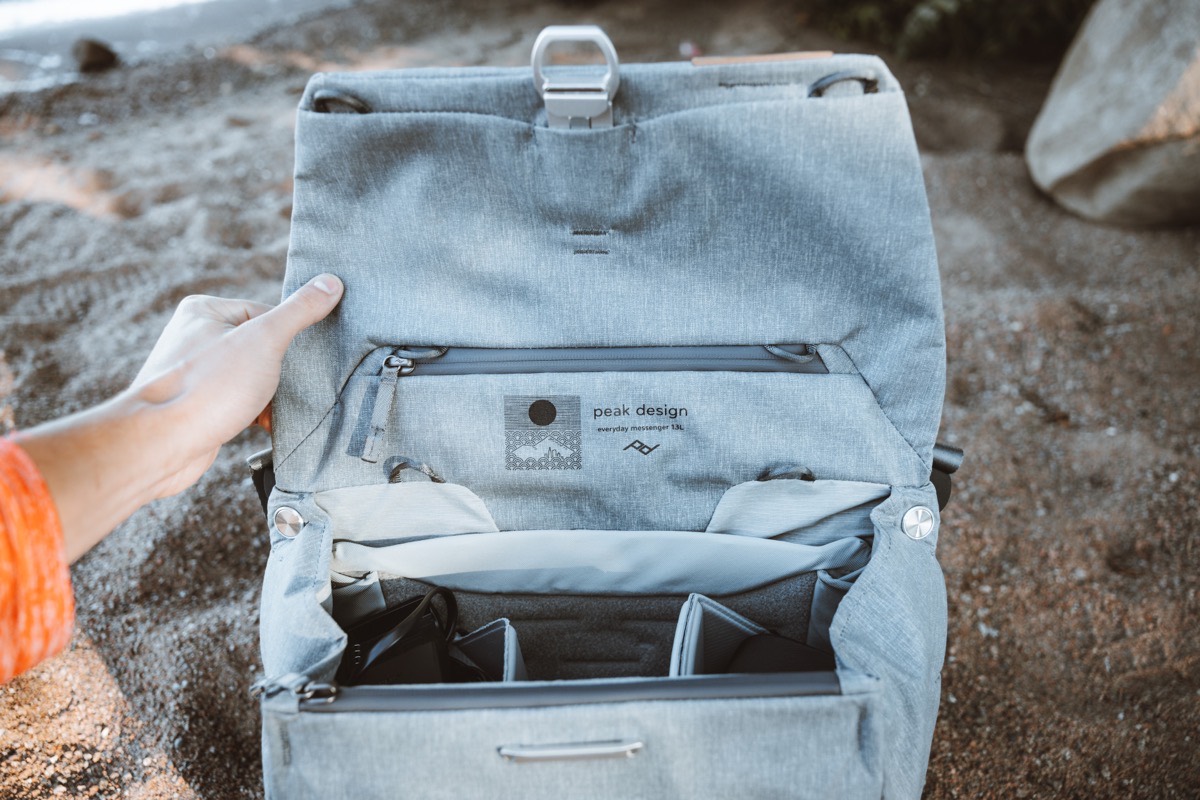
There’s a second zipper pocket on the inside of the flap cover, much like the prior generation Everyday Messenger. I remember the prior pocket feeling bigger, but this is probably chalked up to the smaller 13-inch bag size.
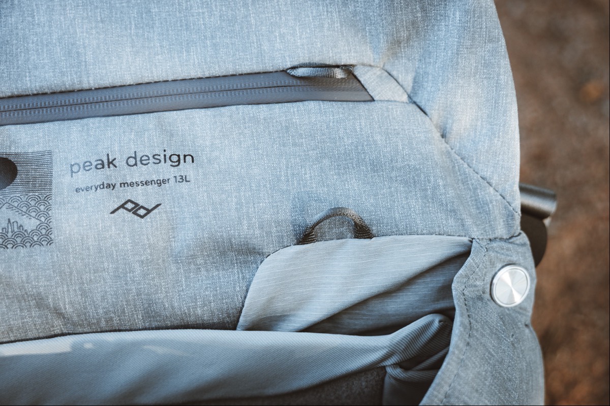
Inside the pocket are the CordHook straps for carrying a tripod or drone or extra large accessories on the outside of the bag. As there’s no particular good place to keep these straps, I’ve left mine inside this pocket, drastically cutting down the pocket’s usability for other accessories.
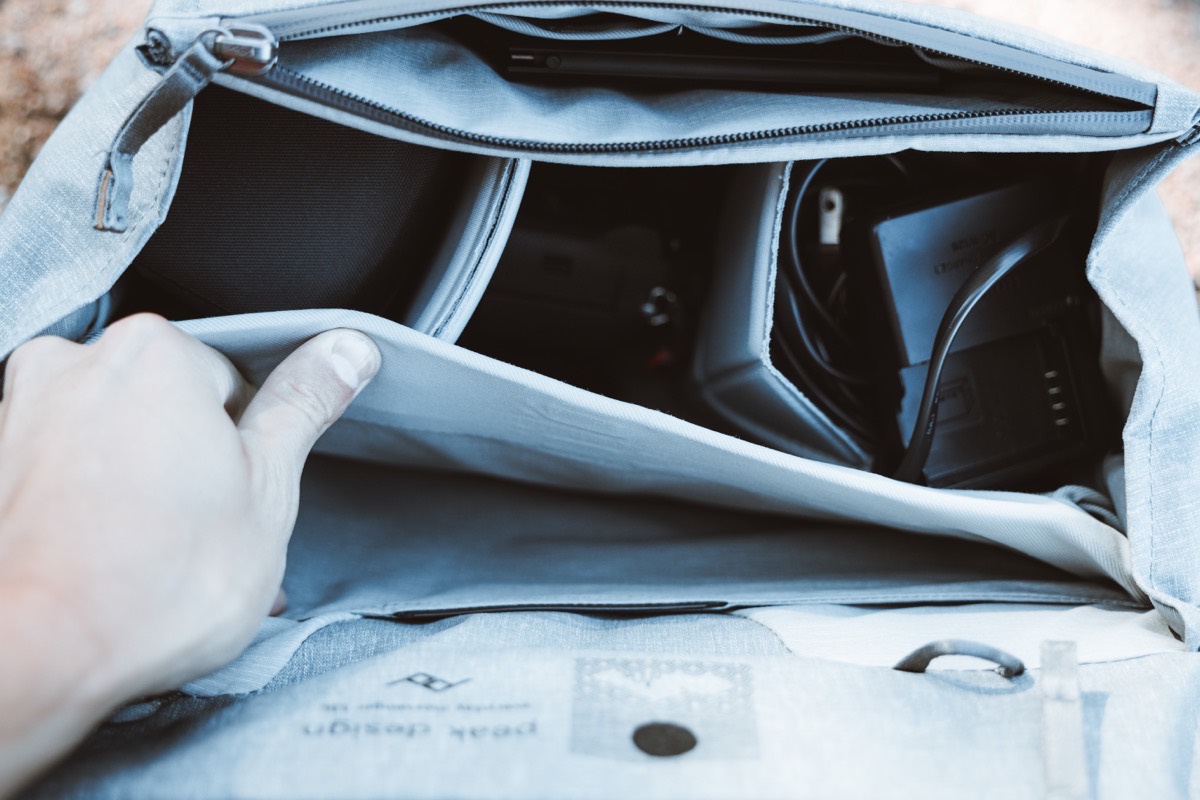
The Everyday Messenger V2 moves the laptop and document storage sleeve to the inside of the bag, providing better protection and security for your computer. This is likely my favorite improvement in the Everyday Messenger V2 — the prior bag was notorious for falling onto its backside (somewhat hard, I might add) when a 15-inch MacBook Pro was loaded into place before any camera equipment was loaded in the main compartments to hold the bag down. So whether this 13-inch size is better suited for handling the weight of a 13-inch MacBook Pro (or iPad Pro with Magic Keyboard) or whether moving the laptop sleeve to the interior of the bag, I find this bag falls over much less often when just an iPad or laptop is loaded up.
On each end of the main interior compartment are two pouches for storing additional accessories. I instantly thought of storing a battery charger or a flash remote/transceiver in these pockets, but quickly found they end up expanding too far into the bag (rather than out towards the exterior of the bag) to be reasonably usable. Instead, I find they intrude on the Flexfold Dividers and cut down on the space in those slots.
Overall, I’ve been fairly negative about the decisions Peak Design has made in changing and upgrading the Everyday Messenger. There are likely numerous factors at play that I haven’t considered, but I do feel there are significant steps backwards in the V2:
- Smaller, less accessible front organization pocket
- Smaller, already-filled pocket inside the top flap
- Two interior pouches that are somewhat usable, though intrusive on the interior storage
But where Peak Design nailed moving the laptop compartment inside the bag, they also nailed (or, rather, perfectly maintained the status quo) with the Flexfold Dividers. I have a variety of Peak Design products in my kit, and when I think of Peak Design, I think of these Flexfold Dividers.
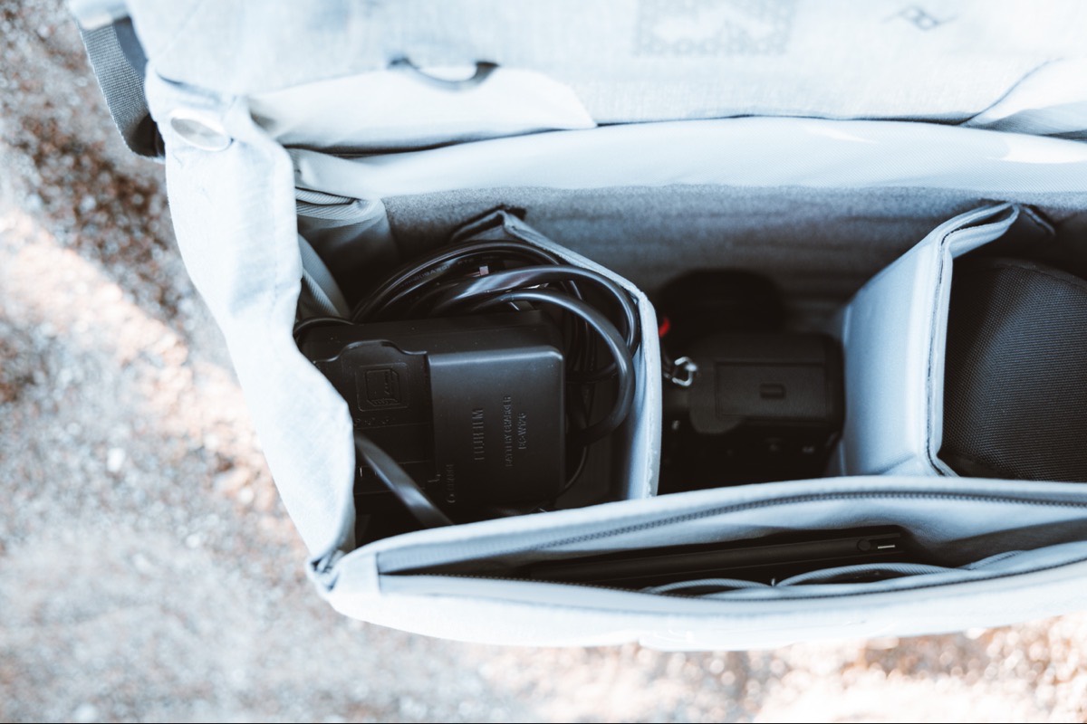
Like the prior generation V2 Everyday Messenger that shipped with the improved Flexfold Dividers, this official V2 Everyday Messenger houses two of the improved Flexfold Dividers. You can alter and maneuver the two dividers just about any way you’d like — the Velcro fasteners attach to the inside of the bag and are very easy to rip apart and reposition on a whim. And, of course, the Dividers have the best origami folding features available on the market.
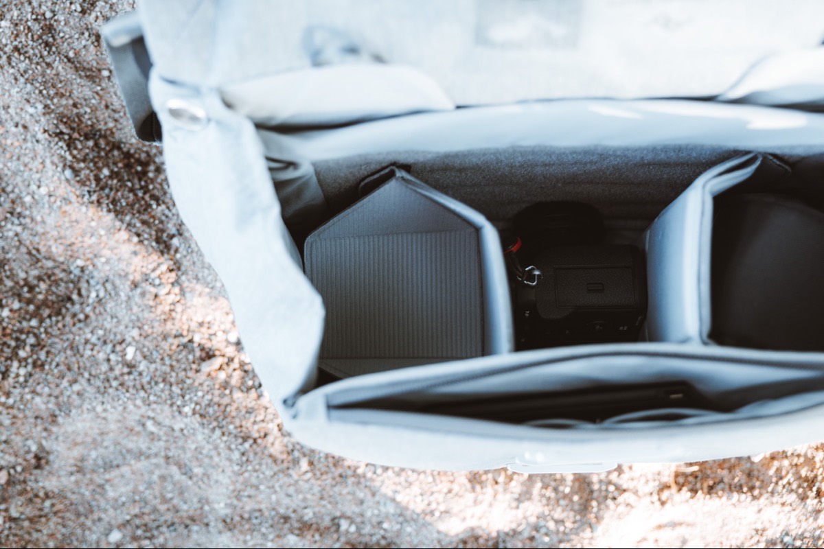
I’d love to see a cross-section of the bag to see exactly how much space there is in each “shelf” — I store a Canon RF 35mm f/1.8 STM Macro lens on top of one of the shelves and generally keep a battery charger or flash remote underneath, and I’m curious about how much space is utilized in the process. As it is, it’s great to have immediate access to that lens, with less used accessories stored safely underneath.
On the opposite side of the bag, I generally store a Godox V1C flash inside its case. This flash takes up the entirety of one of the Flexfold slots, so I don’t use the shelf folding feature in that slot too often.
And in the middle, I keep my Canon EOS-R and Canon 24-70mm f/2.8 RF-L IS USM facing down for fast access.
The shelves provided by the Flexfold Dividers make for safe organization inside the Everyday Messenger V2 and I’m ecstatic Peak Design didn’t make any changes to these dividers.
Other Anecdotes Worth Discussing
Everyone uses bags and accessories differently, so certain features will stand out to different people. A quick bullet list of less-noticeable features for me looks like this:
- Exterior pockets are available for storing your phone or keys, just like the prior Everyday Messenger. These particular pockets are much bigger and much easier to access than the prior Everyday Messenger, however — it’s significantly easier to store an iPhone and keys inside these pockets, especially with the additional corded Peak Design anchor system for attaching your keys in one of the pockets.
- The top portion of the outside sides of the bags are very sturdy and have a pass-through designed specifically for Peak Design’s Capture Clip. If you have a Capture Clip, this feels like a very natural place to store your camera, opening up more space inside the bag itself.
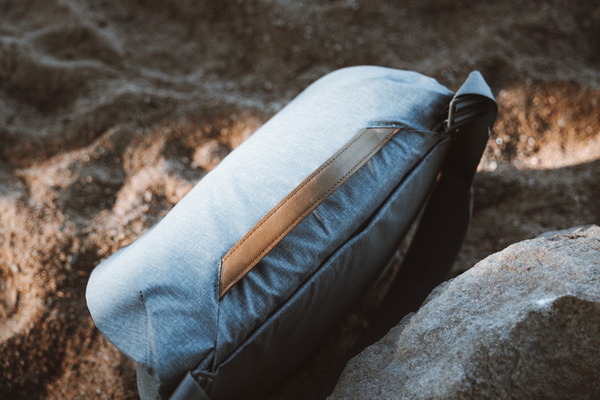
- The top leather handle feels great in your hand, however it’s positioned slightly too far to the rear of the bag in my opinion. When the bag is fully loaded, holding the bag with the top handle feels improperly balanced.
- The shoulder strap’s connectors are circular and perfectly rotate, providing more flexibility for strap positioning and adding a dash of modern flair to the outside of the bag.
- The interior laptop sleeve has a second divider that magnetically adheres to one of the two sides of the laptop sleeve, providing a barrier between a laptop and an iPad if you want to carry both.
- The Everyday Messenger V2 ships in two colorways: Ash and Black. I absolutely love Peak Design’s Ash color across their entire Everyday and Travel bag lines, but there’s something about the jet black Black that I would trade for. The Black bag is very sleek and understated — perfect for street carry and street photography.
I imagine the changes Peak Design implemented for the Everyday Messenger V2 were requested by the very large Everyday Messenger customer base, so my complaints here likely don’t represent the majority of users. My complaints aren’t so much complaints as just disappointments — in no way do they add up to being dealbreakers, but rather represent decisions that don’t necessarily fit how I want to use the camera bag.
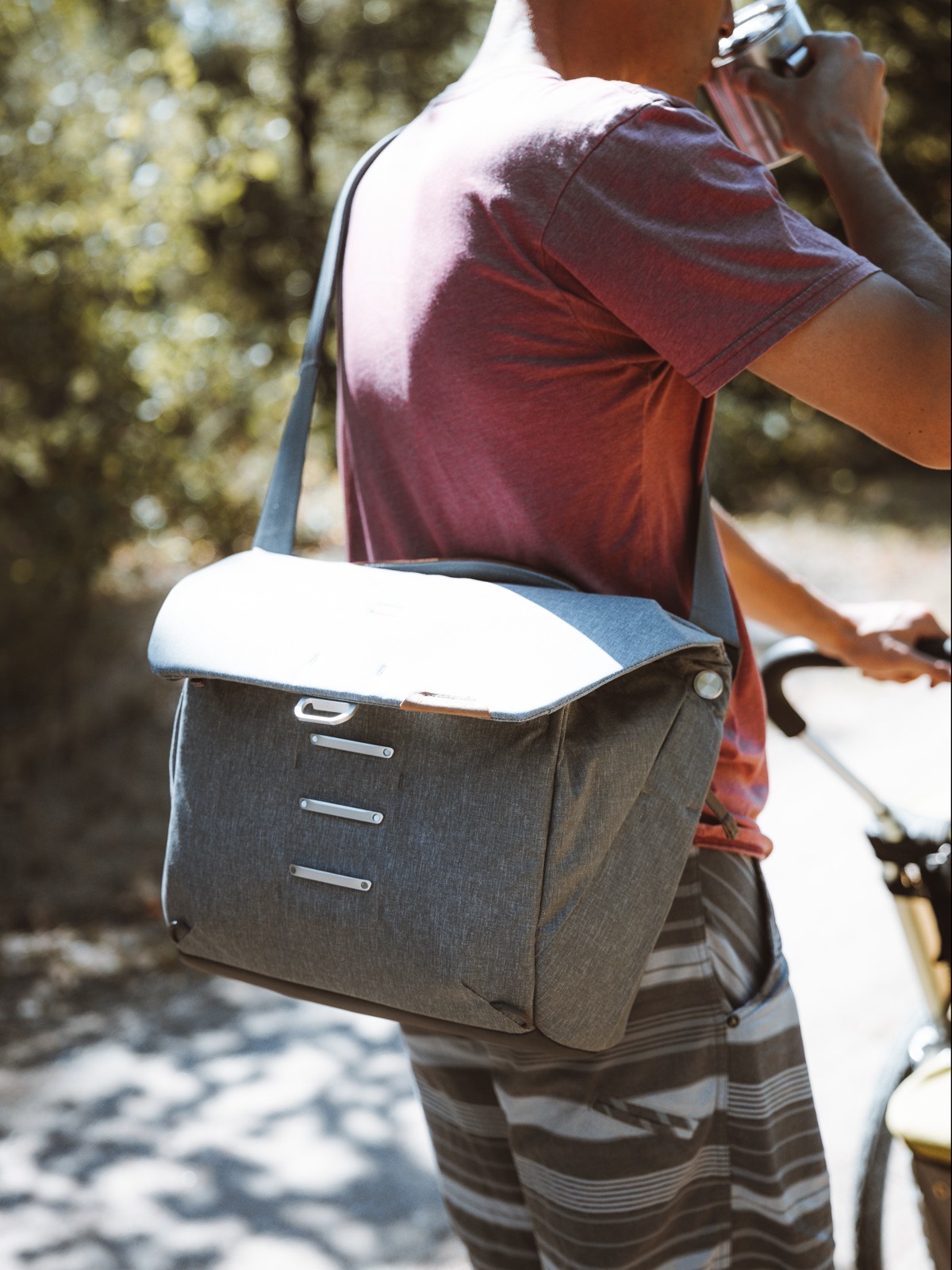
But if there’s one decision to the Peak Design Everyday Messenger V2 that overrules all other decisions, it’s in the fact that Peak Design no longer makes a 15-inch Everyday Messenger. This will really undercut those photographers who want to pack relatively light with their 16-inch MacBook Pro, and it also undercuts anyone wanting to carry additional kit for a day shoot.
Even I’m running into space issues with this bag. As it is right now, the Canon EOS-R, Canon 24-70mm f/2.8 RF-L IS USM, Canon 35mm f/1.8 RF STM Macro, Godox V1C Flash, 11-inch iPad Pro, and small accessories like a battery charger and flash remote completely fill this bag to the brim. That’s a camera, two lenses (one being fairly large), a flash, and an iPad.
But there’s just not a lot of interior space in this 13-inch bag. I imagine there’s more space in this bag than there is in other 13-inch bags, but if you can’t carry a 16-inch MacBook Pro — one of the most popular computers I’m seeing in photography circles — you’re missing one of the key target users for this bag.
I have been planning to buy the Canon 70-200mm f/2.8 RF-L IS USM lens for quite some time now, but I won’t have any place to store it in this bag. Instead, I’m thinking I’ll have to buy the Capture Clip to store the camera on the outside of the bag with the rest of my lenses and accessories stored inside.
Not ideal.
Not impossible.
But not ideal.
Wrap Up
Here’s how I summarized my first review of the original Peak Design Everyday Messenger:
I also think the Everyday Messenger is somewhat overkill for photographers with simple kits. If you have a camera like the Leica Q or Fuji X100F, or if you have a mirrorless camera and only one or two small lenses, the Everyday Messenger could be overkill. There’s a lot of space inside the bag — particularly the 15-inch bag — and it makes little sense to cart around such a large bag with such a small kit.
However, for those with medium sized kits, full-frame kits, or the need to carry around a full-sized laptop each day, the Everyday Messenger is quite the catch. Organizing lenses, flashes, chargers, and other necessities between the FlexFold dividers is a dream come true, while all-day shooters who need extra batteries and SD cards will surely welcome the nice touches in the front flap.
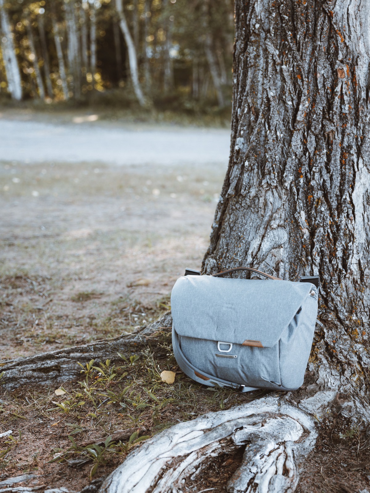
It’s amazing how much of these two paragraphs is exactly wrong in relation to the Everyday Messenger V2.
Where before I felt the Everyday Messenger was overkill for small camera kits, the Everyday Messenger V2 feels more designed for smaller camera kits.
Where before I felt the Everyday Messenger had a fantastic front organization flap perfect for accessories, the Everyday Messenger V2 opts for a smaller, less accessible, and frankly, less useful front organization pocket.
Where before I found it very easy to tote a tripod along with the Everyday Messenger, I now leave my tripod at home because it’s a nuisance to tie up with the Everyday Messenger V2.
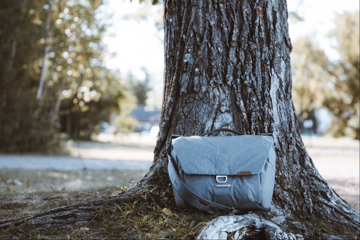
All is not lost though. These changes will be applauded by some who found the front organization flap too easy to open and strew accessories about, by some who greatly appreciate the interior laptop sleeve and exterior document sleeve, and by some who like the smaller 13-inch bag for carrying on their back or hip.
The Everyday Messenger V2 is a lesson in decision-making and compromises. I’d like to have a 15-inch Everyday Messenger with V2 materials, V2 zippers, the V2 shoulder strap, the V2 interior laptop sleeve, a V1 front organization flap, a V1 tripod sleeve, and a V1 top-access zipper for quickly accessing my camera.
That bag doesn’t exist, unfortunately.
Get Our Best Photography Tips & Workflows
Transform your photos and edits from average to awesome with our in-depth, mobile photography course. It’s jam-packed with training, ideas, and lessons that can literally transform your photography overnight.
