The best Reddit app for iOS
Apollo
It’s been two years since we first reviewed the landscape of Reddit apps for iPhone and iPad. After extensive testing and far more Redditing than should be considered healthy, we’ve concluded that Apollo for Reddit is the premier choice for most people. It’s a thoughtfully designed, customizable, and easy-to-navigate experience that just managed to beat out our previous pick, Narwhal (although it was such a close race between the two that it almost doesn’t matter).
Table of Contents
-
Introduction
-
The Apps We Tested
-
What We Look For in a Reddit Client
-
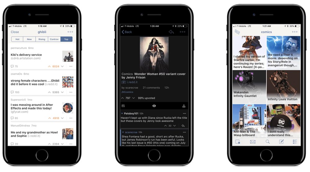
Our Pick: Apollo
-
Second Place: Narwhal
-
Third Place: Antenna
-
The Rest
-
Conclusion
Introduction
Reddit is a tough place to love sometimes. When we published the first version of this review back in April 2016, I wrote about how I spent years avoiding the site like the plague. While that’s no longer the case, there are still some deep, dark corners of Reddit that should never see the light of day. Even in “normal” subreddits, it’s hard to have an innocuous discussion anymore without it devolving into a Facebook-esque political debate or whatever else people feel like arguing about.
Nevertheless, you can still have a great time browsing Reddit, as long as you follow two rules:
Rule #1: Stick to a handful of subreddits that cater to your exact interests. The more niche, the better. When you find a community you love, cling to it for all its worth.
Rule #2: Use an awesome app to keep up with those subreddits, and maybe do the occasional browsing elsewhere.
With that second rule in mind, we’re back with a new and improved review of the best Reddit clients for iOS.
A lot has changed in the two years since the first edition of this article. Two of the apps from our original list are gone, another one was replaced by Reddit’s own app, and we’ve got a couple new challengers on the list — one of which has in fact become our new top pick. We were as surprised as anyone.
The Apps We Tested
![]()
- Apollo — Our new champion. ?
- Narwhal — Previous champion (and still very good). ?
- Antenna — Third place, and there’s no shame in that. ?
- BaconReader
- Wormhole
- Submarine (99¢)
- Beam
- Alien Blue — Replaced by the official app.
- Rhombus — Taken down from App Store; website no longer exists.
- iAlien(s) — Taken down from App Store.
Apps on Our Radar that We Haven’t Tested Yet (or Were Disqualified):
- Karma Train for iPhone and iPad.
- Milkeddit for iPhone (99¢) and iPad (99¢) — Both versions have pretty bad ratings on the App Store as of this writing, so we’ll pass for now.
- Insteddit — iPhone only
- Monochrome — iPhone only
- Silver — iPhone only
- Nano — Designed mainly for the Apple Watch
What we look for in a Reddit client
The whole point of third-party Reddit apps is that you get to bypass having to use the site itself or Reddit’s own app, neither of which offer the greatest experience around. If they did, we wouldn’t have written this article and you wouldn’t be here anyway.
Therefore, we have a handful of criteria that every Reddit client worth its salt should try to meet. The best Reddit apps…
- Are well designed and easy to use, from navigation to readability and everything between.
- Sport a certain level of polish. (Bonus points for extra-thoughtful or delightful details.)
- Offer extensive access to Reddit features, from basic to advanced.
- Feel right at home on iOS.
- Feel like a good value for what you pay.
On the value front, what we’ve discovered is that nearly every app in our tests was free to download but offered some type of in-app purchase, typically to remove ads and/or unlock features. The upside of free-to-download Reddit clients is that you get to test the entire field without paying a dime. However, it should go without saying that once you’ve chosen a favorite app of your own, you should pay for the IAP and support that developer’s work.
Our Pick: Apollo »
[Apollo] is single-handedly responsible for me getting into Reddit.—Josh Ginter (editor-in-chief, The Sweet Setup)
Last October, developer Christian Selig introduced Apollo to the world, after nearly three years of work following an internship at Apple. It quickly got a lot of positive responses on Reddit and elsewhere, and thus our attention was drawn.
Apollo 1.0 showed a lot of promise for a new contender in this space, and it’s only improved significantly since, releasing an average of one update per month without a single update being a waste of time.
In the beginning, I wrote that I would be spending time with Apollo for this review, and here I am to fulfill that promise. Let’s get to it.
Design and Usability
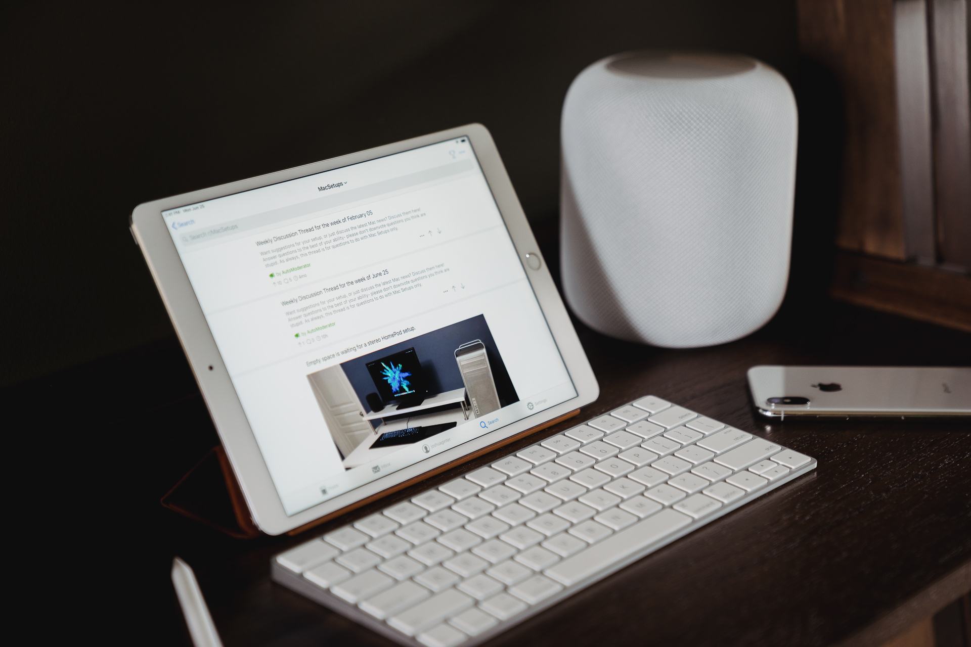
When you first open Apollo, one of the first things you’ll notice is that it feels right at home on iOS. From the iconography to the colors to the clean, sensible layout, you’d almost think Apple were the company behind this app.
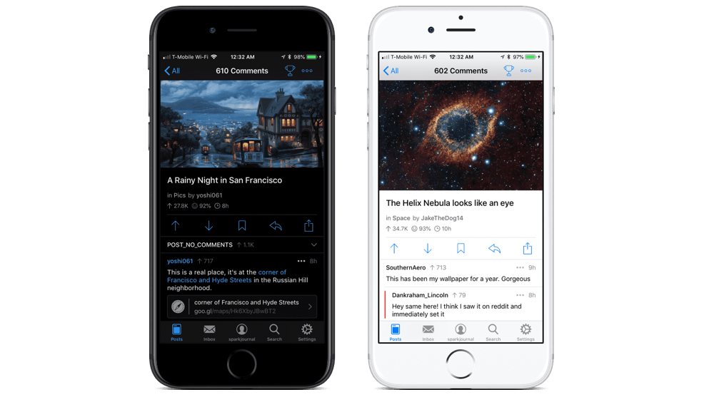
The navbar along the bottom gives you access to common functions:
- Posts
- Inbox
- Your profile
- Search
- Settings
This navbar is persistent, so you can always get to those places no matter where you are in the app.
As you’d expect, Apollo is smooth and easy to interact with. Everything makes sense, to the point that it almost doesn’t warrant mentioning. Whereas our previous top pick Narwhal is the kind of app that took a lot of liberties in its design and personality compared to most apps, Apollo gives off a more spartan, straightforward vibe.
There aren’t many things about Apollo that you might call “charming” or “whimsical,” but that’s just fine for most people, if not preferable.
Setting Everything Up
Before you dive too deep into Apollo, we suggest heading to the Settings tab in the navbar and configuring things to your liking. (Notice how much the list looks like Settings.app in iOS?)
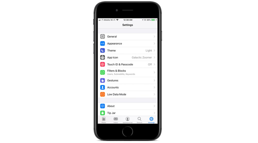
Apollo offers many ways to craft your ideal experience. Let’s go page by page, skipping some of the more self-explanatory ones:
- General — allows you to set various options for posts and comments (including default sortings for each), collapse AutoModerator comments, choose how links open, show/hide certain UI elements, and more.
- Appearance is what you’d expect, with options for text sizes, whether or not to show page numbers as you scroll through posts on the list, show/hide voting buttons (I prefer to hide them), and even enable and choose between comment themes (changes the color schemes of the vertical bars that denote comment thread positions).
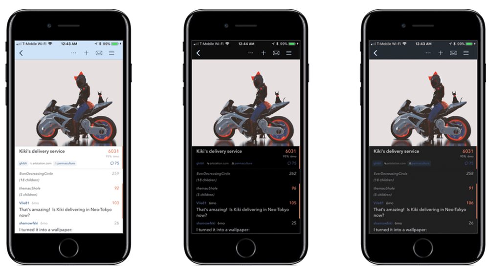
- Theme lets you configure how Apollo’s light and dark themes work, including a “pure black” dark mode option.
- App Icon offers an impressive array of icons that are hard to choose from because they’re all so great. My current choice is “Galactic Zoomer,” which reminds me of EVE from WALL·E.
- Filters & Blocks is where you can manage keywords and subreddits you want filtered out of your experience, along with your “Blocked Users” list.
- Gestures lets you customize all swipe gestures throughout the app. You can set the short and long swipes (in both right and left directions) for posts, comments, your inbox, and profile posts and comments. I’ve changed mine to replicate those in Narwhal, for familiarity’s sake.
![]()
Basically, if there’s something you want to adjust about your Reddit browsing experience, chances are Apollo’s got a setting for it.
Browsing Around
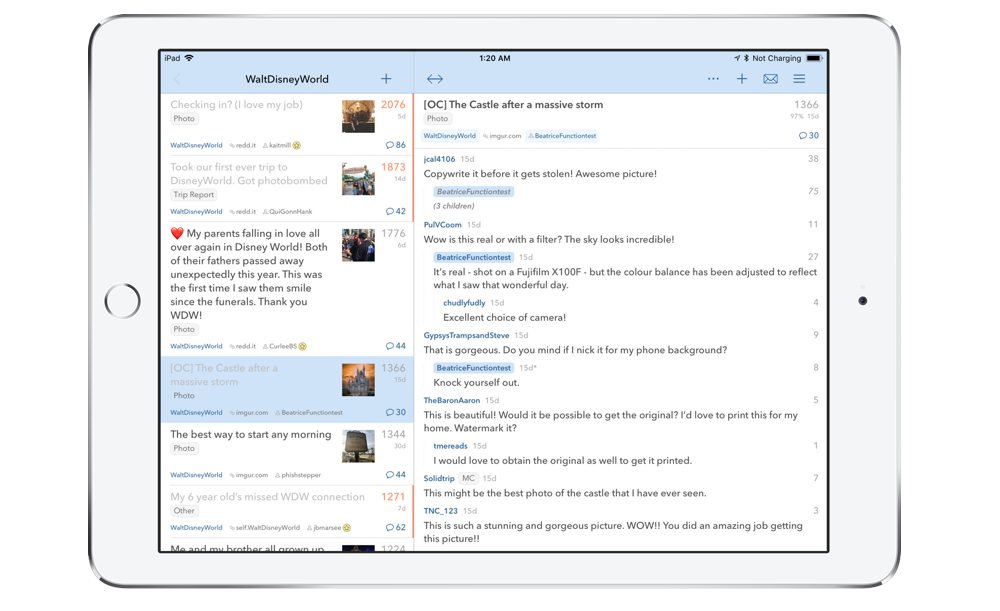
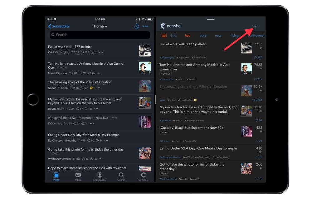
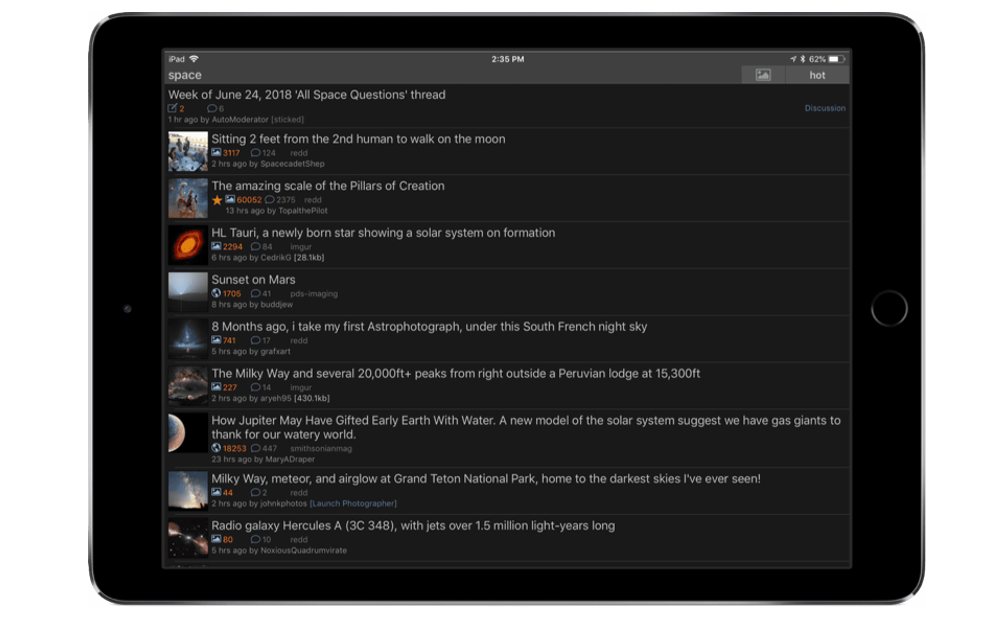
The Posts tab on the navbar is where you can view all the standard places on Reddit: your home page, the r/All page, any multireddits you’ve set up, the subreddits you’re subscribed to, and your “Favorites.” You can hit the plus (+) button up top to add a new subscription, favorite, or multireddit.
Browsing through any of those categories is pretty straightforward.
Shortcuts and Cool Features
Browsing around in Apollo is pretty simple: just head to the Posts tab on the navbar and choose from any of your subreddits, multireddits, or favorites, or you can just tap through to your home page or r/All. Swipe from the left side of the screen to go back to the previous one. You get the drill. Like I said, Apollo was designed to make sense to everyone of all levels of tech-saviness, so you don’t have to worry too much about getting lost.
However, there are a handful of somewhat hidden functions worth knowing about:
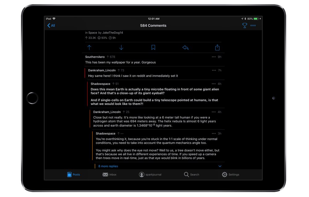
- Apollo’s light/dark switch is accessible from anywhere; just long-press the top bar for a couple seconds and boom.
- Long-pressing on a given post in the feed brings up a menu of options, including the ability to jump to the poster’s profile page or straight to the subreddit that post lives in.
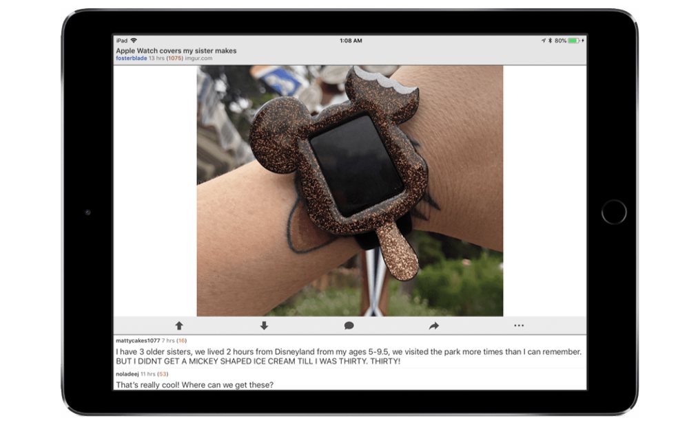
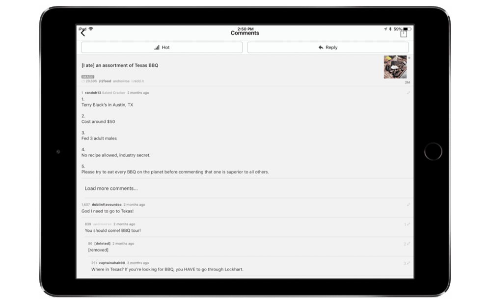
- If you load a post with a gif attached, you can actually scrub through that gif by swiping left or right. It seems like a small thing, but coming from Narwhal, this is a gamechanger — especially for long gifs where you would otherwise have to wait for the thing to start all over just to catch some minor detail you missed the first time around.
- If you swipe from the left to go back a level, Apollo remembers where you came from and even which comments in a thread you’ve collapsed, so you can swipe from the right side to get back to where you were. I can’t tell you how many times I’ve accidentally exited a thread in Narwhal, only to go back in and try to figure out where in the comments I left off.
- Long-press on a comment, and one of the options you get there is “Select” mode, which brings the text of that comment up in an overlay so you can copy any part of it you like, rather than all of it at once. A very nice touch, I think.
- If you’re in any subreddit, tap the name of it at the top (it’ll look like a dropdown button) and your Favorites list will appear, as well as a text field where you can start typing to bring up a list of other subreddits that updates on the fly. This is an easy way to jump straight between subreddits without having to go back to the Posts page or the Search tab.
- While the subreddits on your Posts page have stars that you can tap to add them to your Favorites, you can also browse to any given subreddit, hit the ellipses (…) button at the top right, and select Favorite. Doesn’t matter if you’re subscribed to that subreddit or not.
Alternatively, you can go to the Posts tab, hit the plus (+) at the top left, and choose Add Favorite there to type in a subreddit of your choice, although it won’t attempt to autocomplete search results for you. (Narwhal has one advantage here in that it allows you to add specific user profiles to your shortcuts list in addition to subreddits, but for most people that feature isn’t too important.)
Where Apollo Could Improve
No app is perfect, right? While we have no straight-up complaints about Apollo per se, there are some things we’d like the developer to consider in the future:
- It would be nice if the iPhone and iPad versions synced “read” statuses for threads. If I open a thread on iPhone and another one on my iPad later, neither one remembers which things I’ve read on the other device. (I’m sure the reason for this is that “thread syncing” is one of the features offered by Reddit Gold, and 3rd-party apps like Apollo are likely barred by the Reddit API from having such a feature. Doesn’t make it any less annoying.)
- There should be a shortcut for creating subreddit filters that doesn’t involve going into a subreddit or the Settings page. In Narwhal, you can easily filter a subreddit by long-pressing one of its posts in r/All (or elsewhere) and selecting the “add /r/[subreddit] filter” option right there.
- While Apollo is typically the more stable option of our top two picks, it wouldn’t hurt for it to take a cue from Narwhal by adding some delightful details, like a robot version of Narwhal’s cartoon mascot animation when pulling to refresh. I know Apollo has an option for subreddit moderators that lets them tap a button to receive a random compliment — why not let everyone have that option?
Second Place: Narwhal »

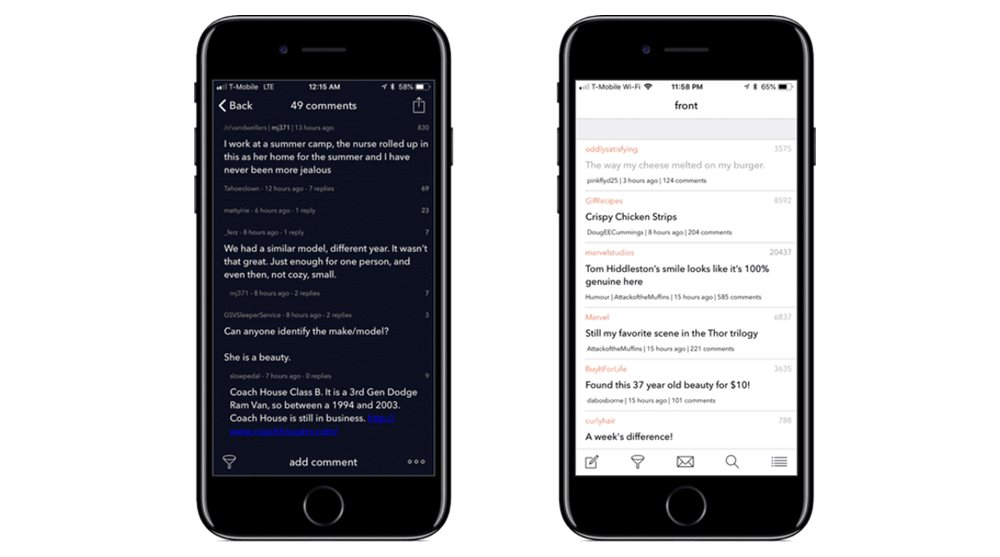
In the first edition of our review, Narwhal quickly rose to the top of our rankings. It was far and away more enjoyable to use than any of the others on the list at the time, and it continues to be a wonderful option.
Bumping Narwhal down to second place was way harder than we thought it’d be. It actually came very close to remaining our top pick. It took some of our renowned nitpicking prowess to make the final call, which you’ll see in the sections below. We felt even more torn about this whole thing than we did with Tweetbot versus Twitterrific, if that tells you anything.
Design and Usability
From the get-go, we’ve always appreciated Narwhal’s features and attention to detail.
On the main screen, you can tap the Narwhal logo at the top to toggle between light and dark modes. Both are enjoyable to look at, which is more than some iOS apps can say. (For example, the dark mode in Tweetbot is way better-looking than its light mode in our estimation.) In both modes, Narwhal gets the balance of text and UI colors just right. There’s also a “true black” option for dark mode that got added a few months ago, and it’s just… *kisses fingers*
The one thing that bugs us about this shortcut toggle is that it’s only available on the main page. When you’re anywhere else in the app, the only way to make the switch manually is by going to Sidebar → Preferences. I’ve long wanted Narwhal to add some simple universal gesture for this, à la Apollo’s long-press at the top or Tweetbot’s two-finger swipe up/down.
Out of our top three apps, Narwhal’s the only one with an always-visible New Post button while viewing any main feed outside of a comment thread (it’s the + button at the top). The other two apps keep that function tucked away in a menu somewhere, and as much as we enjoy a good scavenger hunt, it’s nice of Narwhal to keep that option front-and-center.
Another button that’s nearly always visible is the pixelated envelope icon at the top, which opens your messages inbox. From there, you can switch “tabs” to view sent messages, comment replies, mentions, etc. When you’ve got new messages/replies, the envelope lights up in a pleasant-but-eye-catching orange and white.
Even the pull-to-refresh bar is a nice touch. Pull down and you’re treated to the app’s charming narwhal mascot chewing on a piece of bacon, who gives a joyful smile when you let go to refresh. In “night” mode, the narwhal wears groovy sunglasses and floats in a field of stars in space. Amusing touches like these go a long way to making any app more enjoyable to use.
Another thing I want to mention is how smooth the whole app feels. It never stutters while loading content — even on a throttled LTE connection, threads and comments load surprisingly fast, if not the external links themselves — and it certainly never feels like a chore to use. A lot of care went into every interaction and detail.
Reading and Voting
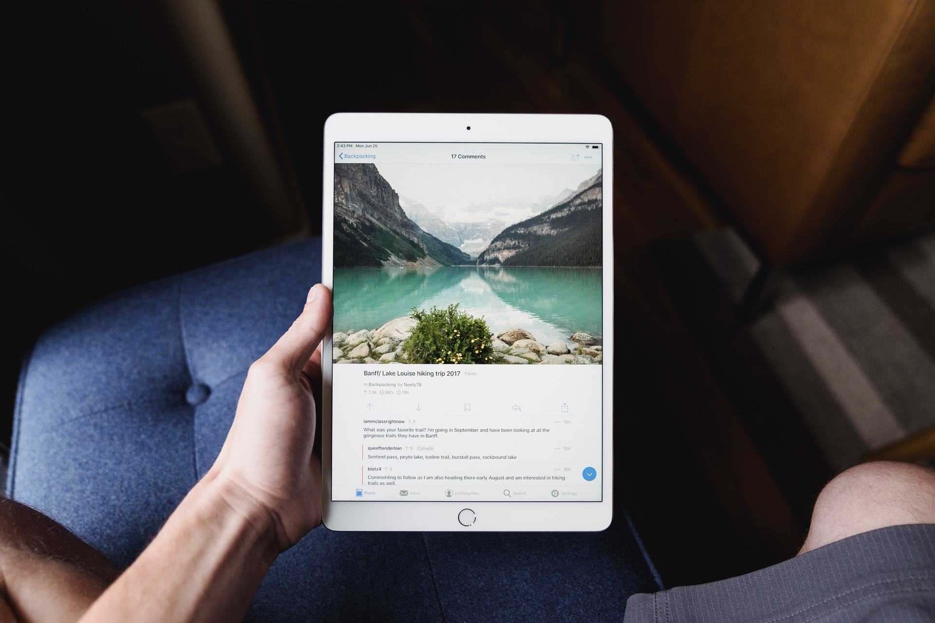
When you tap to open something from the feed, it loads the external link (if there is one) and the Reddit comment thread simultaneously — external content at the top, thread title and comments at the bottom. Swipe the thread downward offscreen to view the external link in full (tapping the “view comments” bar at the bottom quickly brings them back), or swipe upward to view comments only. If you’re deep down in the comments, tapping the top status bar quickly hides the thread. The point is, it’s easy to switch to the other view at any time.
Voting on links, threads or comments is done by swiping a little to the left to upvote, or further left to downvote. Once a vote is made, a line on the right marks that thing with the appropriate color (orange or purple, respectively). The vote counter itself will also match that color.
This is a clever solution for both letting you vote on things and showing that you’ve done so, all without having onscreen arrows to clutter things up. I don’t care how big your device is, screen real estate is precious.
Other Gestures
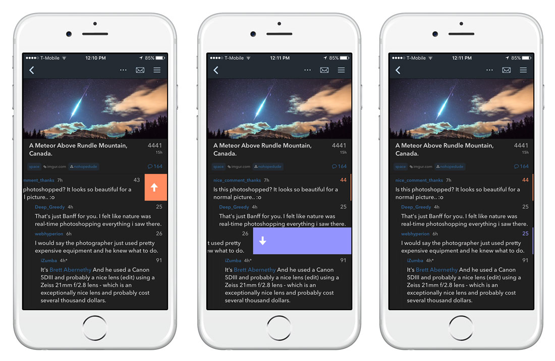
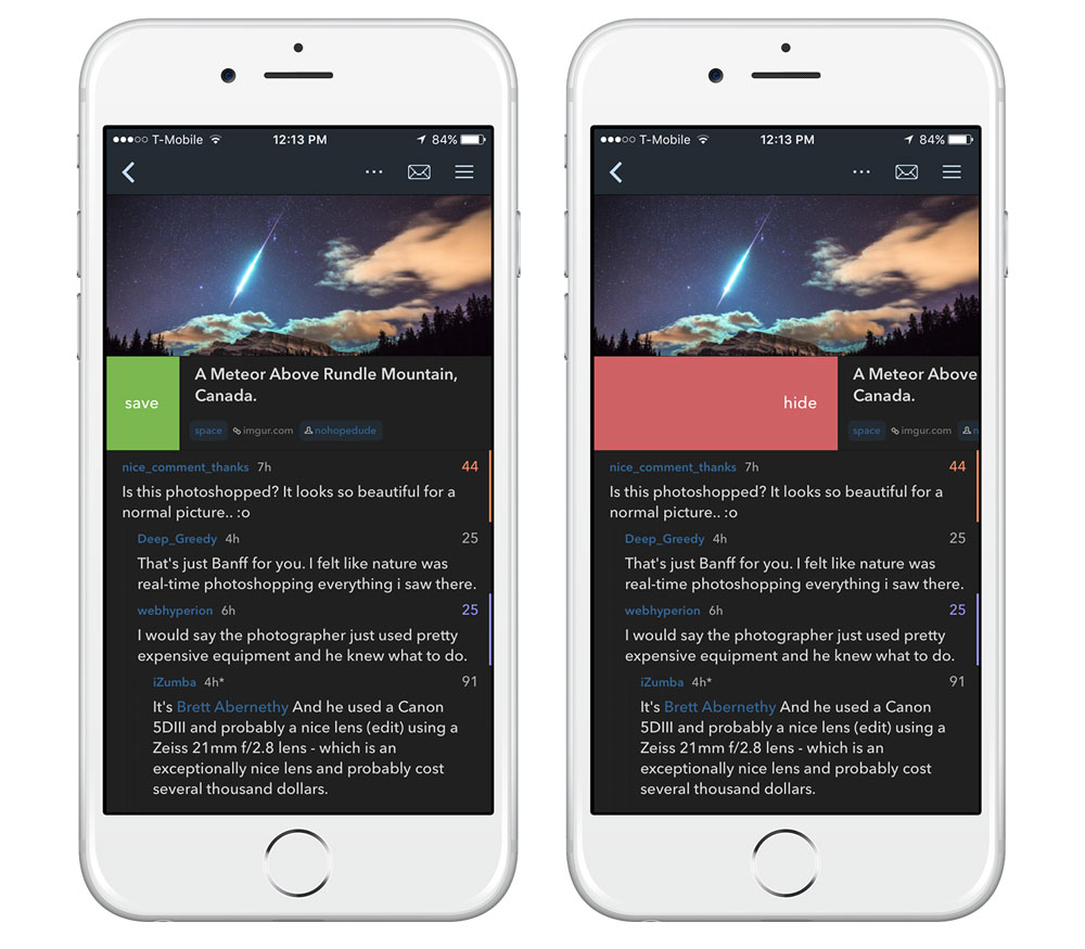
Voting isn’t the only thing you can do with gestures. For example, swipe a little right on a thread title to save it, or further right to hide it altogether. Pretty simple.
Comments in threads have similar actions: Swipe a little right to reply, or further right to bring up advanced options:
- Private message that user
- View their profile
- Share comment
- Save comment
- Report comment
When viewing a thread, you’ll see an ellipsis (…) button next to the New Post (+) button at the top, which displays a list of options:
- Share Reddit post
- Sort comments
- Refresh comments
- Refresh post
- Report post
Occasionally you’ll also see a “Refresh link” option on that list, but we’ve found no rhyme or reason yet as to which posts will show it and which ones won’t ¯\_(ツ)_/¯
Whenever you’re viewing a main feed of some sort — i.e. your front page, a subreddit, or a list of search results — there’s a horizontal toolbar hidden at the top of the list (you’ll have to scroll up to see it) that gives you quick access to certain contextual functions.

Depending on where you are in the app, you may see the typical Reddit sorting options (hot, new, rising, controversial, top, etc.), a toggle for large/small thumbnails, a button to sort search results by relevance, or when you’re viewing a multireddit, buttons for viewing that multi’s subreddits and/or creating a copy of it for yourself. While viewing a standard subreddit, you get buttons for subscribing/unsubscribing and viewing the sidebar.
Sidebar

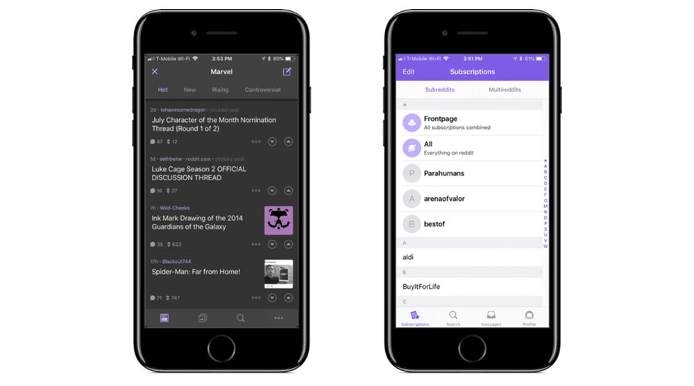
Narwhal’s sidebar makes it easy to access any subreddits and multireddits you’re subscribed to, along with your saved posts, your own profile, posts by your friends, and more. There’s also an option to switch accounts, which is awesome if you’ve got multiple handles for different purposes.
Customization
Narwhal offers a wealth of customization features so you can create your own ultimate Reddit browsing experience. Apollo isn’t exactly lacking in this area, but Narwhal blows it out of the water.
The main preferences screen gives you basic options for turning night mode on/off, enabling or disabling push notifications, tweaking fonts and text size, and enabling or disabling auto-refresh on launch.
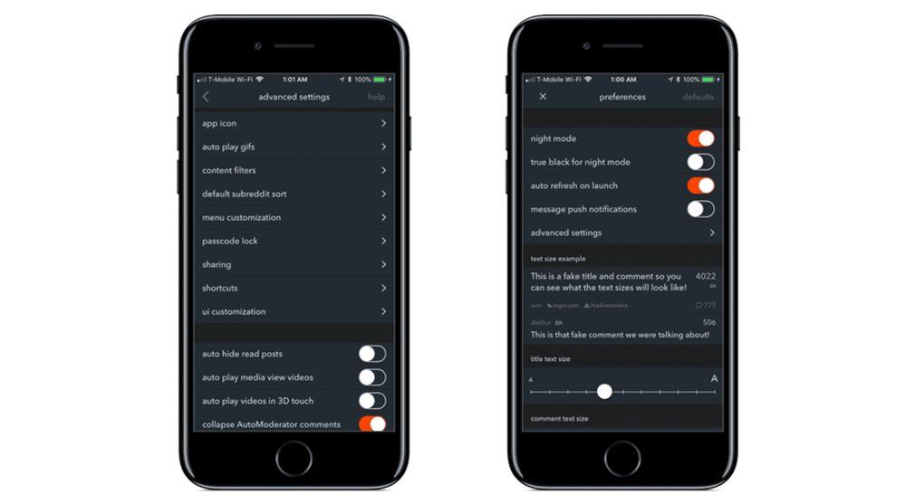
The advanced settings is where it gets fun. You can change the app icon, choose whether to auto-play gifs on Wi-Fi or otherwise, manage content filters, customize what appears in the sidebar, set a passcode lock, collapse AutoModerator comments, customize the UI in myriad ways (including the exact threshold for how far to swipe right/left on things before the secondary option appears), and way more options than I can list here.
I’ll just sum it up by saying that if one of our top picks was for the “power users” subset, the nod would go to Narwhal.
Where Narwhal could improve
Narwhal has improved by leaps and bounds even since we first reviewed it. However, there are still some straggler issues that need resolving:
- As I said earlier, there should be a universal swipe action for swapping between light and dark modes.
- Like Apollo, it’s frustrating that thread statuses don’t sync between devices without Reddit Gold. I would totally use a third-party service for this feature alone.
- It’d be nice if the search bar remembered what you last typed, or you could somehow modify the existing search rather than retyping the whole thing just to make a change or fix a typo.
- There should be an ability to save drafts of posts/comments. As it is, if you ‘x’ out of the compose window for any reason, you’d better copy everything to your pasteboard first or you lose it all. And even then, you can’t just go find a link to insert into your draft because that removes the copied text itself. I shouldn’t have to copy drafts into Simplenote to solve this problem.
- The iPad version has no way to “close” or back out of an open link/thread. Maybe you need to close a video real quick, or you’re looking at some silly gif at work that might get you in trouble. We’re not judging, these things happen sometimes. The only way to close what you’re looking at is by switching to another random thread, which if you’re acting quickly and not thinking about it, might just open some other auto-playing thing.
- There is some bugginess on iPad when running Narwhal in Split View. Namely, the messages icon and sidebar button (≡) often disappear completely, like so:
- One last thing: When viewing a thread and changing between light and dark modes in Preferences, every time you switch modes it forces the comments in that thread to reload. This has caused me many annoyances in the past. I know not to do it now if I’m going to lose my place somewhere, but I shouldn’t even have to think about it.
Antenna »
Formerly our 2nd place nomination, Antenna (known in a past life as AMRC) has been bumped down to 3rd place thanks to Apollo. It’s not a bad app by any stretch.
In fact, one of the things I like about Antenna over both Apollo and Narwhal is that it’s the most lightweight and snappy of all, with a simple interface that feels like an ode to old-school app design — in a good way. I can’t say for sure if it’s actually loading anything faster than the other apps, but it certainly feels that way. You know how some websites are more enjoyable to browse when you view them without HTML or CSS, keeping just the plain text? Yeah, that.
What Antenna lacks in high-falutin’ design, it more than makes up for in simplicity. Navigating and interacting with the app is a breeze, with no fancy gestures to worry about:
- Want to reach the right-hand sidebar? It’s always just a swipe away, no matter where you are in the app.
- Need to go back? Just swipe right.
- Want to interact with posts and comments? Just long-press on it, and every possible action you could need is right there. It’s always the same too, so you don’t have to remember which way to swipe to make something happen.
- Want to quickly switch between day and night modes? There’s no gesture shortcut, but the option is listed in the sidebar so you can always easily reach it with a swipe.
- Threads load similarly to Narwhal, where the external content is shown up top with the comment section below it. You don’t have to worry about them loading separately. One nice touch is that when you’re not on Wi-Fi and open a thread with a hi-res image, it will ask you to tap to load it rather than loading it by default.
That said, Antenna’s simplicity belies its bevy of advanced features. From the Settings page, you can customize most of the same things you can in other apps and then some — for example, it lets you decide whether or not to keep a history of your recently viewed posts in the left navbar, what happens when you 3D Touch something, and the data limit of your cellular usage.
Now, it bears mentioning that some of what we’d consider basic functionality is walled behind Antenna’s $3 “Pro” IAP, which unlocks things like:
- User history
- Night mode
- “Read Later” services
- Additional fonts
- Search
- Filters
- Additional shortcuts (i.e. access to multireddits and recently viewed threads)
- History sync (via a Synccit account)
- Thread submission
Once you do unlock the IAP though, Antenna becomes a sleeper knockout of a Reddit experience. Again, this is one of those things where some people will actually prefer the experience of Antenna over our top two picks. It’s really up to personal taste at a certain point.
The Rest
Two years later, BaconReader still stands out in my mind for being one of the only apps to prompt me with an EULA on initial launch. Not exactly a good first impression.
Aside from that, this app has seen a lot of visual upgrades since we first reviewed it, with improvements to loads of minor details that make BaconReader nicer to look at and use:
- Comment threads offer easy access to buttons for voting, replying, and more. You can also tap a comment with two fingers to upvote and three fingers to downvote, although I don’t see the point of this since the buttons are already visible right there.
- The top of each comment section has buttons for filtering/sorting, hiding comments altogether, or collapsing/expanding all comments. I don’t use any of these all that much, but it’s nice that they’re there.
- The main list view is formatted in a much cleaner way than it used to be, making it easy to pick out all the relevant details about each post.
- A bottom navbar has been added to the list view, where you can access options for jumping to subreddits, checking your messages, running searches, submitting posts, and switching between list and grid view.
- I don’t know when this was added — or if I simply missed it the first time around — but BaconReader has one feature I’ve been dying for Narwhal to add: the ability to save drafts for posts and comments. So handy.
I’m pleasantly surprised how far BaconReader has come these past couple years. I’ve yet to find anything I straight-up dislike about it anymore, other than the “Swipe in Comment Cell” function being a bit buggy when I have it toggled on.
That said, it still doesn’t have quite the level of polish of apps like Narwhal and Apollo. It’s one of those things that’s hard to put a finger on.
At first glance, Wormhole appears to be a solid entry. It has a nice clean design and things are easy to read for the most part, but once you dig into it a bit, you’ll find it’s made some odd choices:
- The only two viewing modes for the main list are seemingly “huge thumbnails” or “none at all.”
- When you load a thread with an image attached, it goes to the image first, and you have to tap the speech bubble at the bottom right to get to the comment section. I’m not a fan of this extra step.
- Static images load natively, but every gif I’ve tried has loaded an external page (like the Imgur site).
- The comment editor has no formatting toolbar.
- In dark mode, links are so blue they hurt my eyes.
- When you swipe left or right to vote on something, it needlessly animates all the way across the bar after your finger leaves the screen.
I could keep nitpicking, but suffice it to say that Wormhole needs a lot of tuning up before we can consider it as a top contender.
This app just feels weird to use. Tap a post with an image and it loads the image alone, with no way to reach the comment section directly from there (as far as I can tell, anyway). You have to go back to the list and swipe left on the post to reveal a little speech bubble icon, which then takes you to the comments.
Tapping on comments in a thread doesn’t collapse them as you’d expect — again, you have to swipe left to do that — but rather brings up a menu of options for upvoting, downvoting, saving, etc. However, you can already reach those three particular functions by swiping right on a comment, so this just feels redundant.
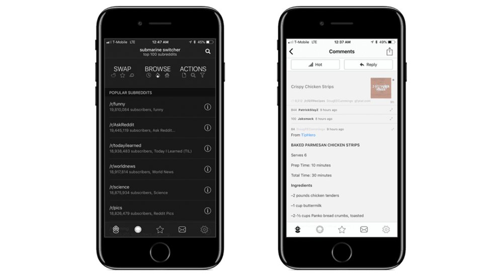
Telling the app to hide posts seems to do nothing…? And if you tap on the “porthole” button on the navbar, the three buttons at the top — Swap, Browse, and Actions — are a little confusing to use. Just weird all around.
On the plus side, the way Submarine handles gifs is kinda neat. You can tap a post to open the gif image, then pull the gif down to the bottom of the screen à la the YouTube app, where it will continue to animate as you browse around elsewhere. Similarly, the gif can be dismissed by flinging it offscreen to the right. When you’re viewing the gif full-screen, you can pause the “playback” and even skip to other parts of it by tapping the progress bar at the bottom.
I also appreciate the 1Password login functionality when you open the app for the first time.
There’s really not much to say about Beam. You can do basic things with it and not much else, and the design isn’t that great besides. I will say that I like the app icon a lot, and it does have a handy all-in-one search bar that lets you use a search term to search for subreddits or posts, as well as open a specific subreddit or user profile — all from one place. Unfortunately, that one feature isn’t enough to put it anywhere near our top picks list.
Conclusion
If you’re going to browse Reddit on iOS, we recommend Apollo, Narwhal, or Antenna — in that order. However, as we’ve stated several times in this review, it mostly comes down to personal taste and your own order of preference may differ from ours. Luckily, they’re all free to download, so you can try all three before you make a final call.